Advanced Typography: Expressing Absurdity
Foundational Inspiration: Jeffery Keedy’s Insightful Essays In my typography project, I drew inspiration from the thought-provoking essays of Jeffery Keedy, particularly “The Rules of Typography according to Crackpots Experts,” “Design Modernism 8.0,” and “The Global Styles.” This experimental book delves into typography as a means to interpret various quotes reflecting the author’s design philosophy, while also encouraging readers to embrace exploration and expressiveness in their typographic endeavors. Created exclusively using Adobe InDesign, this project aims to challenge conventions and embrace a Dadaist approach to design.
-
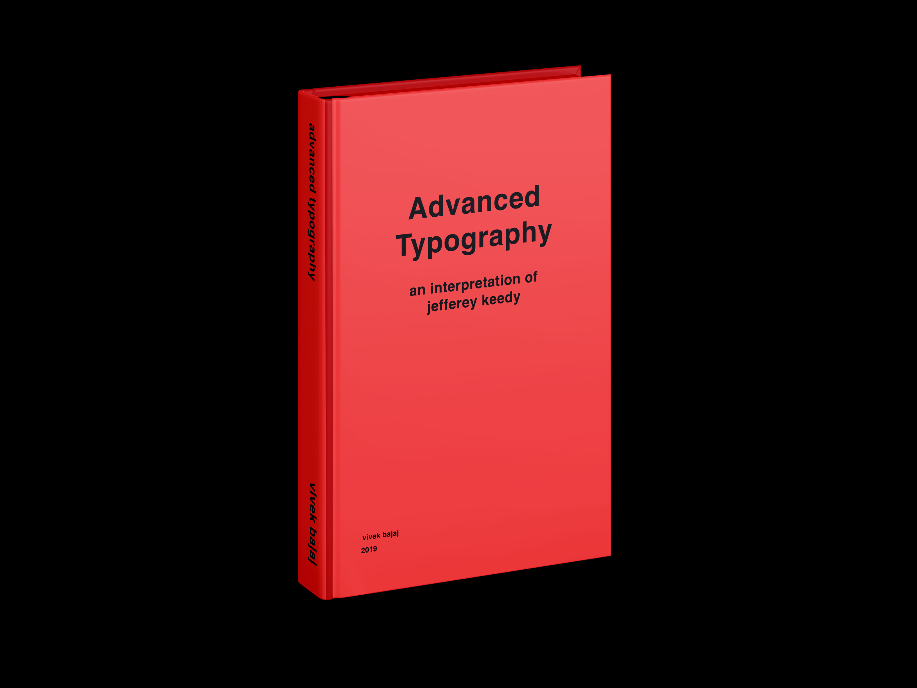
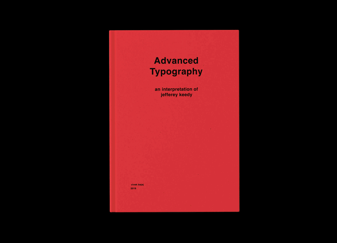
Book cover for the Reading Reader.
Typeface as a Statement: The Impact of Helvetica BoldThe choice of Helvetica Bold as the primary typeface amplifies the absurd and hilarious nature of the quotes, while also emphasizing the Dadaist essence of the essay. The bolder typography adds a layer of visual impact, further accentuating the unconventional nature of the content.
-
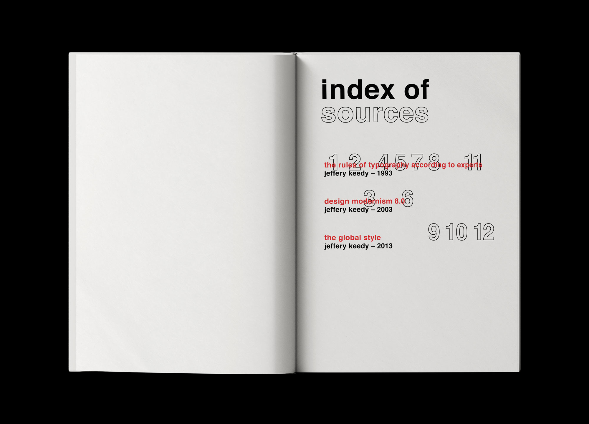
Index page of the book.
Disrupting Conventions: The Irregularity of the Index SectionSetting the tone for the book’s irregularity, the index boldly defies the rules of conventional typography. Visual hierarchy is disrupted as chapter numbers take precedence over chapter titles, overlapping in a playful and unexpected manner. This intentional design choice disrupts expectations and engages readers in a unique reading experience.
-

Motion graphic animation displaying my favourite quote from the book.
Dynamic Motion Graphics: Exploring Typography in AnimationIn addition to the printed book, I ventured into the realm of motion graphics, developing an eccentric animation. The motion graphic embodies a rigid and static aesthetic, evoking a sense of organic energy akin to street graphics. This deliberate departure from fluidity adds another layer of intrigue and visual interest to the overall project.
-
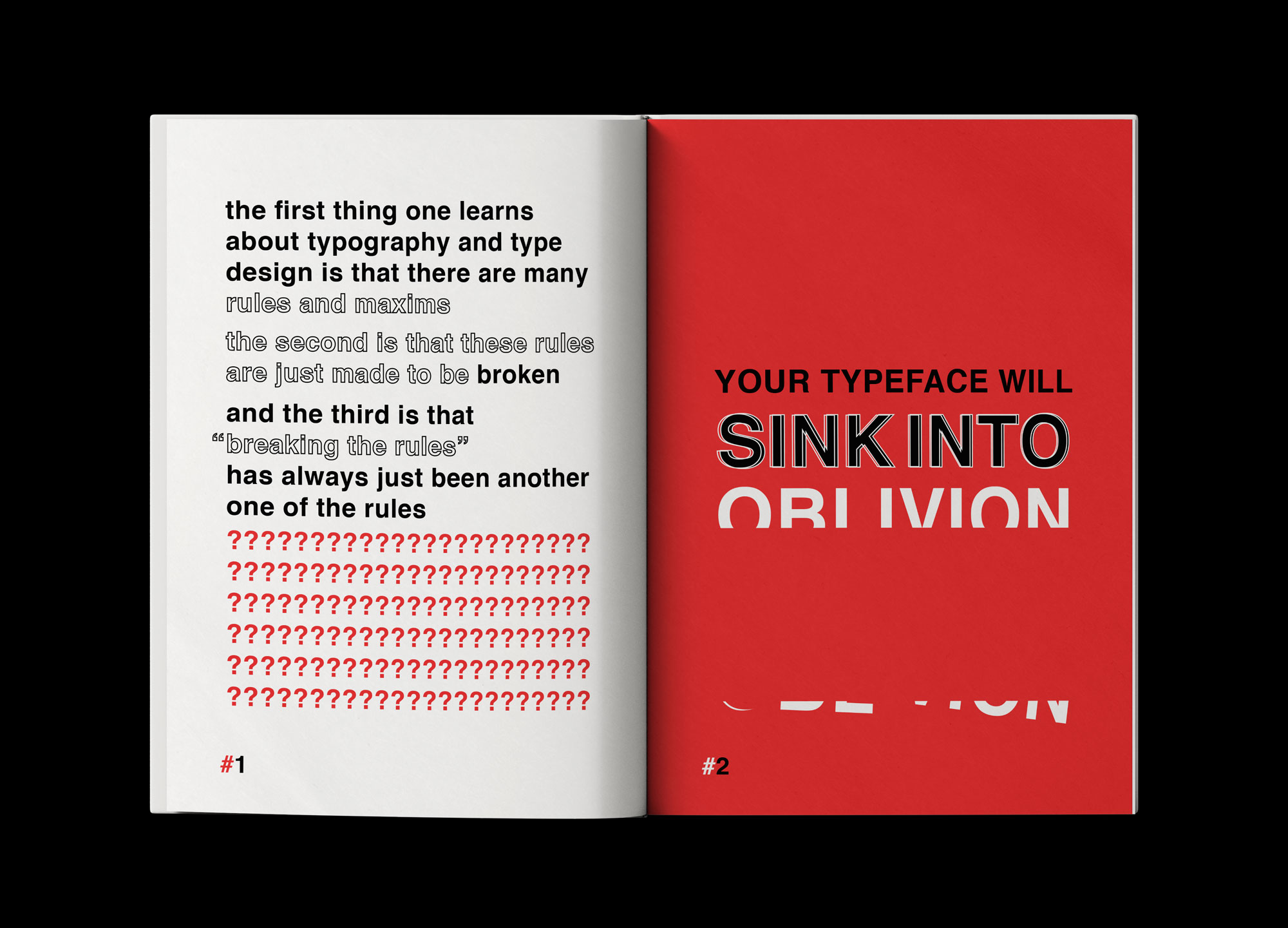
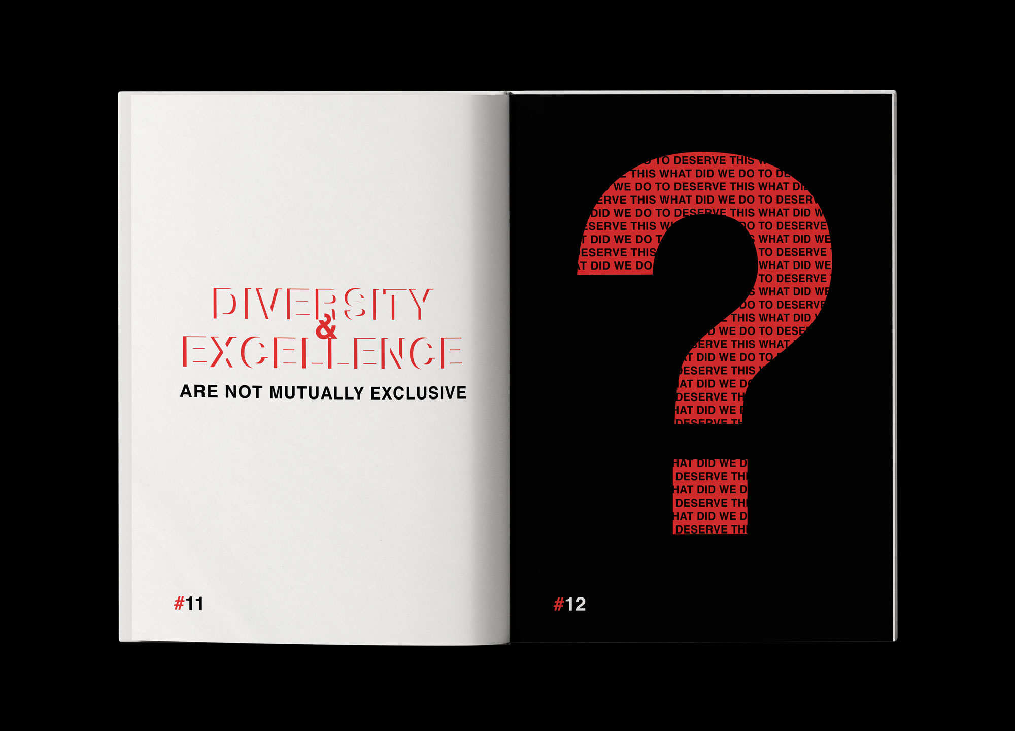
First spread of the book.
Amplifying Absurdity: Black and Red as Accent ColorsThe color palette of black and red serves multiple purposes. It accentuates the absurdity of the advice presented in the book, while also signaling the light-hearted and playful nature of the content. By employing only typography to create artwork, the design becomes constrained yet dynamic, leveraging the overlapping of type, the interplay of colors, and the manipulation of shapes and textures to create visually striking compositions.
-
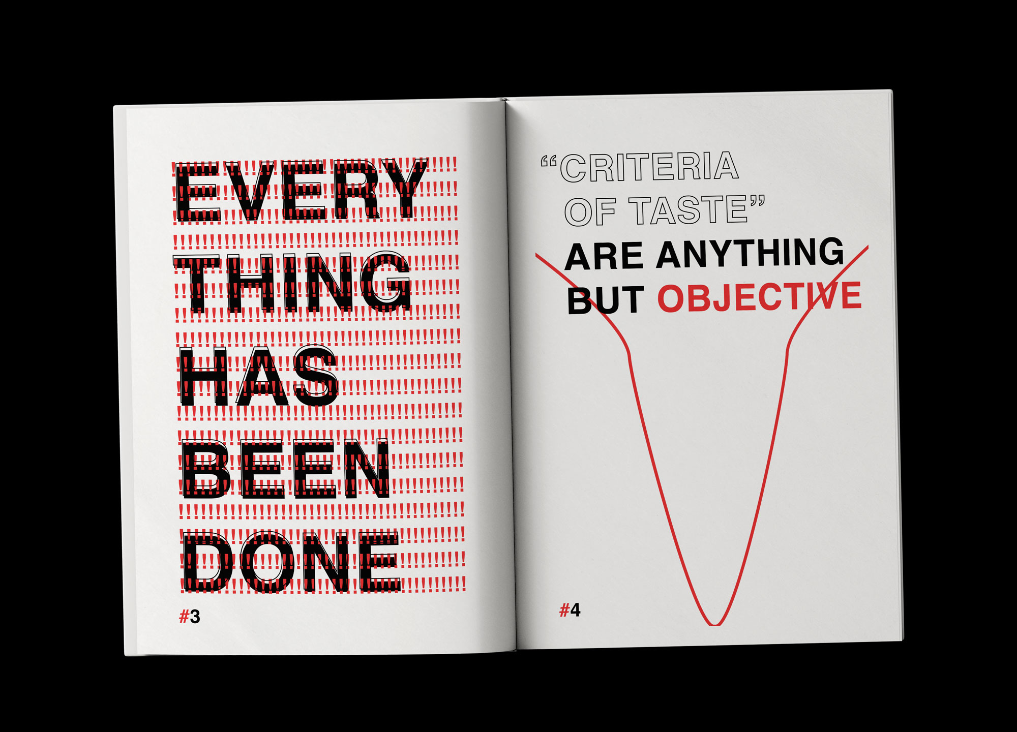
Second spread of the Book.
Constrained Creativity: Artwork Created Solely with TypographyAdvanced Typography takes typography beyond its traditional boundaries, inviting readers to embrace unconventional approaches, celebrate absurdity, and push the boundaries of expressiveness. Through this project, I seek to ignite a sense of curiosity and creative exploration, encouraging others to break free from typographic norms and embark on a thrilling journey of visual storytelling.
-
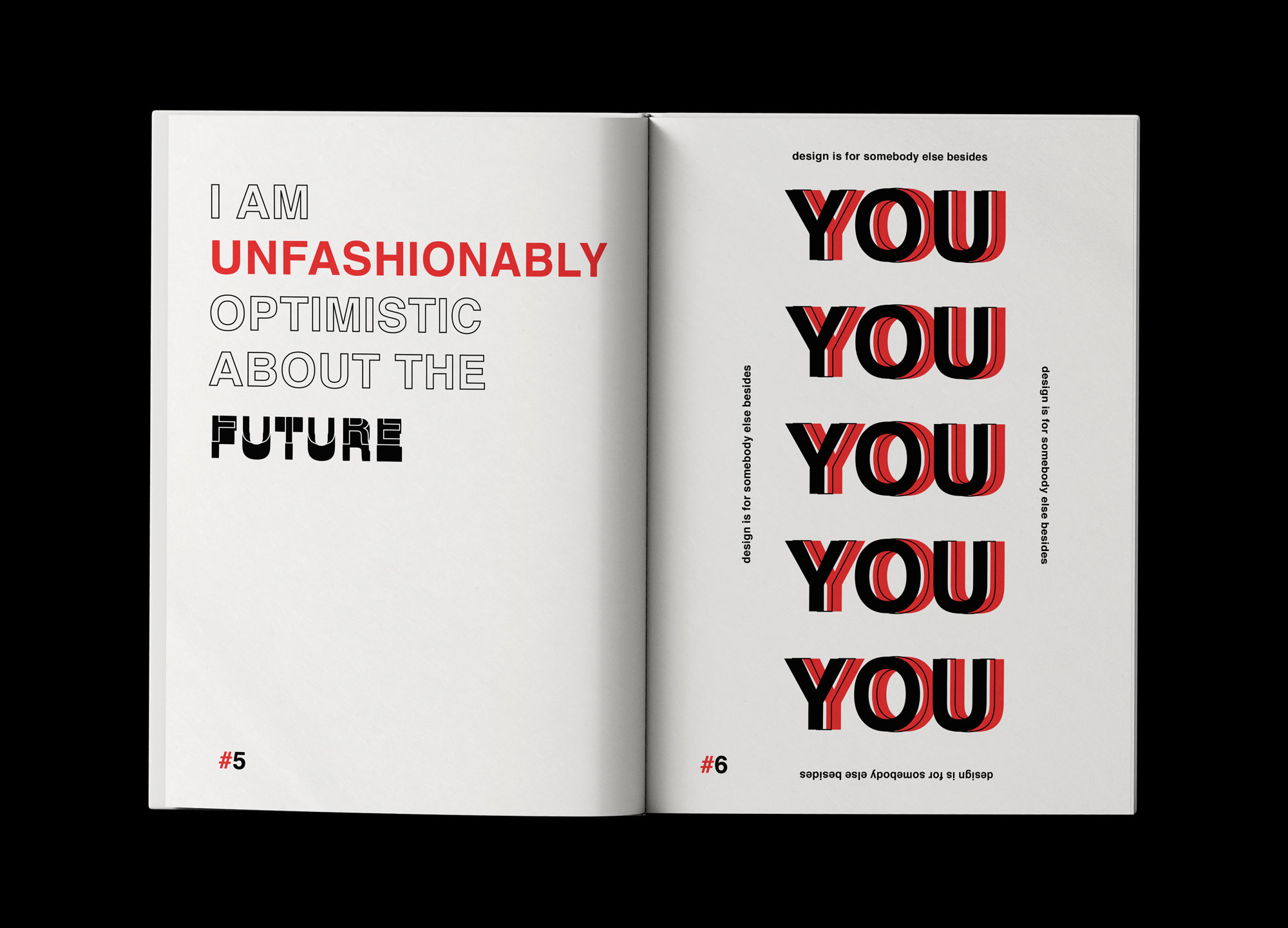
Third spread from the book.
-
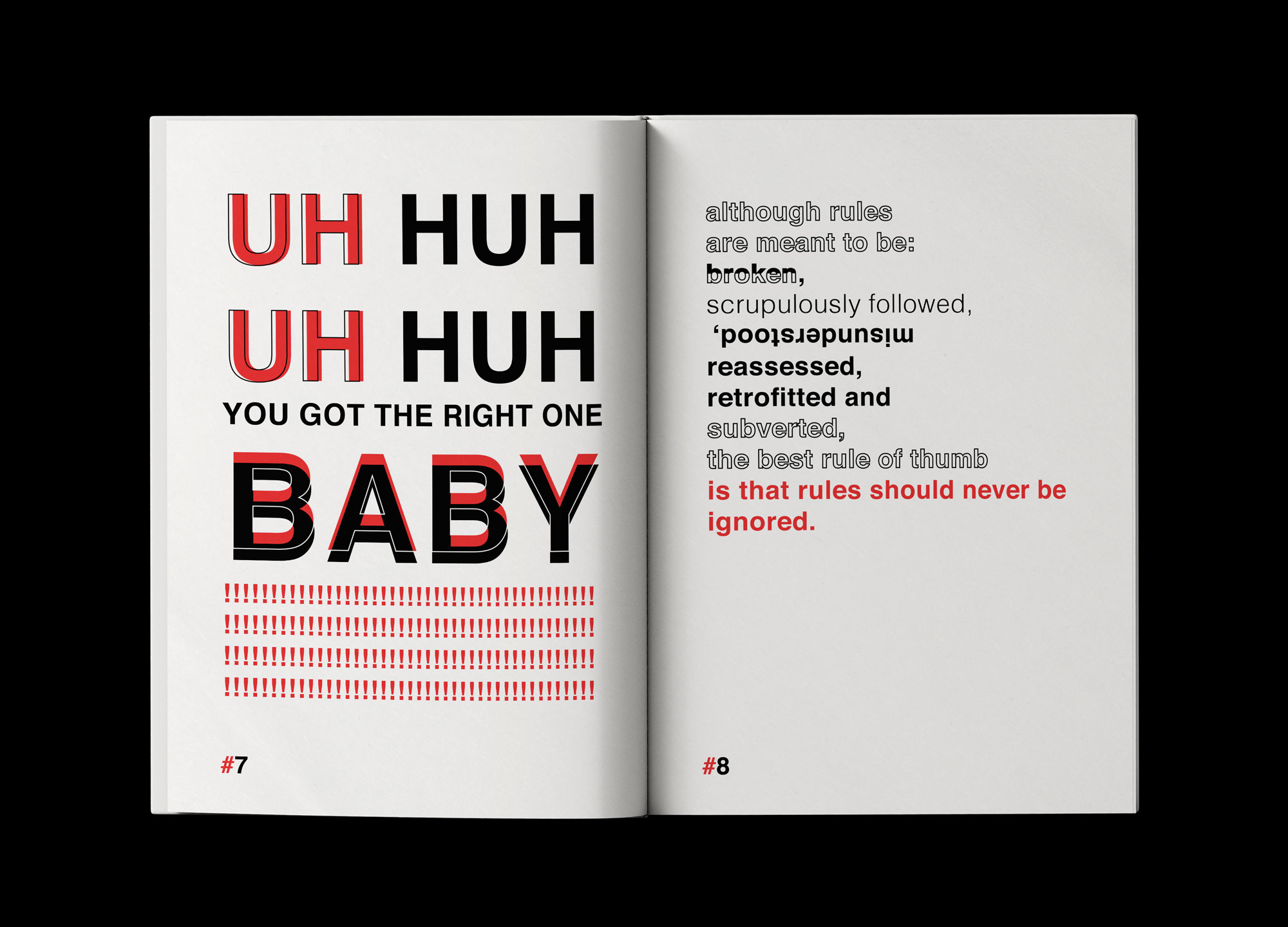
Fourth spread of the book.
-
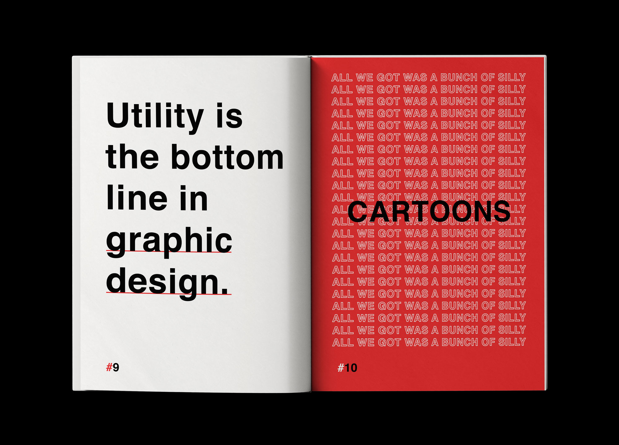
Fifth spread of the book.
-
Final spread of the book.