Joe’s Pizza: Embracing Tradition
Designing a rebrand for Joe’s had to speak to the unique feeling I associate with the place. I categorized their values into – Classic, Proud and Approachable. The first word that comes to mind is Classic because the experience is the same each time. Eating at Joe’s becomes a habit and not a task. The experience is the same each time. For decades they have offered the same four flavors of pizza. It doesn’t rely on fancy ingredients for a large customer base. Joe’s Pizza also encapsulates the pride of being a New Yorker. The restaurant has earned legendary status in the city. It can be seen in the movie Spider-Man 2 as the protagonist is an employee at Joe’s Pizza and also hangs a sign acknowledging the fact. Adorning the walls are photographs of the biggest celebrities who have been regulars for years. The final brand value – Approachable, is a derivative of the aforementioned values. Since it offers a simple experience that has its own charm, it’s loved by a multitude of cultures and people. Whenever I visit, I see people from all walks of life, it’s almost like a trip to the park.
-
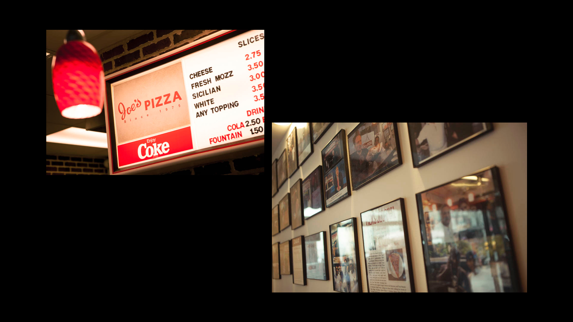
Photos of the menu and the photographs hung up at Joe’s.
A Timeless, Proud, and Inclusive Experience:Joe’s Pizza embodies three core values that define its essence: Classic, Proud, and Approachable. With decades of consistency, offering legendary four flavors of pizza, Joe’s creates a comforting ritual that brings joy and satisfaction. As a proud symbol of New York City, immortalized in pop culture and frequented by celebrities, Joe’s reflects the rich history and cultural significance of the city. Embracing inclusivity, Joe’s welcomes people from all walks of life, fostering a sense of community where everyone can gather, connect, and share the simple pleasure of a delicious slice of New York pizza. The rebranding successfully captures this timeless, proud, and inclusive experience.
-

Logo design to personify ‘Joe’.
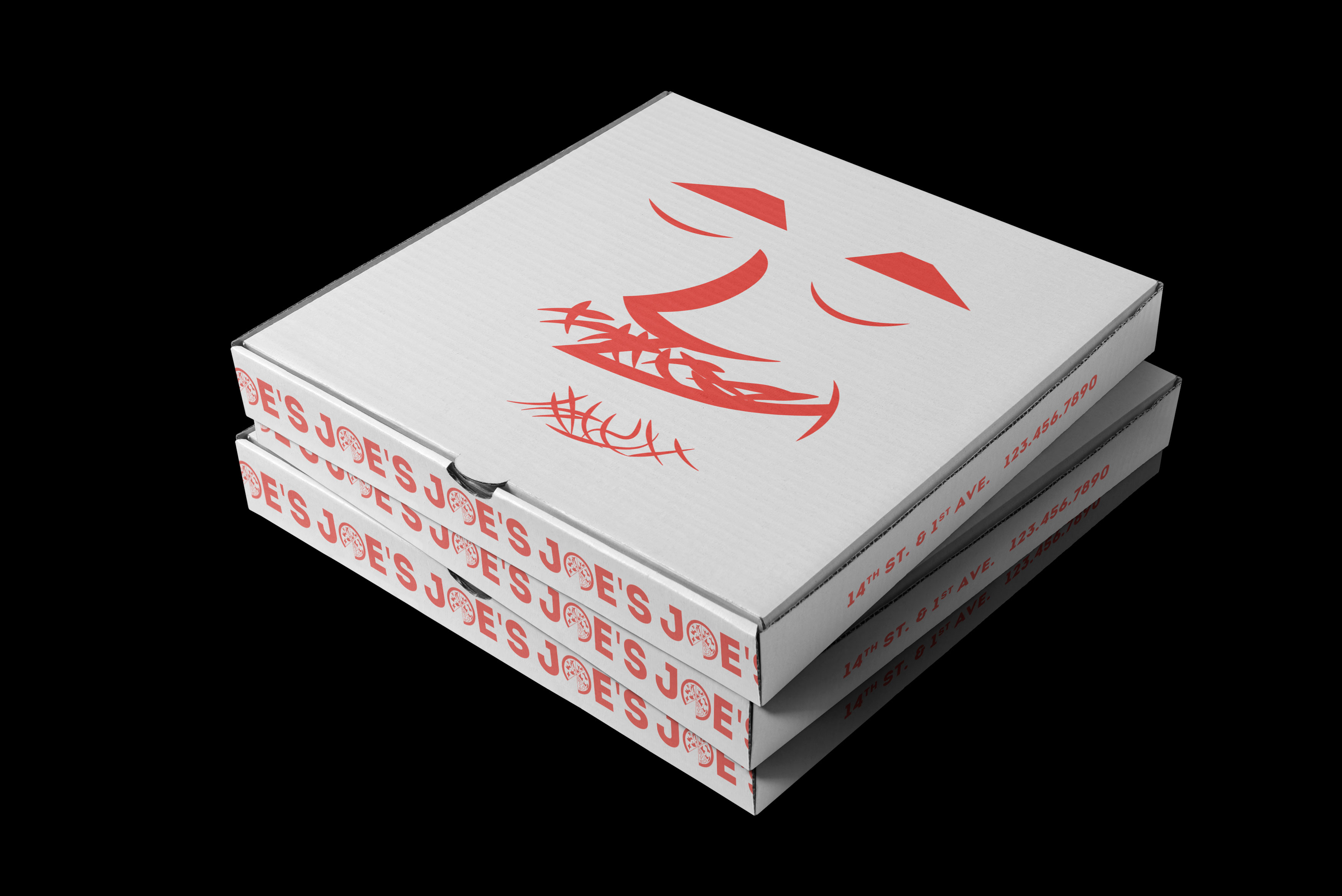
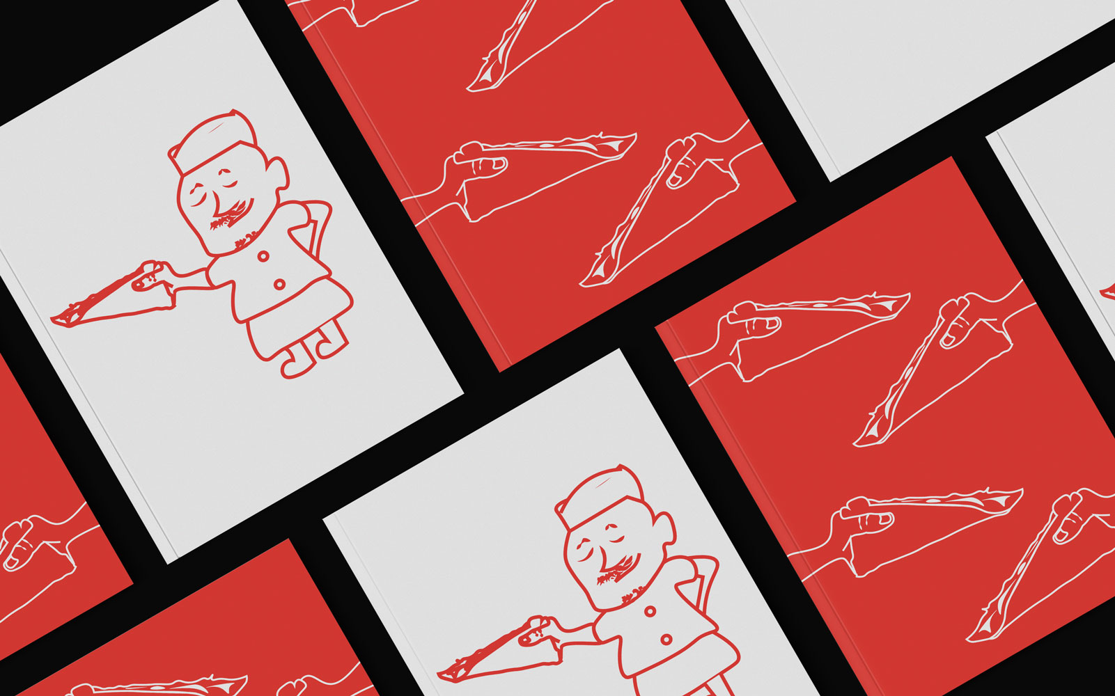
Adding a Distinctive Touch: Meet Joe, the Pizza Chef Behind Joe’s PizzaAs part of the rebranding journey for Joe’s Pizza, a delightful addition was made to the brand identity—an illustrated pizza chef named Joe. Joe’s friendly face now graces the pizza box art, embodying the heart and soul of this beloved pizzeria. The character of Joe adds a personal touch to the brand, creating a connection between customers and the culinary craftsmanship that goes into every slice. With his warm smile and chef’s hat, Joe represents the passion and dedication that have made Joe’s Pizza a staple in the hearts and taste buds of New Yorkers.
-
Design process for the ‘Holder’.
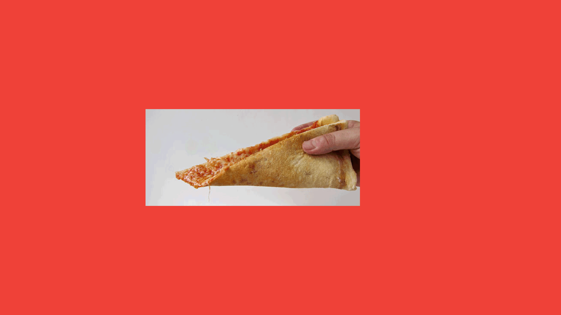
Art Imitates Life:To recreate that unique feeling associated with Joe’s Pizza, the brand identity honed in on a particular observation—everyone folds their slice of pizza when eating it. This simple act became a central inspiration for the logo and artwork. Elements like paper containers for single slices were also incorporated, emphasizing the folding tradition and becoming a recognizable symbol of the Joe’s Pizza experience.
-

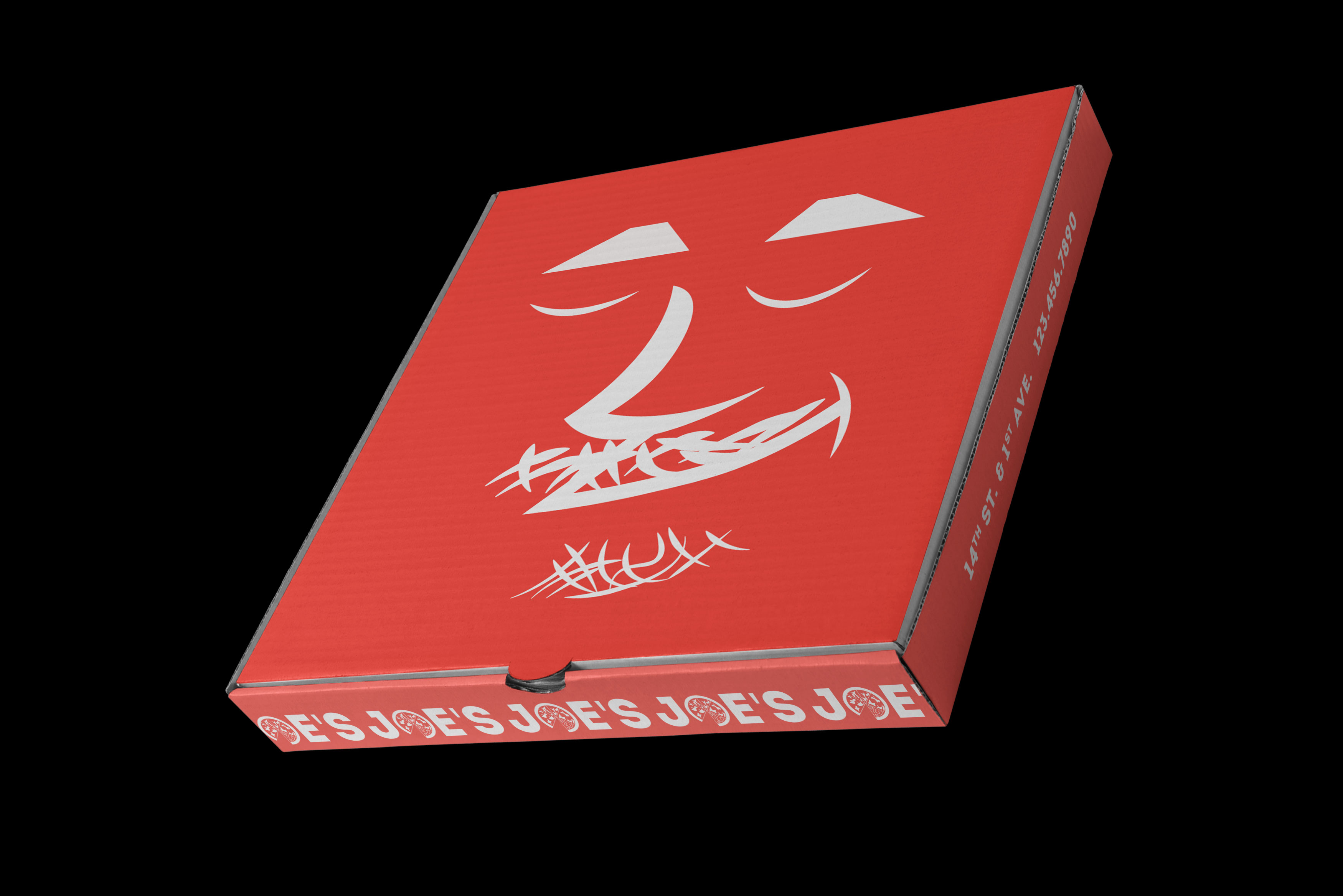
Pizza box mockups featuring the re-designed Joe’s logo.
By featuring Joe on the pizza box art, the rebranding emphasizes the human touch behind the delicious creations served at Joe’s Pizza. It reminds customers that each slice is carefully crafted by skilled hands, resulting in a mouthwatering experience that has delighted generations. The illustrated Joe not only enhances the brand identity visually but also evokes a sense of familiarity and authenticity. His presence on the pizza box art reinforces the unique feeling of stepping into Joe’s Pizza, where customers are greeted by a friendly face and treated to a memorable dining experience.
-
Alternative colour scheme for the pizza box.
Joe, the pizza chef, has become an integral part of Joe’s Pizza’s brand story. Through his charming presence, he invites customers to partake in the time-honored tradition of savoring a slice of New York’s finest pizza. It is a visual representation of the care, pride, and craftsmanship that go into every aspect of the Joe’s Pizza experience.
-
Menu designs featuring the signature Holder and the characterised Joe.
With Joe as the friendly face behind the brand, Joe’s Pizza continues to embody the values of tradition, quality, and approachability that have made it a beloved institution. Whether opening a pizza box or stepping through the doors, customers are welcomed by Joe’s infectious enthusiasm and passion for creating exceptional culinary delights.
-
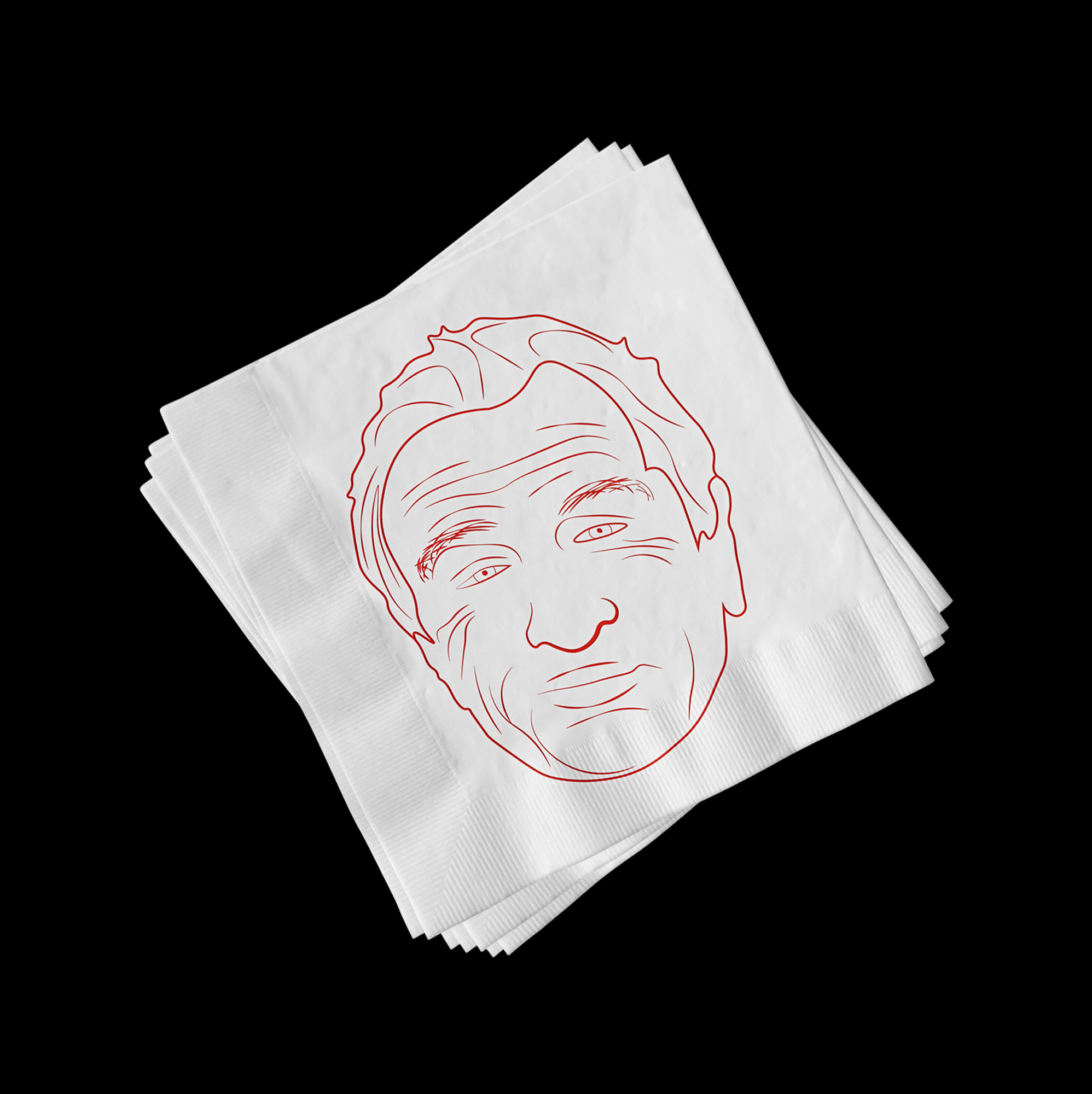
Napkin featuring an illustration of Robert de Niro.
To allude to its proud heritage, Joe’s Pizza pays homage to the famous celebrities who have frequented the pizzeria by featuring their illustrations on restaurant napkins. Just as their photographs grace the walls of Joe’s, the napkins become a canvas to honor these notable personalities. From Robert De Niro to other renowned figures, each illustration on the napkins serves as a visual reminder of the iconic status of Joe’s Pizza and its enduring appeal among celebrities and pizza aficionados alike. This artistic touch connects the patrons to the storied history of Joe’s, further enhancing the dining experience and creating a sense of pride in being part of the pizzeria’s legacy.
-

Table mat featuring the signature Holder.
The folded slice becomes more than just a culinary practice; it becomes a source of inspiration for the artwork throughout the brand. The logo design incorporates elements that mimic the fold, symbolizing the unique experience and authenticity of Joe’s Pizza. Additionally, illustrations and graphics featured in various brand applications, such as signage and promotional materials, playfully incorporate the folded pizza slice motif. This artistic approach not only captures the essence of enjoying a slice of New York’s finest pizza but also adds a distinctive and engaging visual element to the overall brand identity. It evokes a sense of familiarity, connecting customers to the cherished ritual of folding a slice and savoring the delectable flavors of Joe’s Pizza.
-
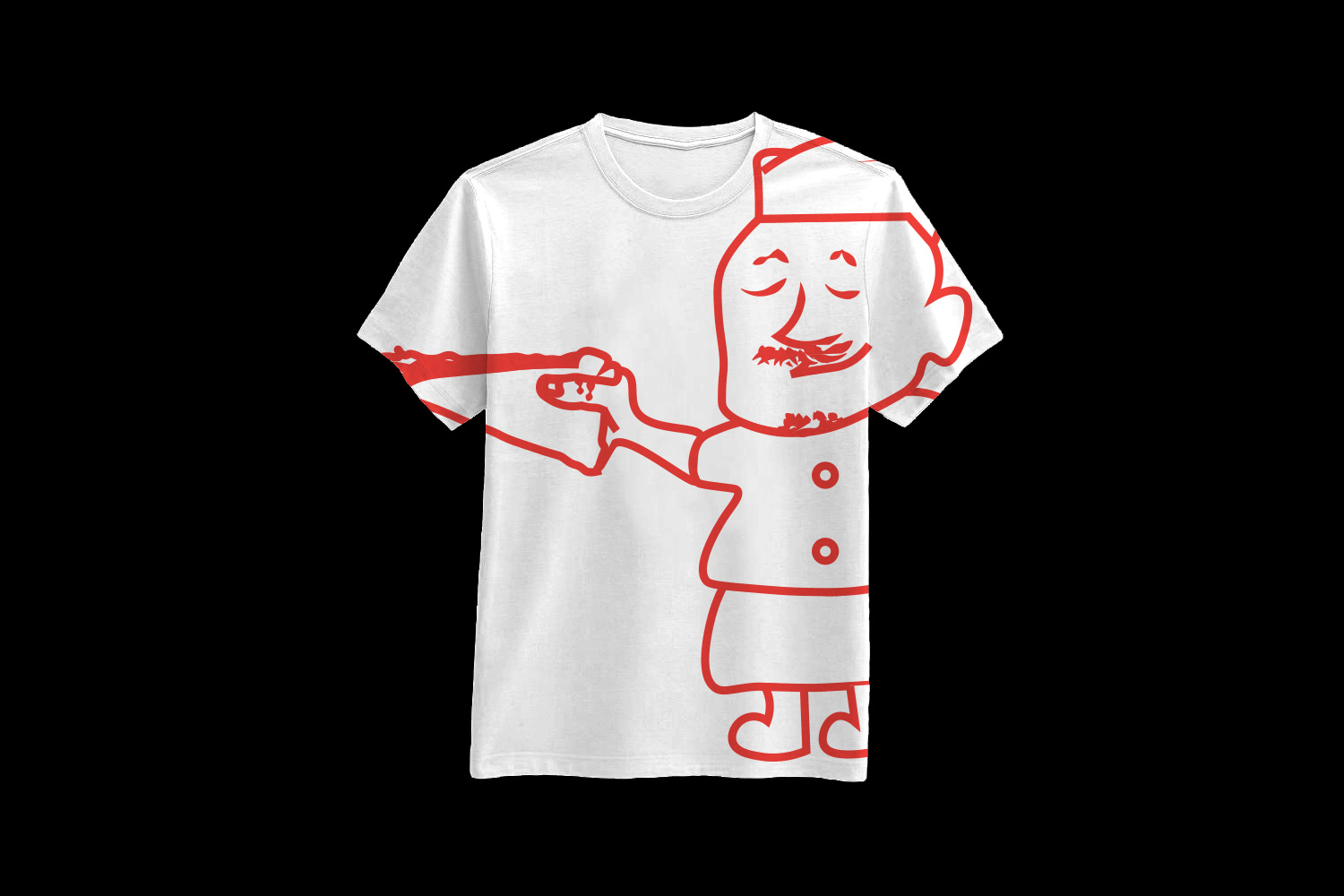
T-Shirt merchandise featuring Joe.
-
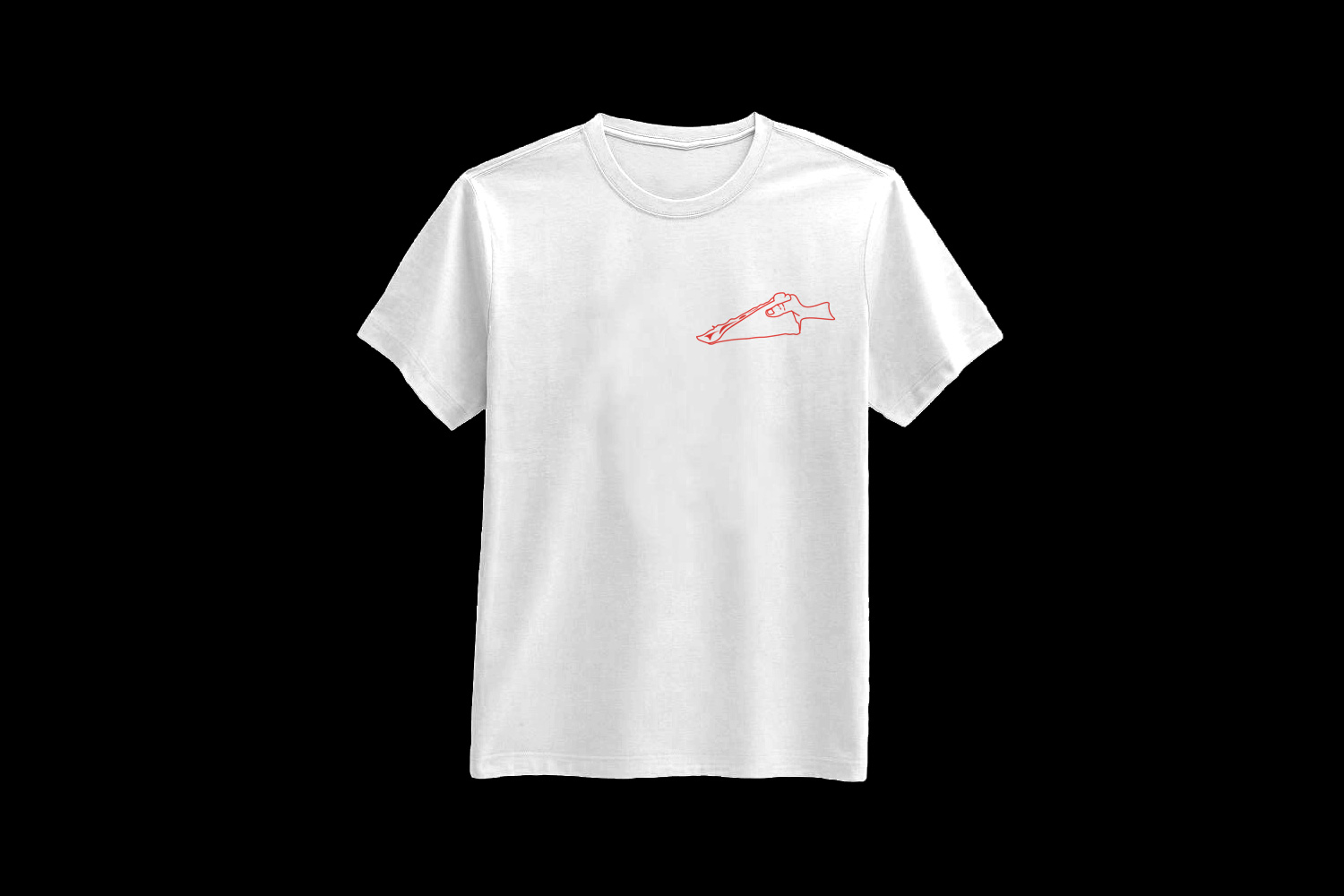
Minimal alternative to the t-shirt, with a small holder logo.