Bluebirds Kid’s Health
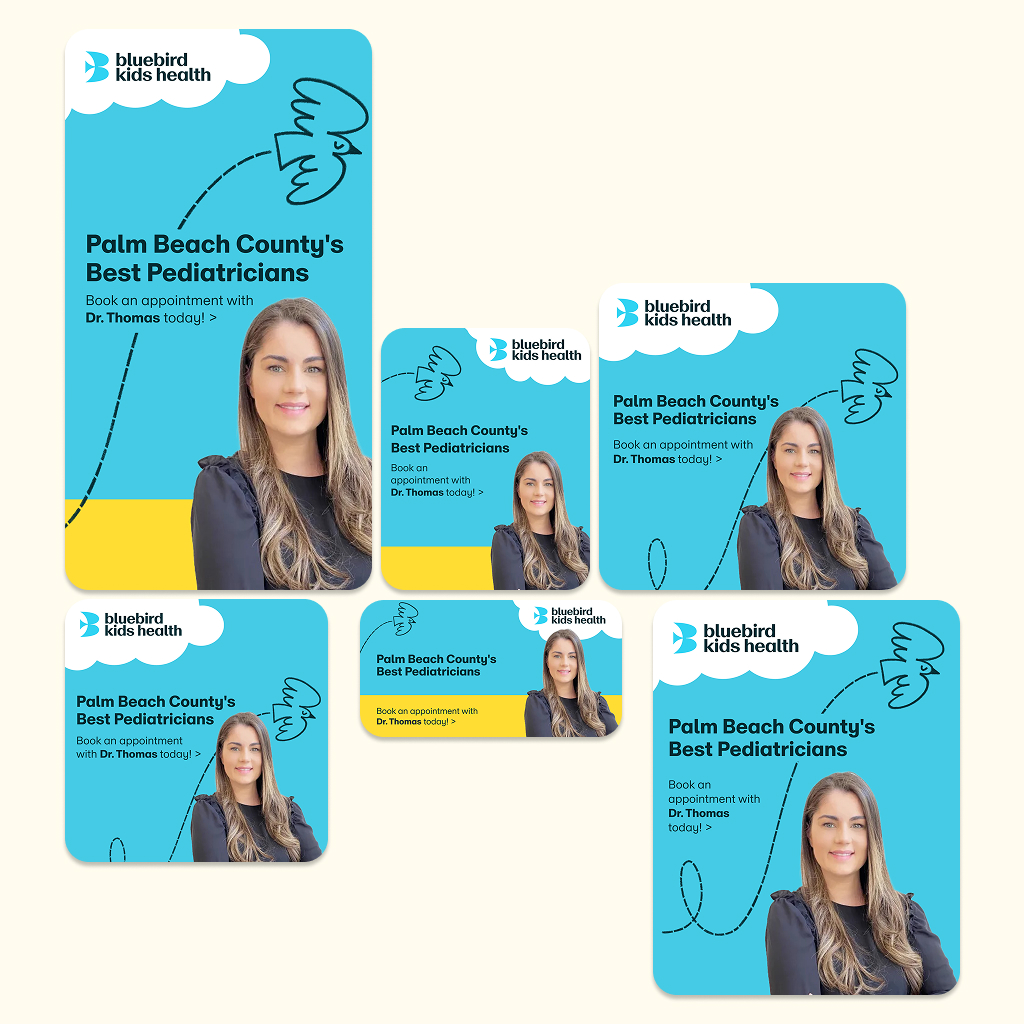
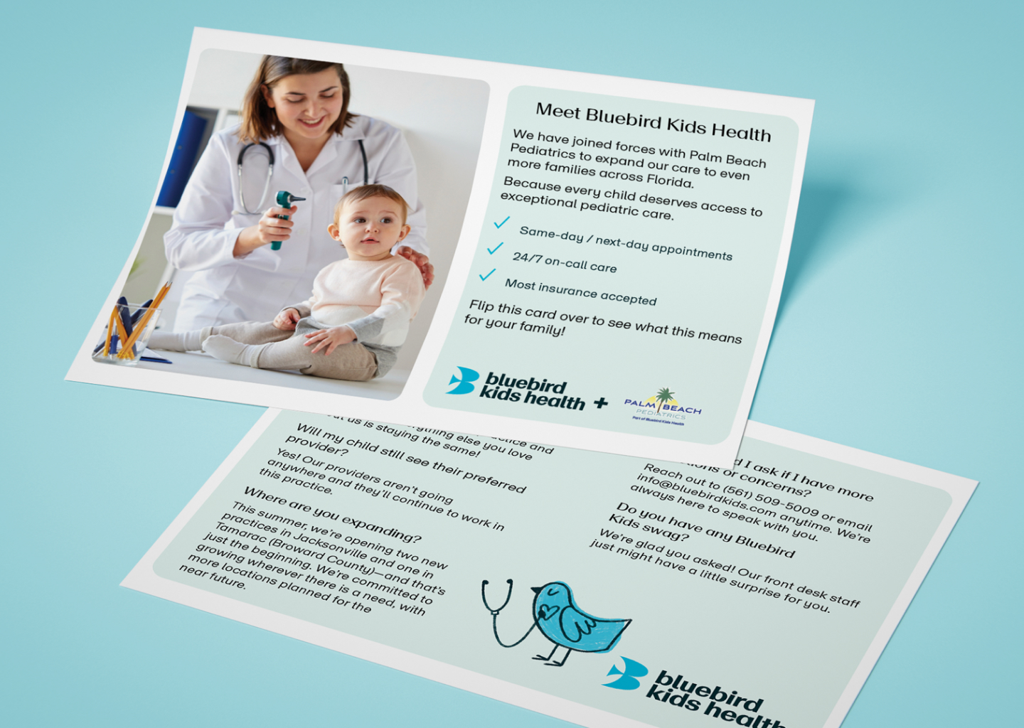
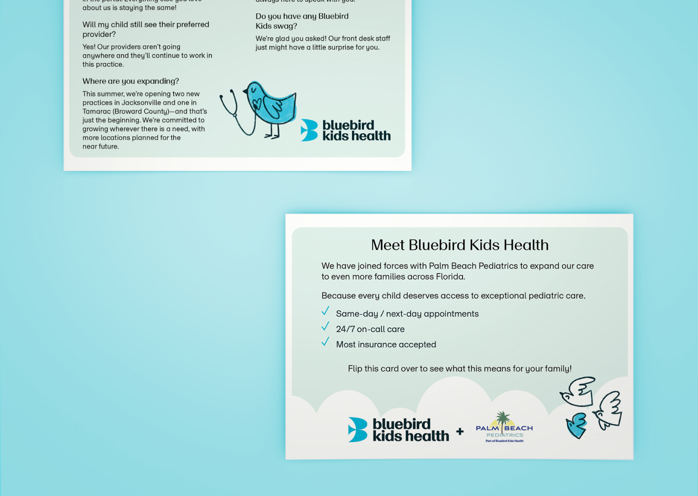
While working at Designity, I collaborated with Bluebirds Kid’s Health on their rebranding initiative. My role involved applying their refreshed identity across a wide range of print and digital touchpoints, including multilingual posters, brochures, pamphlets, flyers, and HTML ads. The goal was to create cohesive, accessible, and family-friendly communications that reflected the organization’s mission of supporting children’s health and well-being.
-
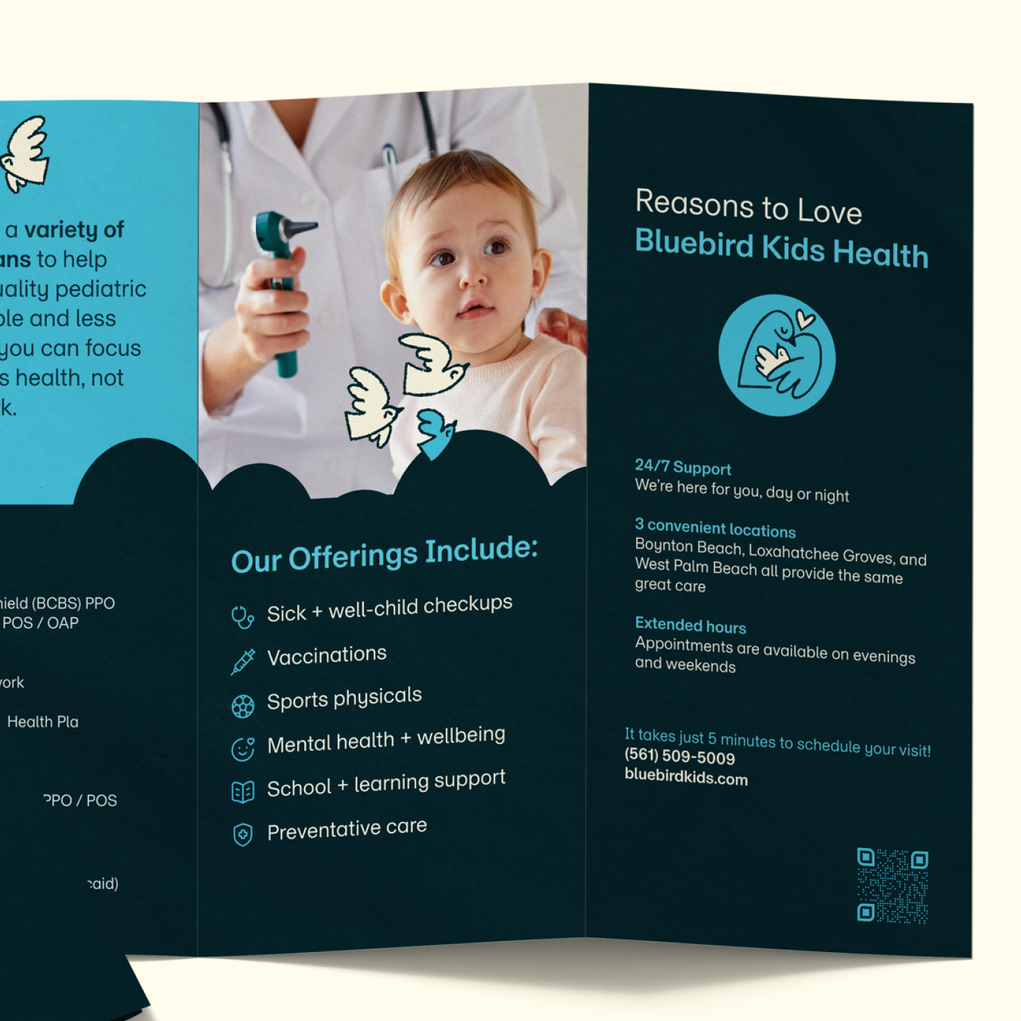
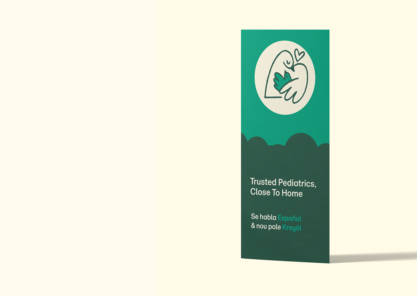
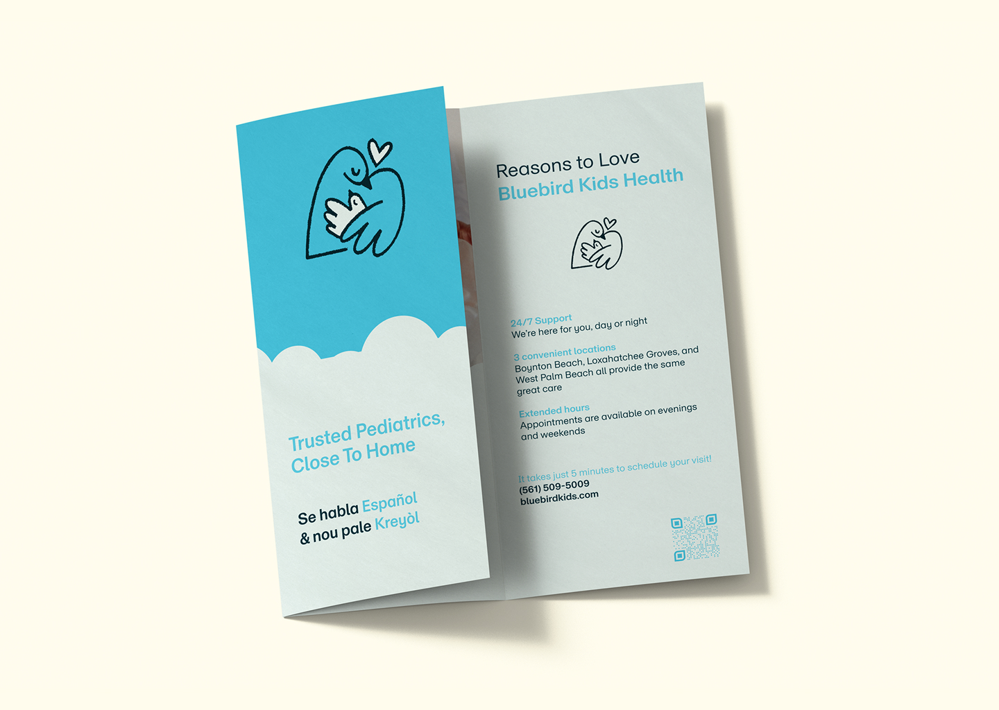
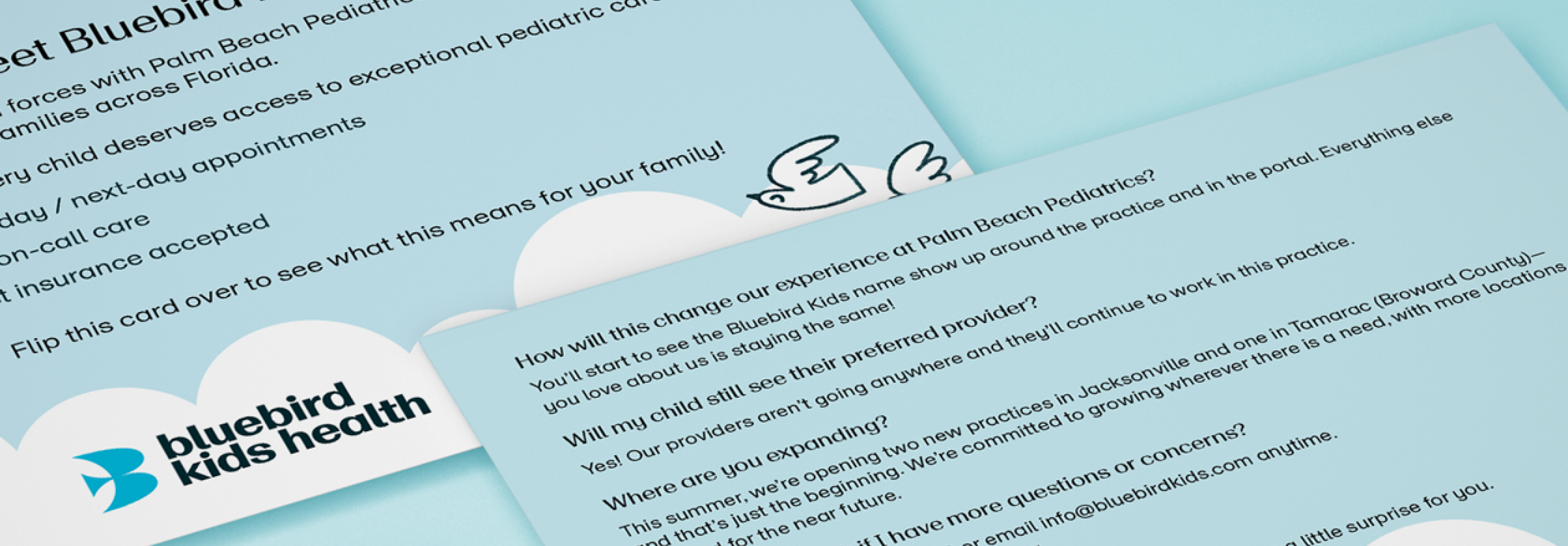
Brochure for BBK.
I helped extend their new branding across a variety of formats, from multilingual posters and brochures to pamphlets, flyers, and HTML ads. Each piece was designed to be both engaging and accessible, reinforcing Bluebirds Kid’s Health’s mission to promote children’s health and well-being through clear and inclusive communication.
-
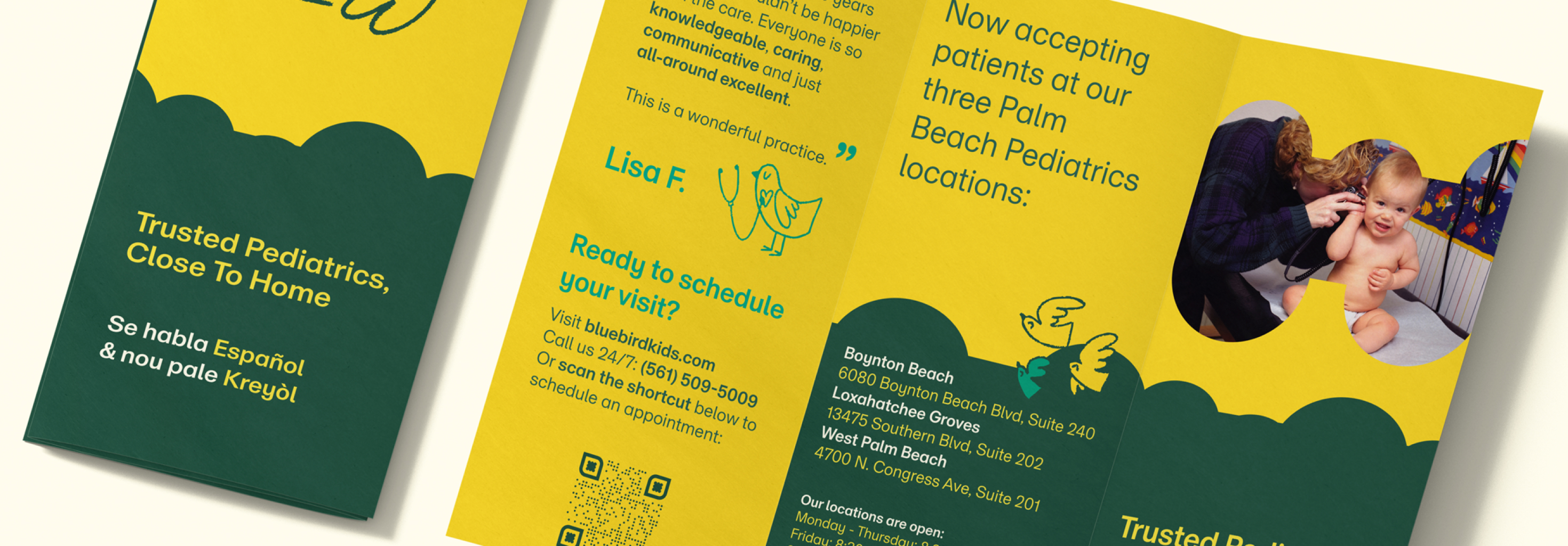
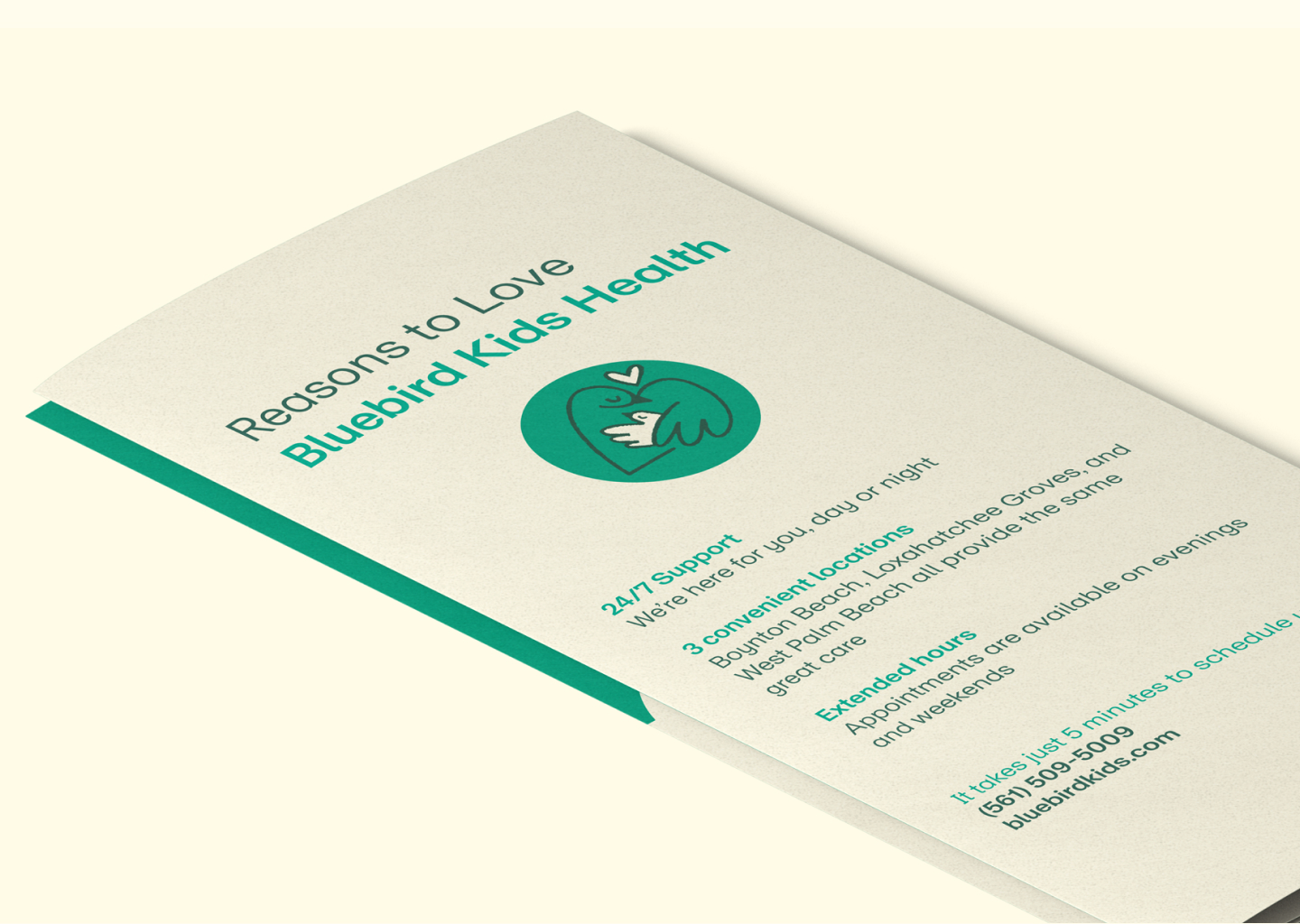
As part of the collateral, I developed a series of pamphlets that drew on the full breadth of Bluebirds Kid’s Health’s brand palette. By thoughtfully exploring different combinations of their identity colors, I was able to highlight the flexibility of the system while keeping the materials cohesive and recognizable. This experimentation not only brought variety and visual interest to the pamphlets but also demonstrated how the refreshed identity could adapt across different formats and audiences without losing its sense of unity.
-
-
-
-
-
-
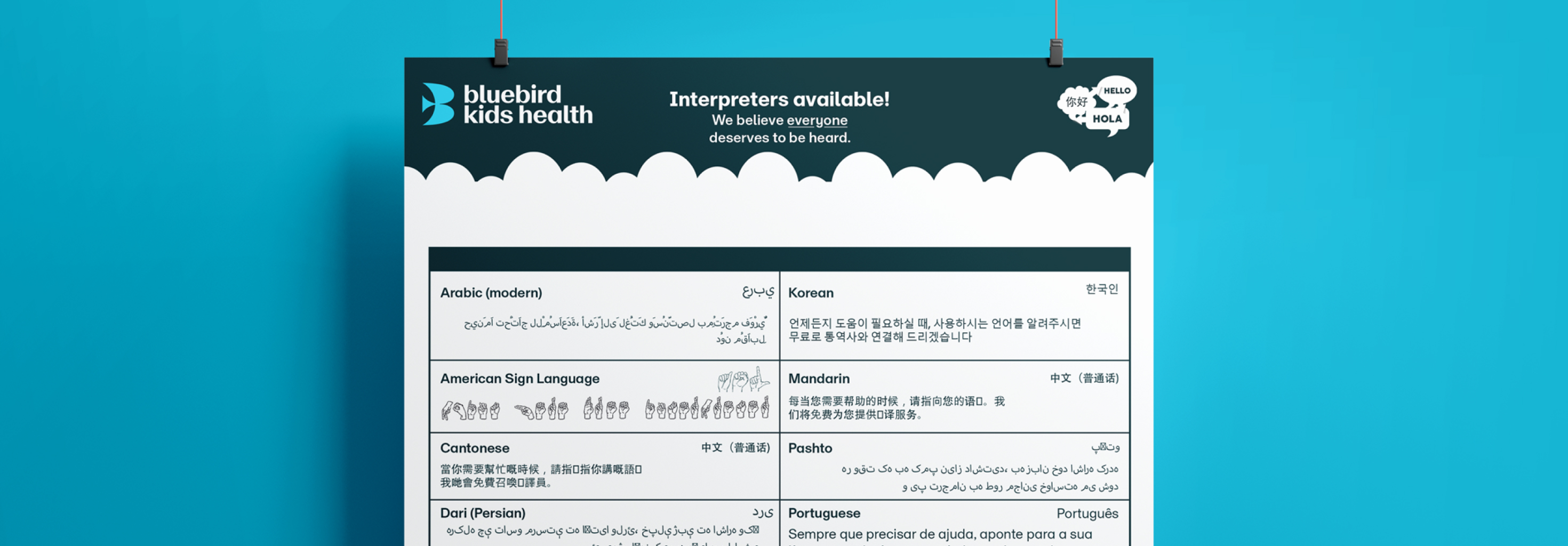
As part of the rebrand, I also worked on a set of posters that extended the organization’s message across multiple languages, ranging from American Sign Language to African and South Asian languages such as Hindi. The goal was to make the identity not only visually consistent but also culturally and linguistically accessible to the diverse families that Bluebirds Kid’s Health serves. By adapting the brand voice across these different contexts, the materials reflected the organization’s commitment to inclusivity while maintaining a unified look and feel.
-
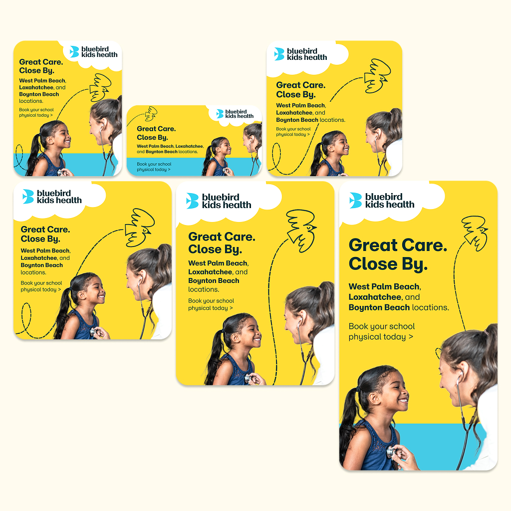
In addition to print collateral such as brochures, flyers, and pamphlets, I explored a variety of identity color combinations to bring vibrancy and flexibility to the brand while maintaining cohesion. I also supported the organization’s digital presence by contributing to the development of SEM and Performance Max ad campaigns, which helped launch the brand across multiple locations, including Palm Beach, Loxahatchee, and Boynton Beach. Together, these efforts built a consistent yet versatile brand system that worked across both traditional and digital channels.
-