Murphy Bed Depot
While working on the Murphy Bed Depot website redesign at Designity, I contributed to both the research and development phases of the project. I began by creating two user journey maps to understand the motivations and decision-making process of potential buyers, which informed the overall site structure and content flow. Under the direction of a senior designer, I helped bring the new design to life by developing sub-pages, filling in wireframes, and exploring different visual permutations to refine the brand’s digital identity. The result was a more cohesive and user-friendly website experience that aligned with Murphy Bed Depot’s modern, space-saving ethos.
-
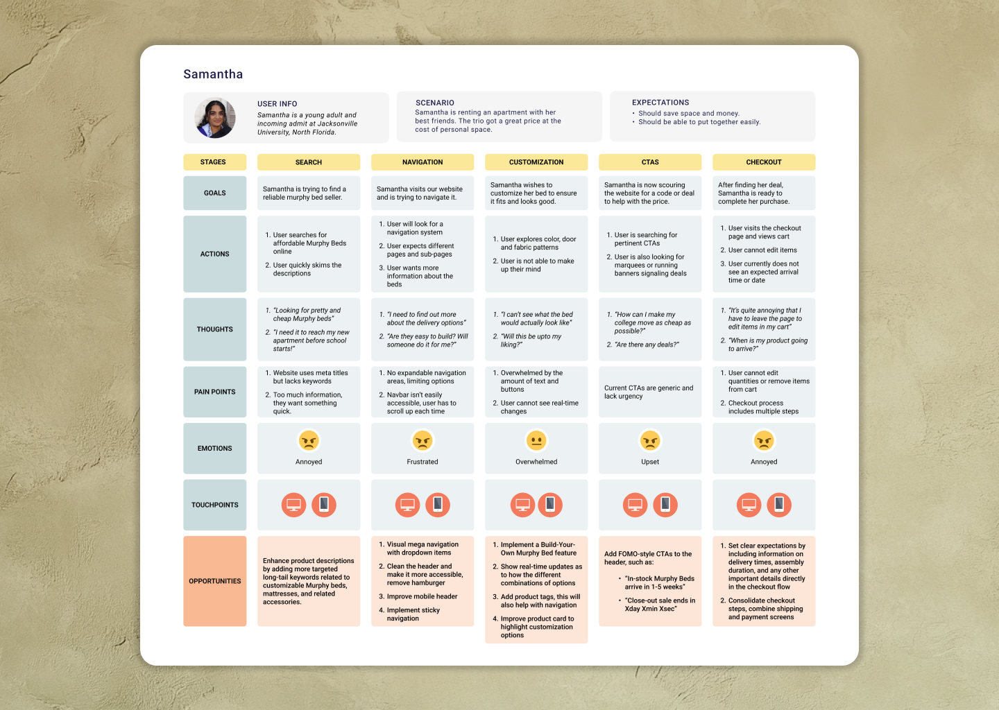
User journey map for Samantha.
This user journey map documents research findings for Samantha, a young adult persona preparing for college who needs space-saving furniture on a budget. Through user research, I mapped her experience across five stages—Search, Navigation, Customization, CTAs, and Checkout—tracking her emotional journey from annoyance to frustration as she encounters unclear product descriptions, inaccessible navigation, overwhelming customization options, and a multi-step checkout process. The map revealed critical opportunities including implementing visual mega navigation, adding real-time customization previews, creating FOMO-style CTAs with urgency messaging, and consolidating the checkout flow. This research helped prioritize design improvements to reduce friction and better serve budget-conscious, space-limited customers.
-
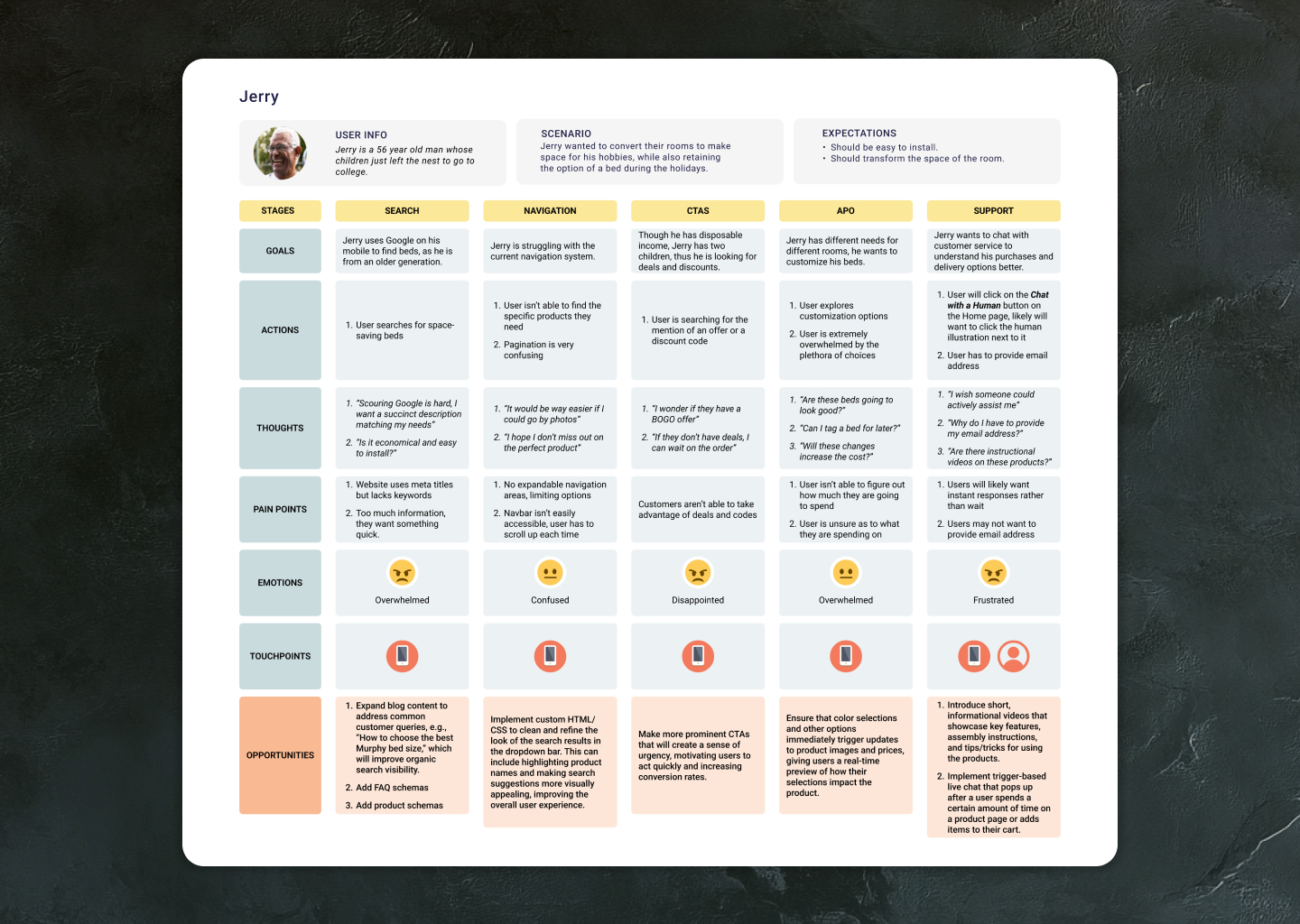
User journey map for Jerry.
This user journey map represents research conducted to identify pain points in the Murphy Bed Depot customer experience. Through user research, I developed Jerry, a 56-year-old persona seeking to convert his children’s rooms for hobbies. The map tracks his emotional journey across five key stages—Search, Navigation, CTAs, APO, and Support—documenting goals, actions, thoughts, pain points, and emotions at each touchpoint. This visualization helped identify critical friction points in the customer experience and provided actionable opportunities for UX improvements, including enhanced search functionality, clearer navigation, more prominent calls-to-action, real-time customization previews, and improved customer support options.
-

Moodboard for the project.
-

Identity graphics.
-

Identity graphics.
-
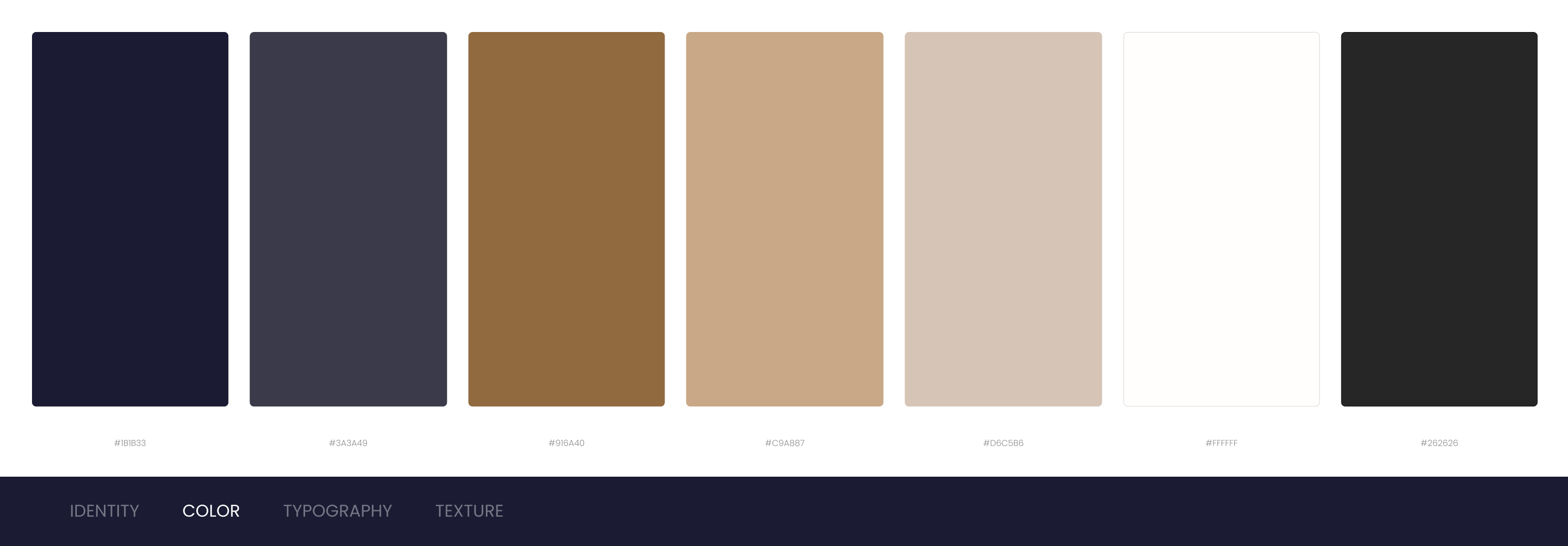
Brand colors.
-
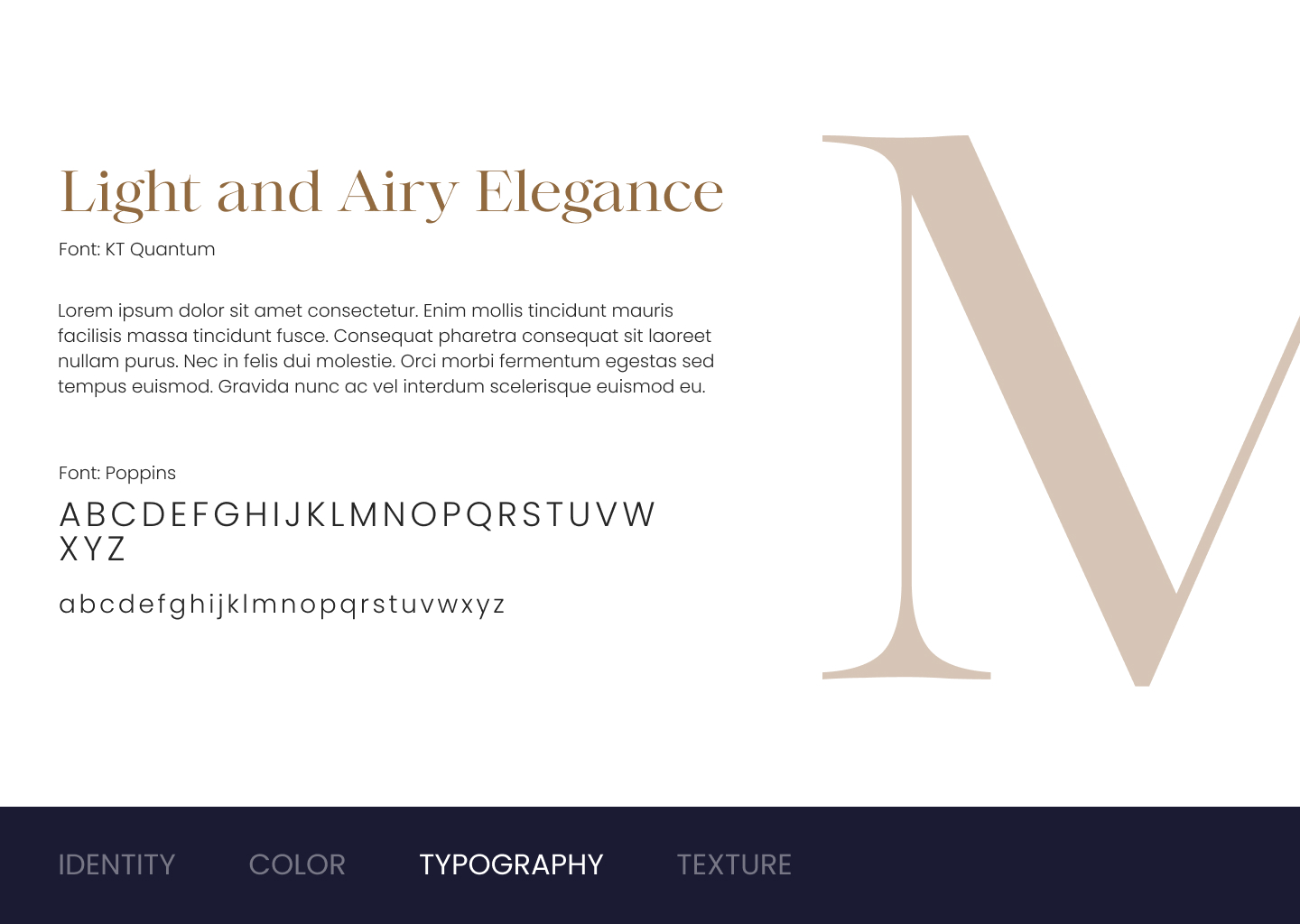
Brand typography.
-
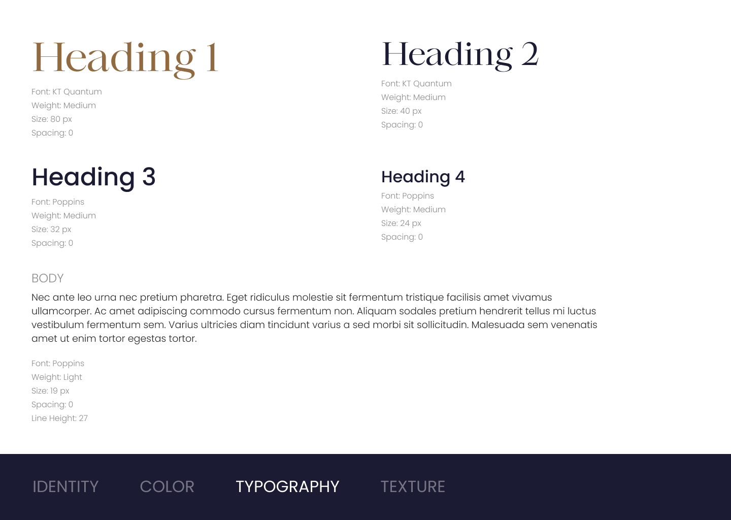
Brand typography.
-

Brand imagery.
-
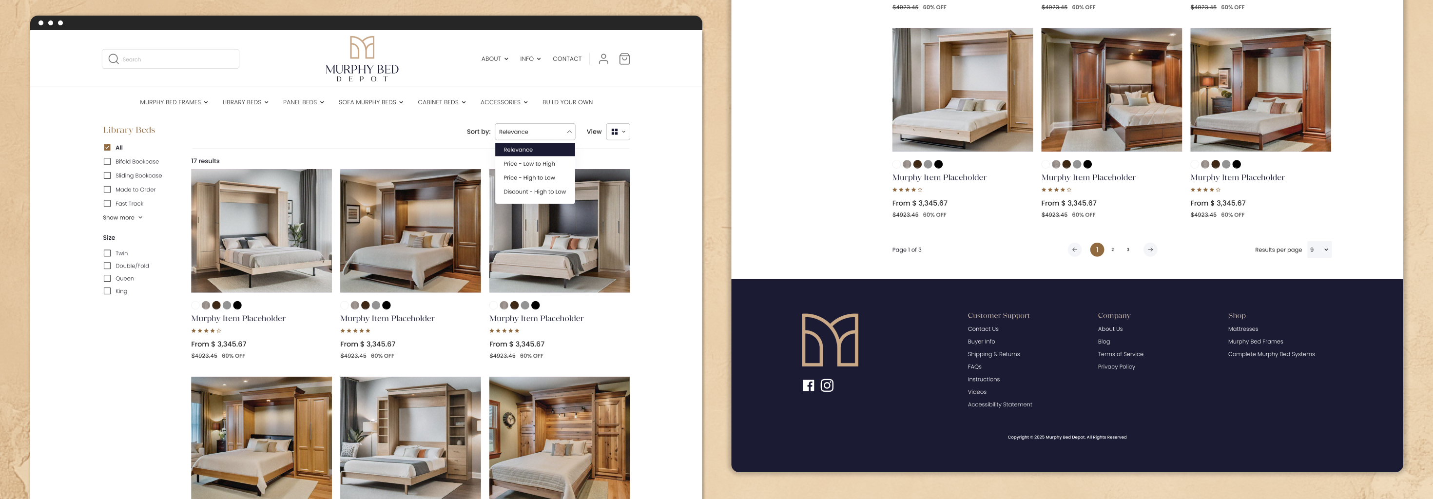
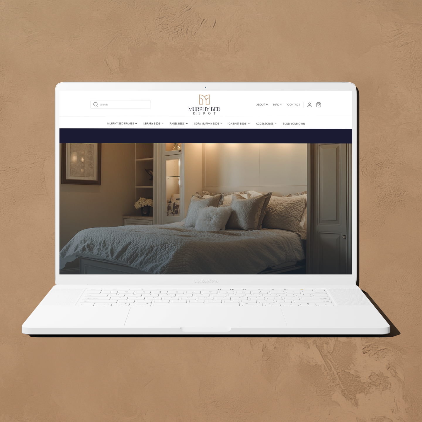
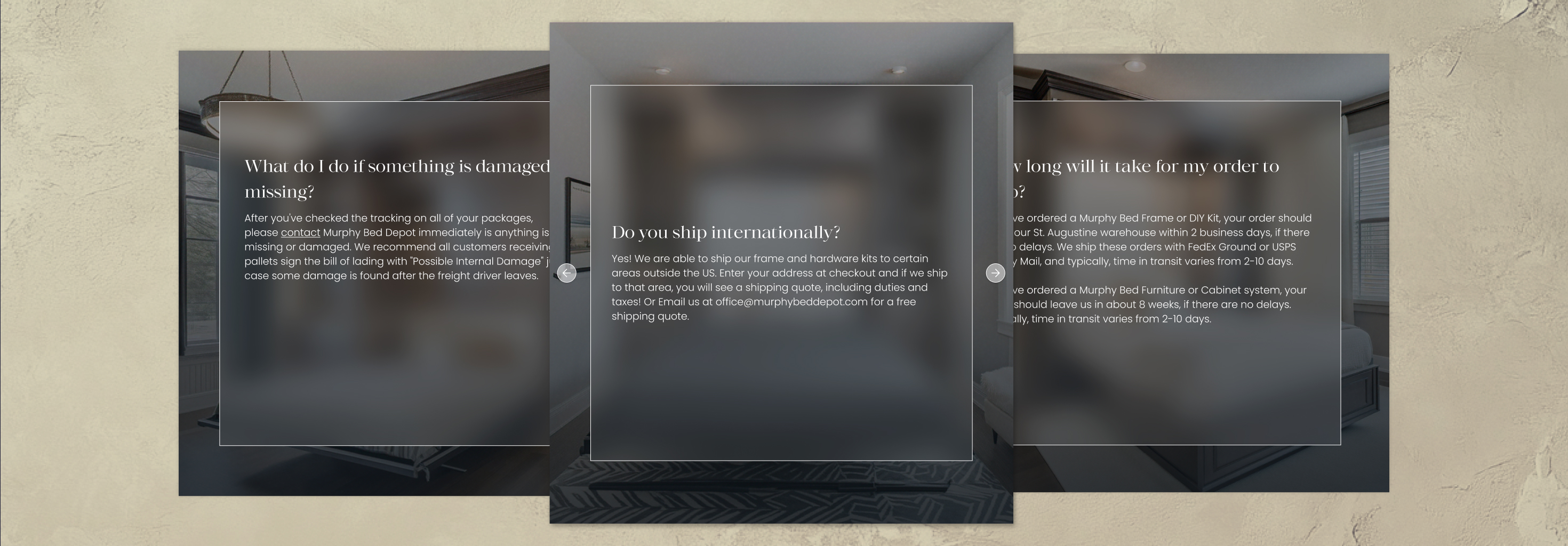
Desktop screens.
Building on the homepage design established by the senior designer, I helped develop the rest of the website’s visual system and structure. My role involved creating high-fidelity wireframes and exploring sub-page layouts that maintained consistency with the homepage while adapting to different content needs. All desktop wireframes were designed in Figma using a 12-column grid to ensure alignment, balance, and scalability across the site. I also designed the mobile version to provide a seamless experience across devices, and developed key pages such as the Welcome and Orders pages. Throughout the process, I focused on extending the design language thoughtfully, balancing clarity, hierarchy, and usability to create a cohesive, scalable system for Murphy Bed Depot’s digital presence.
-
Pull quote graphics.
-
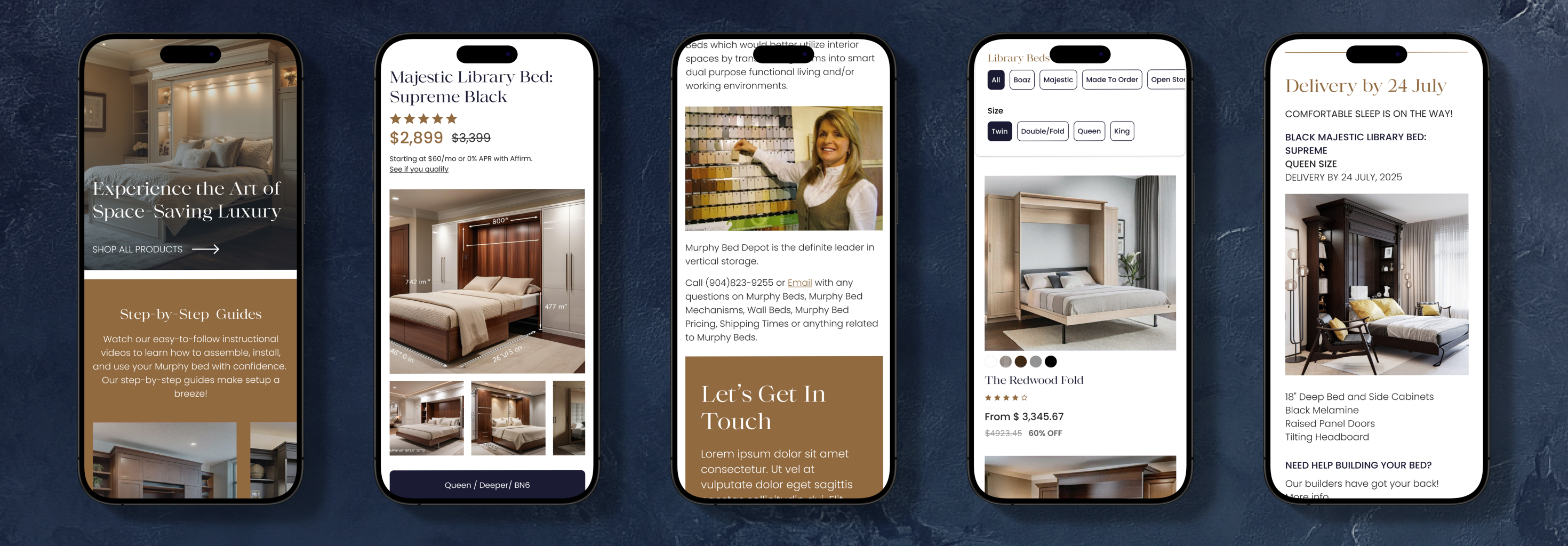
Mobile screens.
In addition to the desktop layouts, I created both low- and high-fidelity mobile versions for each wireframe to ensure a seamless responsive experience. Designed in Figma using a 4-column grid, these mobile layouts preserved the same visual hierarchy and structure established in the desktop designs while optimizing usability for smaller screens. The process involved thoughtful adjustments to spacing, typography, and navigation patterns, ensuring that the Murphy Bed Depot website remained intuitive and visually consistent across all devices.
-
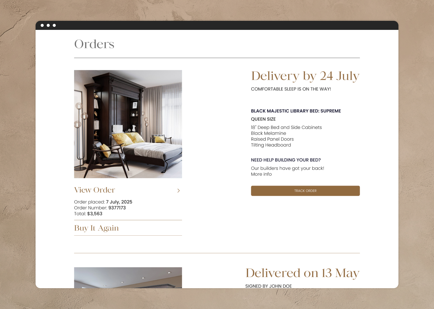
Orders page.
-
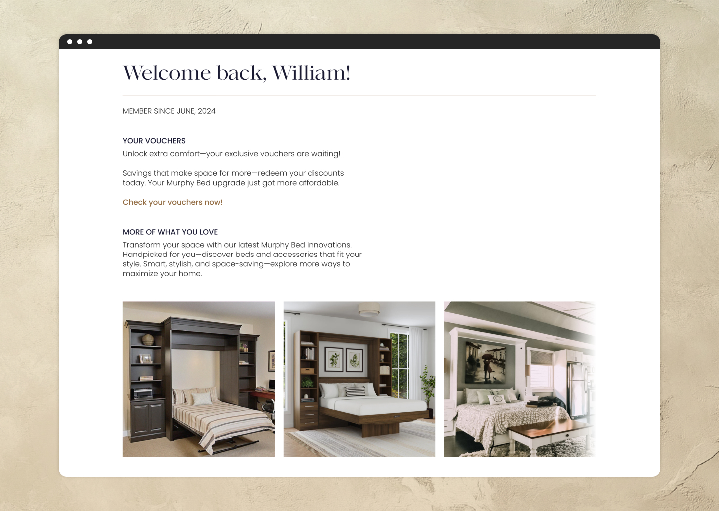
Welcome page.