East River Raiders: Culture and Passion
Embarking on my creative journey in design college, the East River Raiders project emerged as my inaugural foray into the world of branding. This endeavor, which marked the genesis of my graphic design portfolio, offered an exhilarating challenge that allowed me to meld the realms of cultural heritage and artistic ingenuity. Tasked with crafting an emblematic brand rooted in cultural artistic patterns, I embarked on the odyssey of conceptualizing a soccer club that would encapsulate the spirit of both New York’s rich diversity and the fervor of sportsmanship.
-
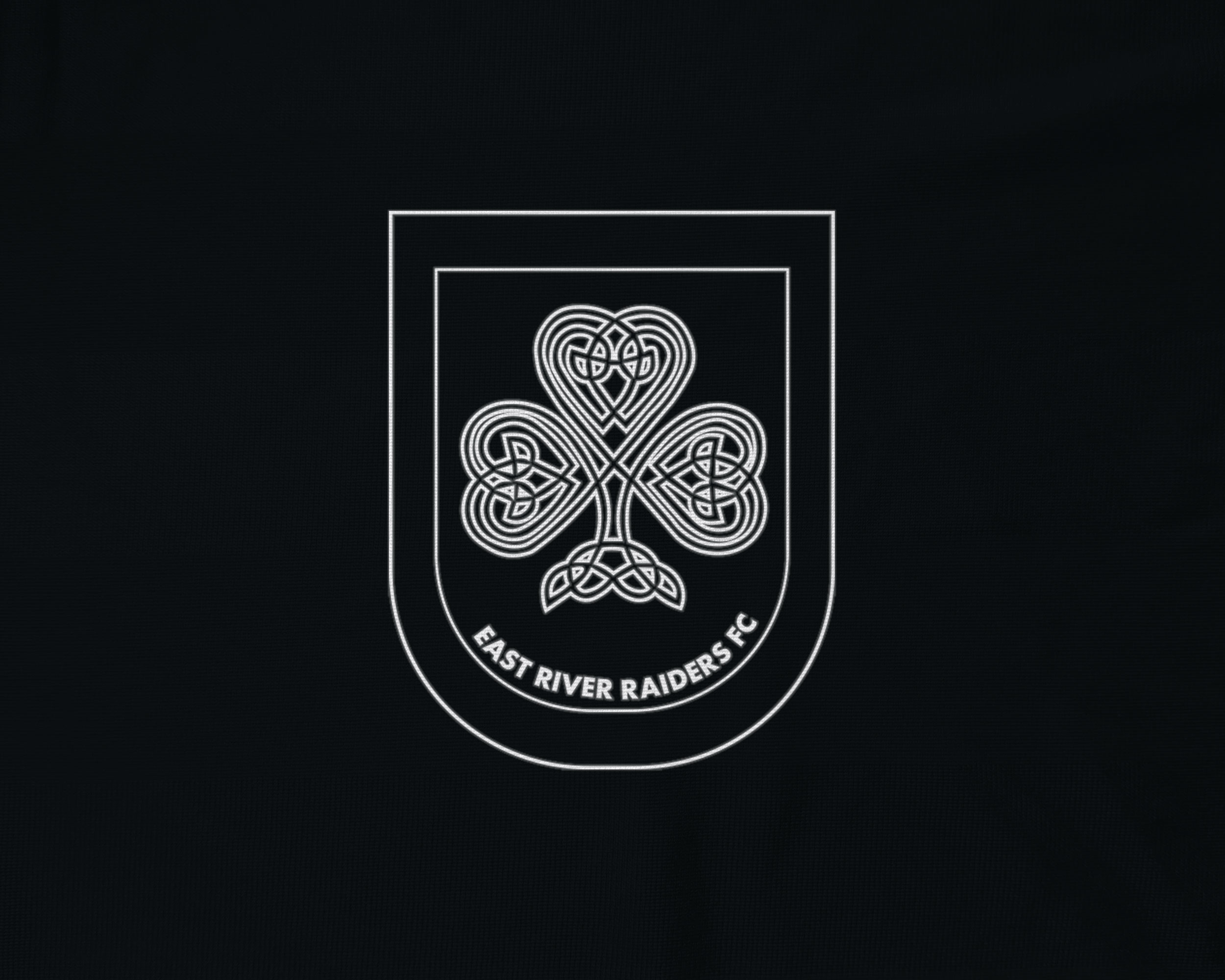
White outline of the East River Raiders crest.
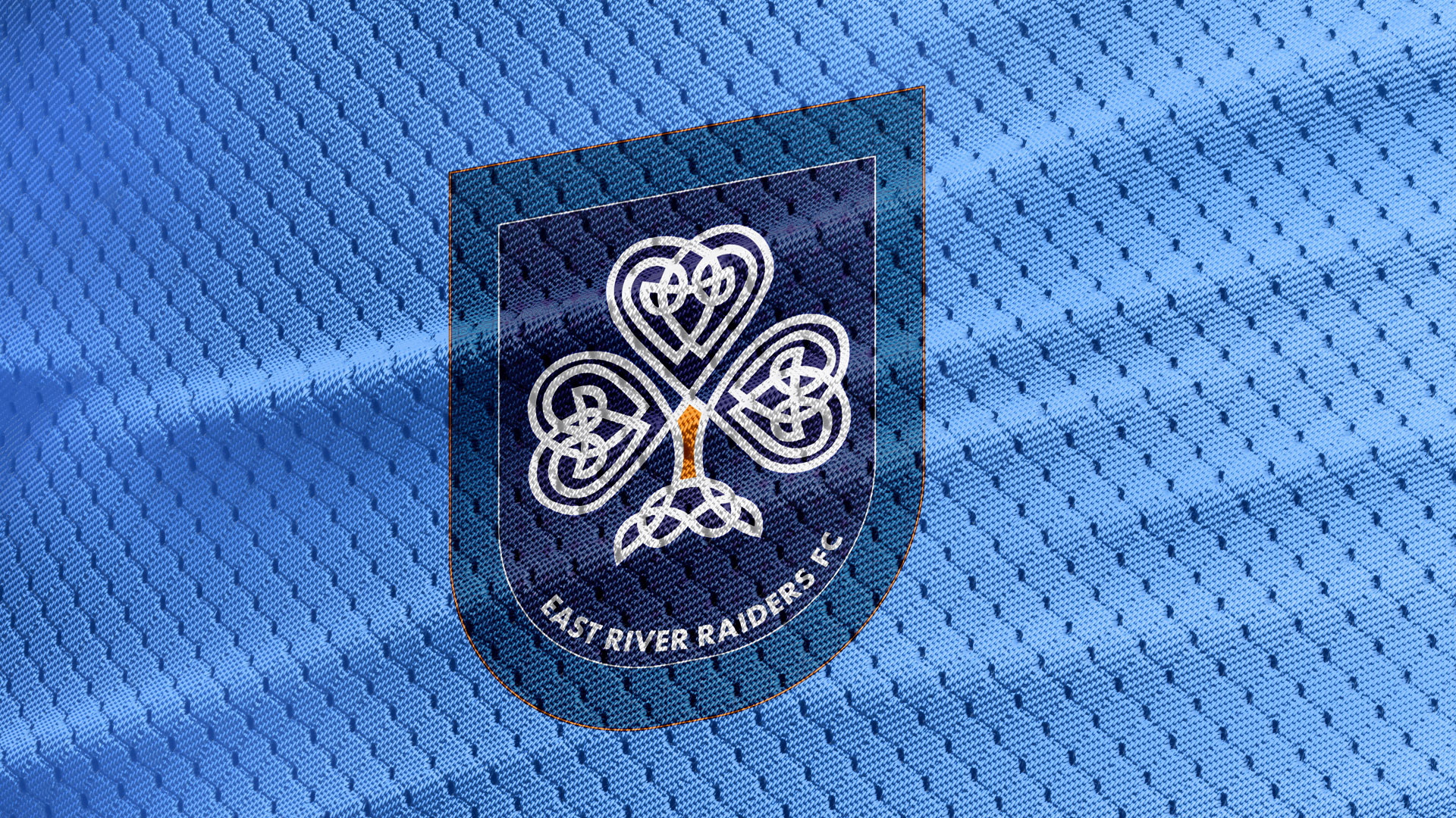
The crest of the East River Raiders serves as the keystone, capturing the essence of the brand. Adorned with the timeless Clover, it pays homage to the storied Irish legacy while acting as a heraldic beacon of unity and fortune. Further embellished with intricate Celtic knots and Gaelic crosses, the crest echoes the aesthetic legacy of a bygone era, intertwining tradition with modern design sensibilities.
-
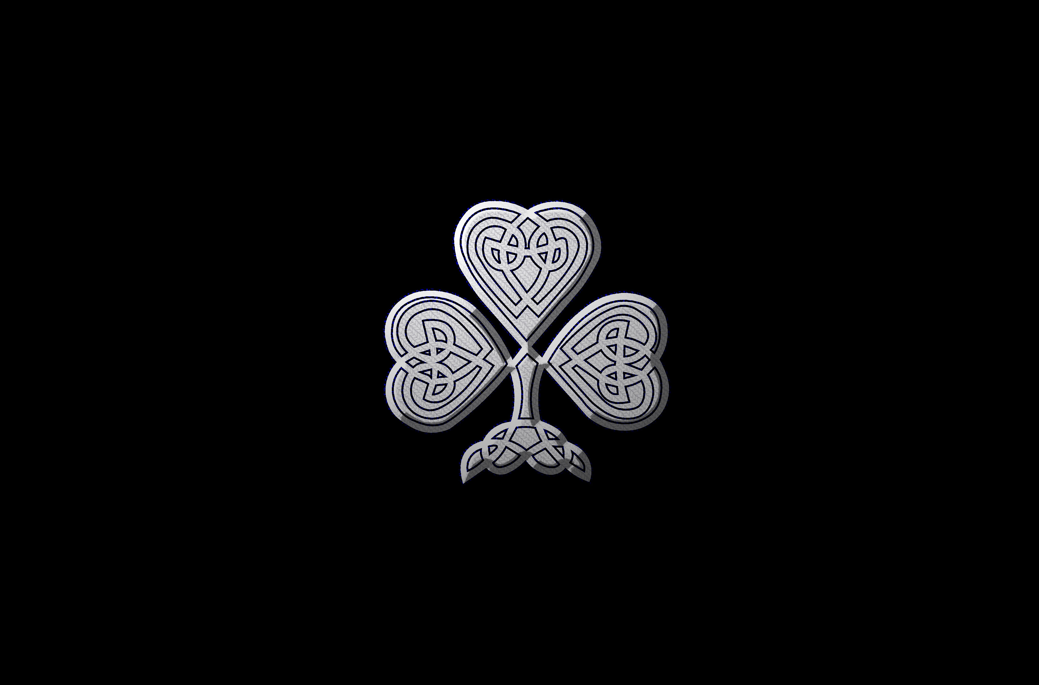
Stitched clover pattern.
The heart of the project revolved around the creation of the East River Raiders, a captivating soccer club nestled in the vibrant locale of Bowery. Channeling the energy and history of this melting pot of a neighborhood, I delved into the intricate tapestry of its Irish heritage. This cultural thread, woven into the very fabric of the city, offered a fount of inspiration for the brand’s visual identity.
-
Gaelic crosses pattern.
The Gaelic crosses, both elegant and steadfast, evoke the spirit of those who, generations ago, carried their faith and traditions across oceans to find a new home. By incorporating these symbols, the brand encapsulates not only the aesthetics but also the resilience and determination of the Irish community that helped shape Bowery’s vibrant identity. The choice to integrate these patterns is a conscious tribute to the legacy of those who paved the way, forging connections and enriching the cultural fabric of the city.
-

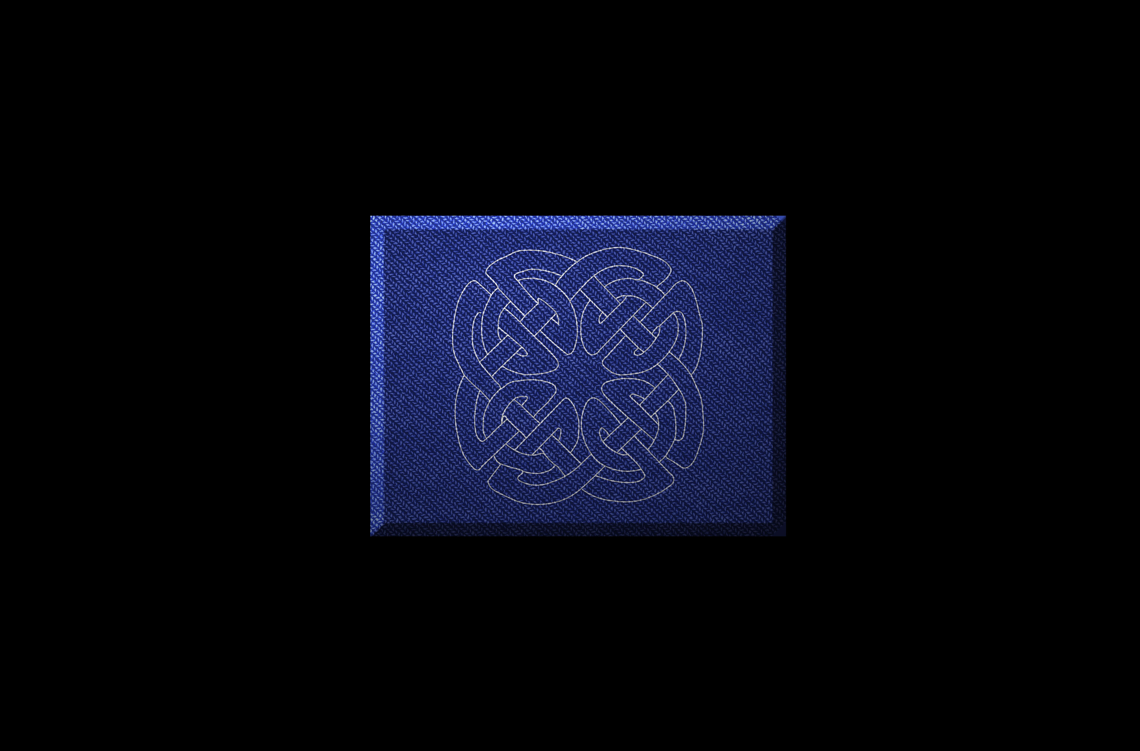
Stitched knot pattern.
The infusion of Irish and Gaelic patterns within the East River Raiders’ brand identity is a deliberate homage to the historical tapestry of Bowery’s Irish heritage. In the very weave of the patterns, one can trace the footsteps of countless immigrants who embarked on their journey to the United States, seeking new opportunities and a better life. The Celtic knots, with their intricate interlacing, mirror the interconnectedness of diverse cultures converging in the heart of New York. Each loop and twist serves as a reminder that, much like the patterns themselves, the story of Bowery is one of interwoven lives and shared aspirations.
-
Angled shot of the away jersey.
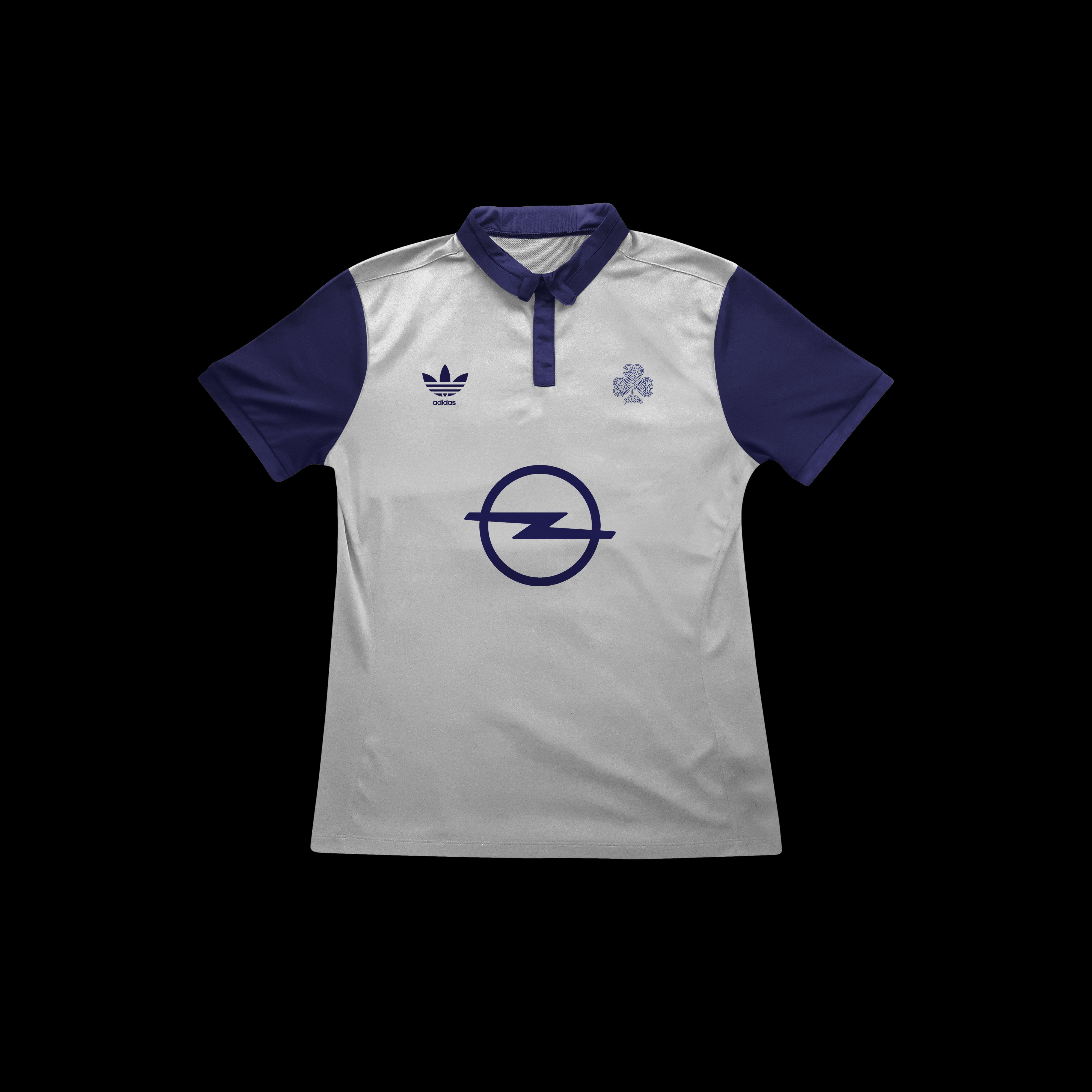
Distinguished by its minimalistic elegance, the special edition jerseys of the East River Raiders are a testament to the brand’s versatility and ability to adapt while maintaining its essence. These jerseys, bedecked in a refined white and deep blue color scheme, stand as a striking departure from the standard attire, embodying a sense of prestige and uniqueness.
-
Frontal shot of home jersey.
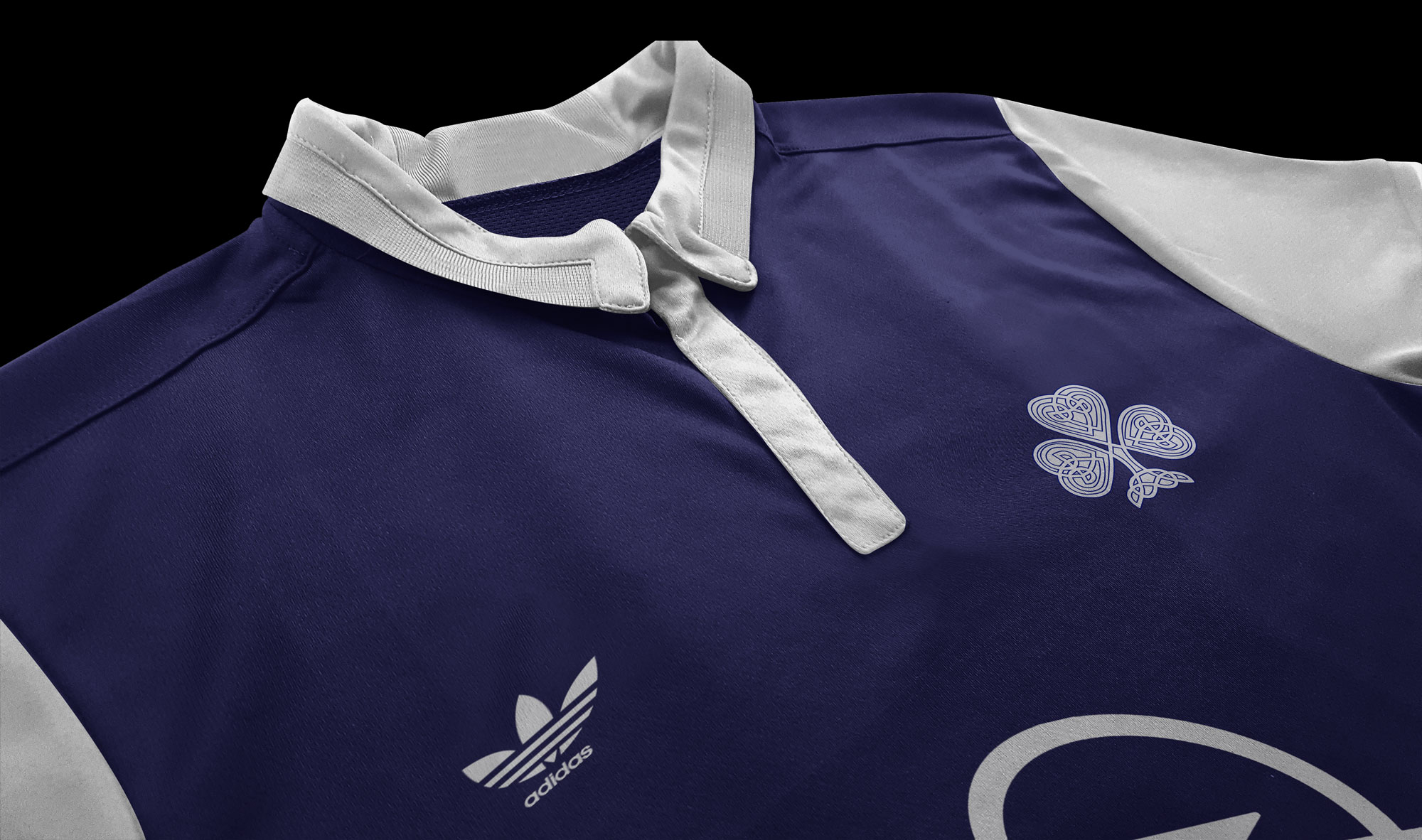
Intricately designed, the white canvas of the jersey becomes a canvas for storytelling, inviting the observer to embark on a visual journey that pays homage to both the Irish heritage and the spirit of the team. The vibrant green Clover, a symbol deeply rooted in Irish culture, takes center stage, replacing the customary club badge. This substitution is more than mere aesthetics—it represents a deliberate choice to embrace the spirit of heritage, to infuse it with contemporary minimalism, and to create a visual icon that resonates with fans and onlookers alike.
-
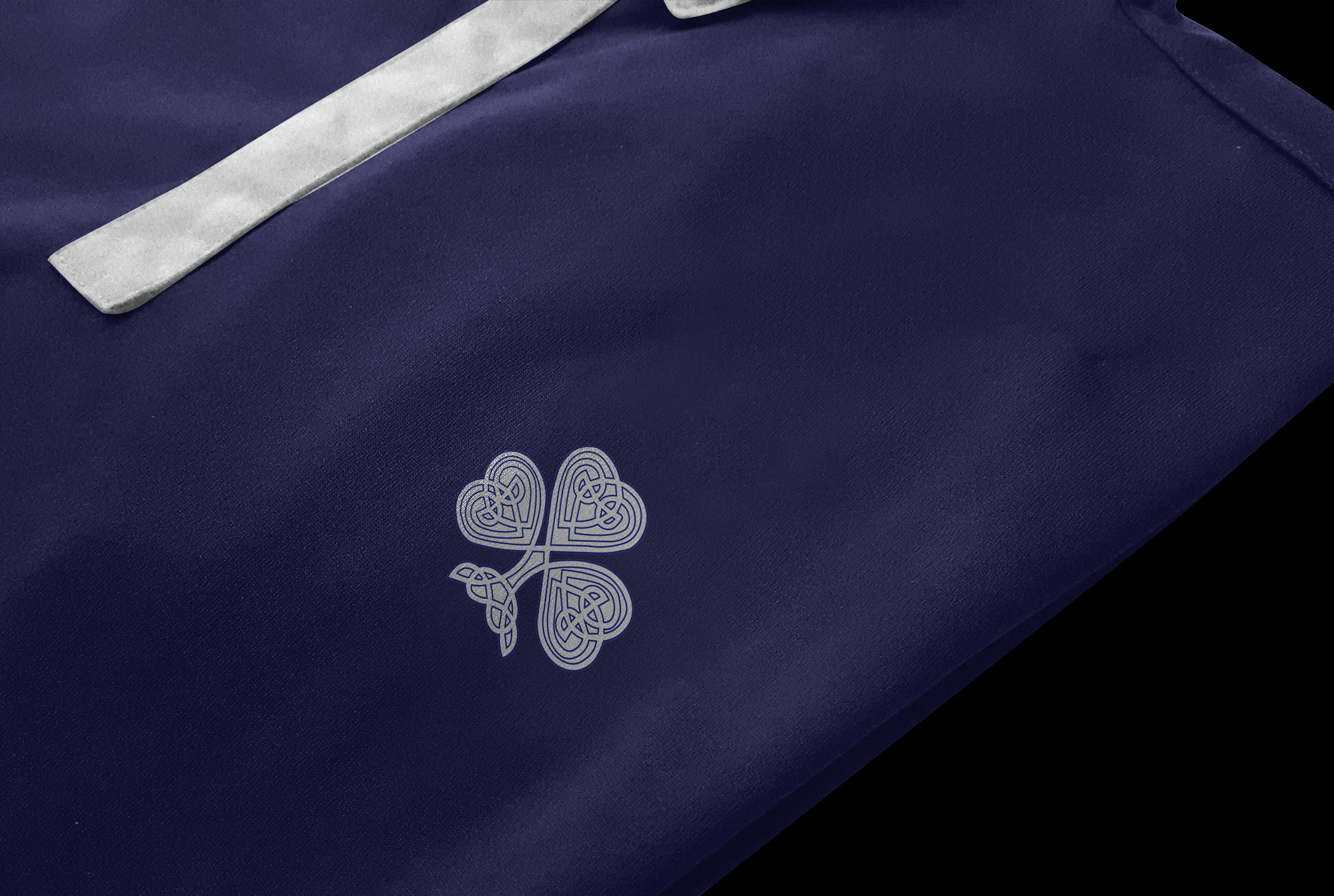
Stitched clover replacing the club emblem.
The ethereal white, symbolic of unity and purity, resonates with the essence of the Clover. It mirrors the bond shared between the players and the community they represent, encapsulating the very heart of the team’s existence. Complemented by the deep blue hue, reminiscent of the vast expanse of the East River that flanks Bowery, the jersey’s palette paints a picture of determination and aspiration, mirroring the aspirations of the team as they navigate their journey to victory. In this striking marriage of color and design, the special edition jerseys strike a delicate balance between the past and the present. The clover, an emblem of tradition, harmoniously coalesces with the contemporary minimalism of the design, symbolizing the brand’s ability to remain anchored in history while continually pushing the boundaries of innovation. This unique blend showcases the East River Raiders’ commitment to upholding their heritage while simultaneously embracing modernity, ultimately exemplifying the vibrant spirit of Bowery’s Irish legacy within the dynamic realm of graphic design.
-
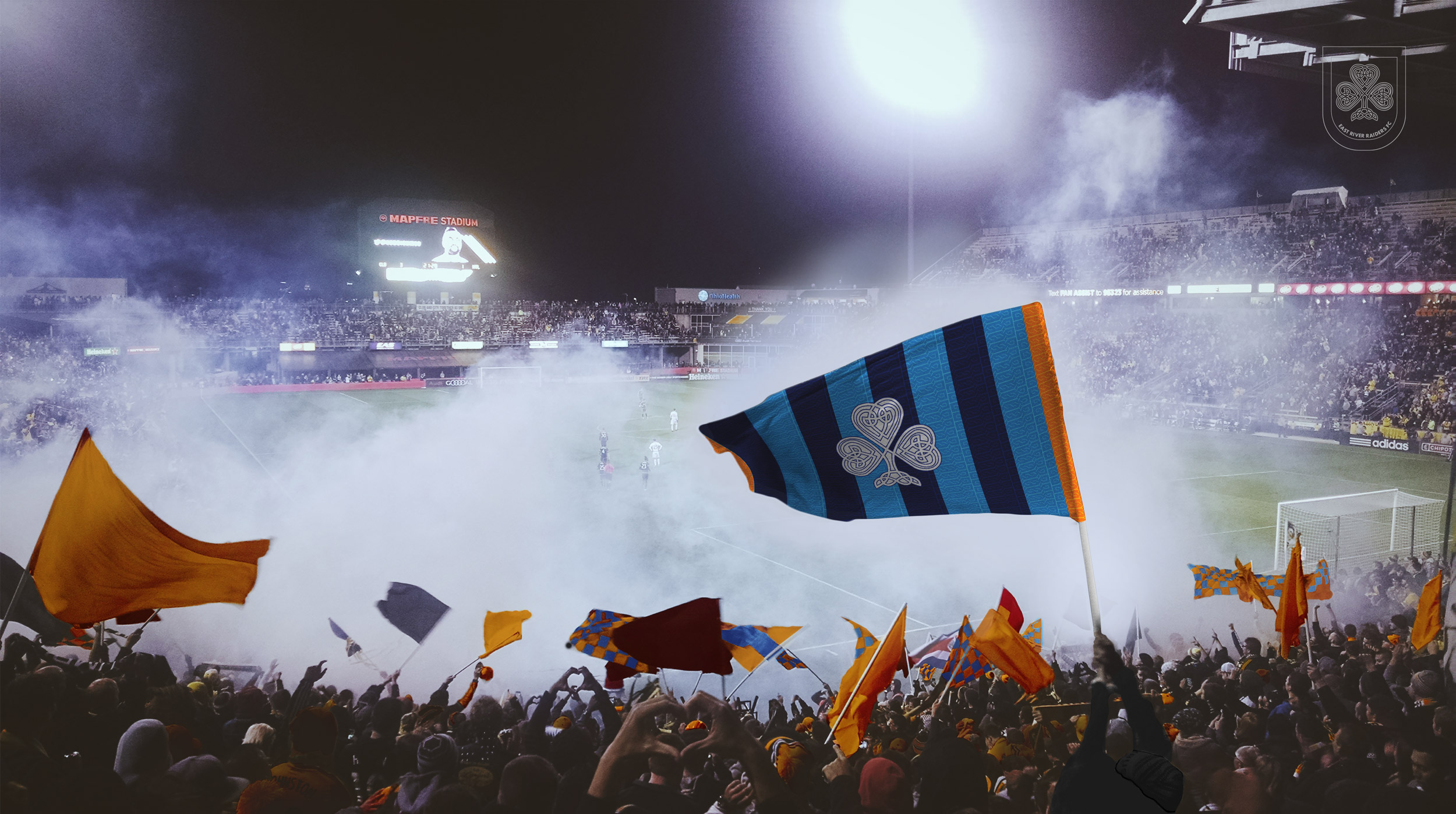
Mockup of East River Raiders support.
-
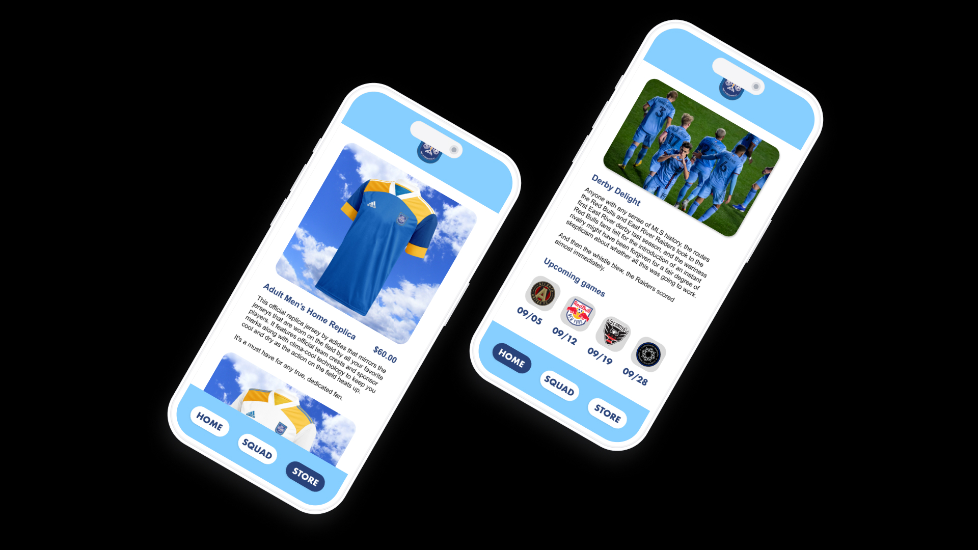
iPhone mockups for the East River Raiders app featuring the home page and the store page.
-
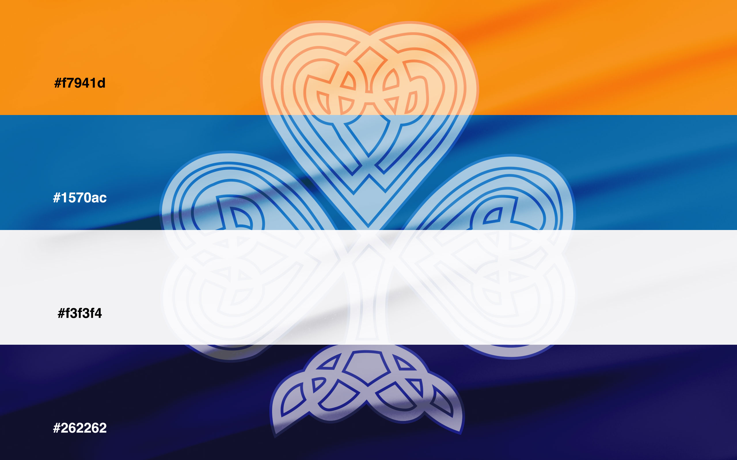
Colour scheme for the East River Raiders.
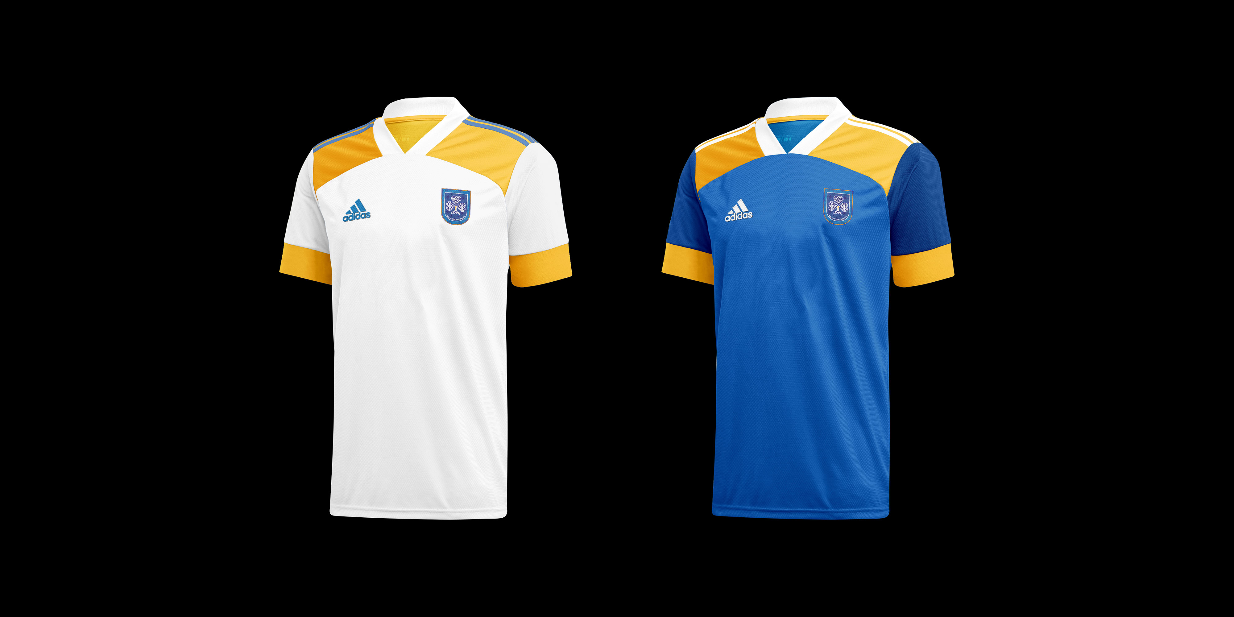
To bring the identity to life, I meticulously conceptualized the team’s home and away jerseys. Drawing from the established patterns, I meticulously crafted apparel that not only showcased the brand’s cultural roots but also harmonized with the dynamic spirit of the sport. The color palette, a symphony of hues drawn from the New York flag, seamlessly integrated the club’s essence with the vibrancy of the city that never sleeps.
-
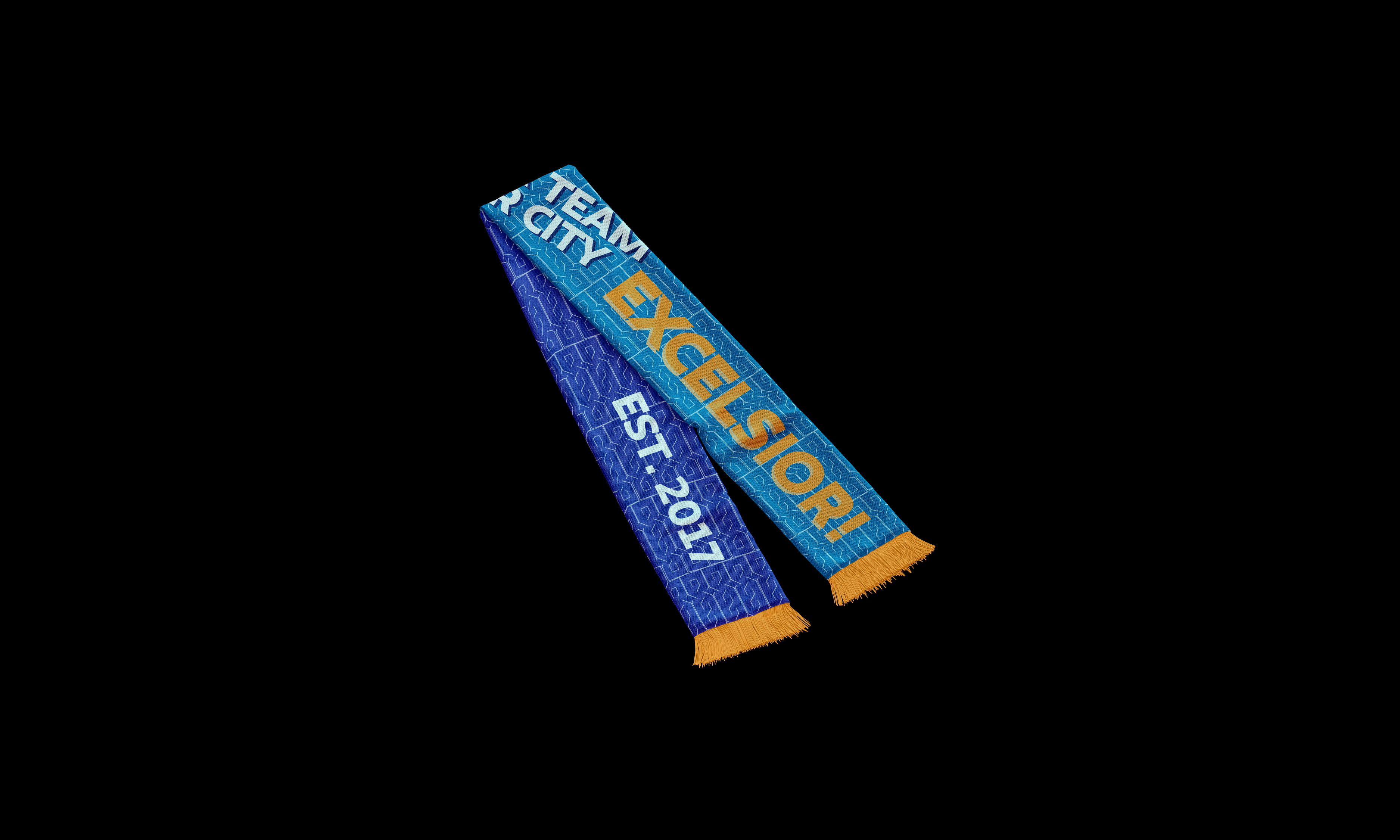
East River Raiders scarf featuring bold typography.
Typography, a powerful tool in conveying the brand’s ethos, was wielded boldly across all facets of the branding. The resounding cry of “Excelsior!” resonates throughout, encapsulating the club’s commitment to striving for excellence and reaching for the stars. This rallying call is a testament to the unwavering passion that fuels the East River Raiders and their pursuit of both sporting glory and cultural heritage.
-
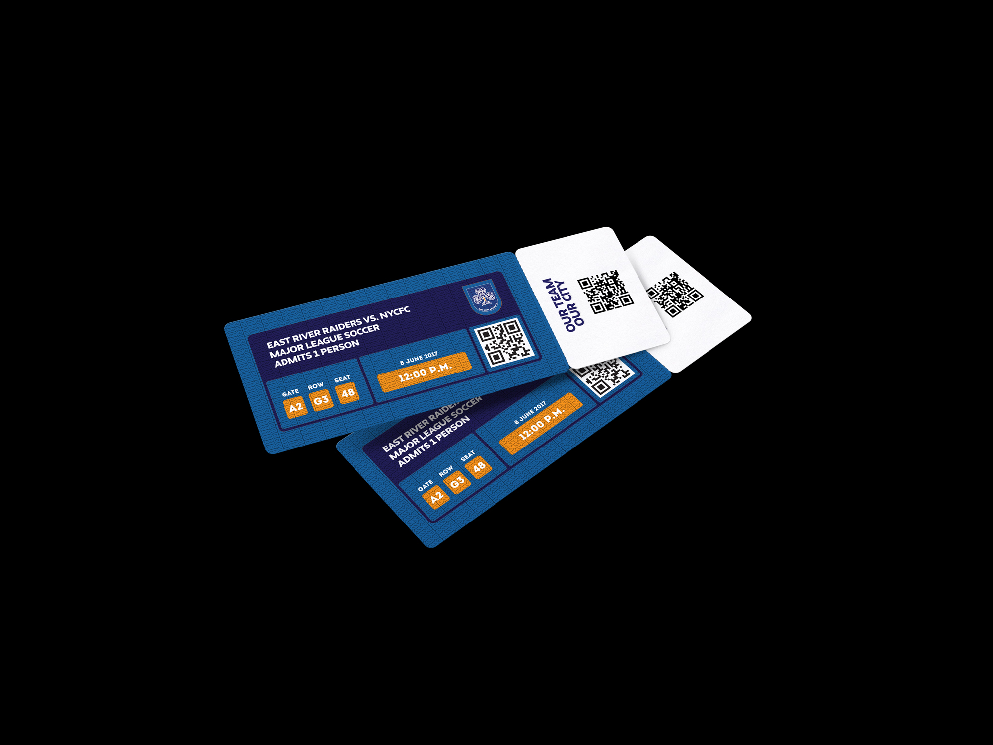
Mockup of tickets for a match.
-
Original drafts of East River Raiders jerseys.