Senskin: A Modern Identity
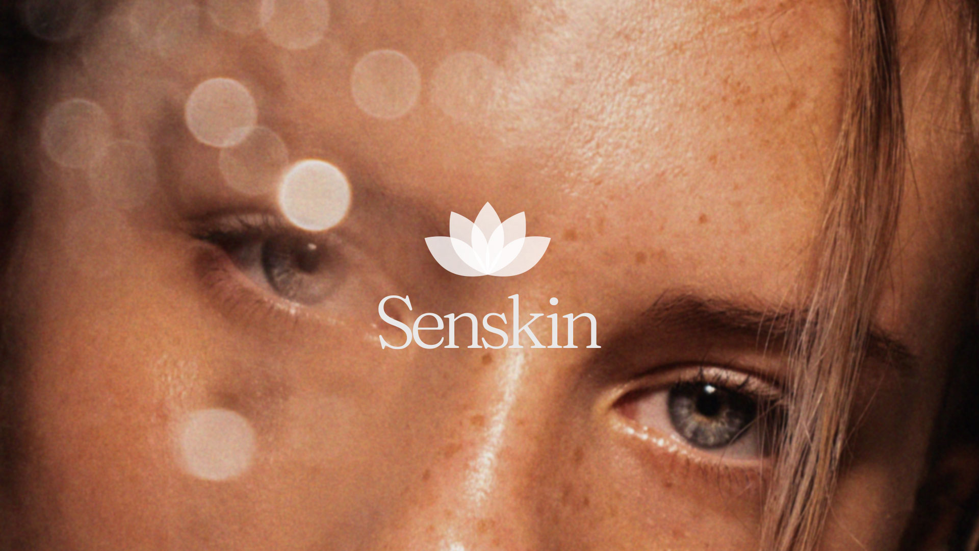
Senskin’s reimagined identity is more than a visual transformation; it is a testament to the brand’s dedication to empowering women through a gentle and memorable skincare experience. With a minimalist aesthetic and a touch of sophistication, Senskin’s new brand identity is poised to leave an indelible mark on the world of beauty, inviting users to embark on a journey of self-love and discovery.
-
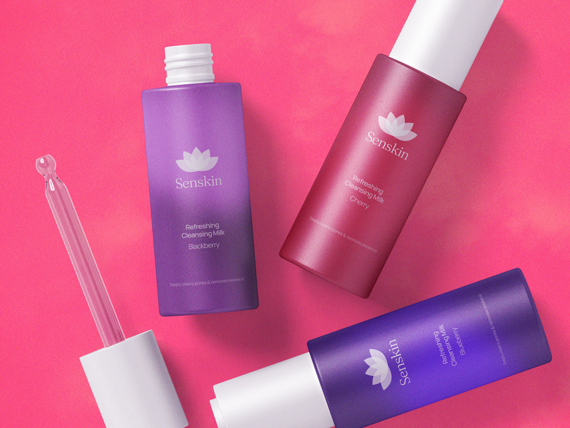
Various Senskin products.
Unveiling Timeless BeautySenskin’s ethos lies in crafting experiences that are as memorable as they are gentle. From indulgent footscrubs to revitalizing hand gels, from nourishing eye creams to luscious hair oils, each product is a testament to the brand’s commitment to enhancing natural beauty. With a focus on providing products that not only pamper but also invigorate, Senskin is dedicated to empowering women on their journey to feeling more beautiful and confident.
-
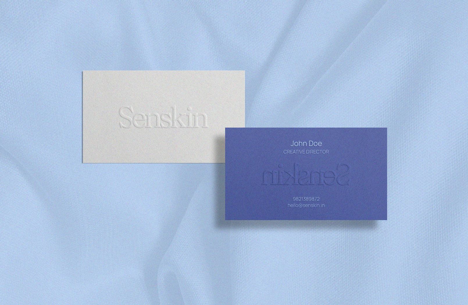
Business cards for a Senskin employee.
A Symphony of ElementsThe revitalized brand identity of Senskin orchestrates a symphony of elements, seamlessly blending the old and the new. The typography choice marries tradition with contemporaneity, while the carefully curated color palette offers a visual language that speaks of tranquility and comfort. Together, they forge a visual identity that resonates with Senskin’s commitment to providing products that caress the skin and soothe the soul.
-
Colour palette for Senskin.
Harmonious Palette SelectionDrawing inspiration from the rich tapestry of Indian culture, I meticulously curated a color palette from the Pantone library. Soft, pastel-like tones with hints of blues and reddish hues were meticulously chosen to reflect the brand’s essence. These carefully selected shades not only evoke a sense of serenity but also convey the gentle nature of Senskin’s products. The resulting imagery exudes a harmonious and inviting aura, inviting users to experience the soothing embrace of Senskin’s offerings.
-
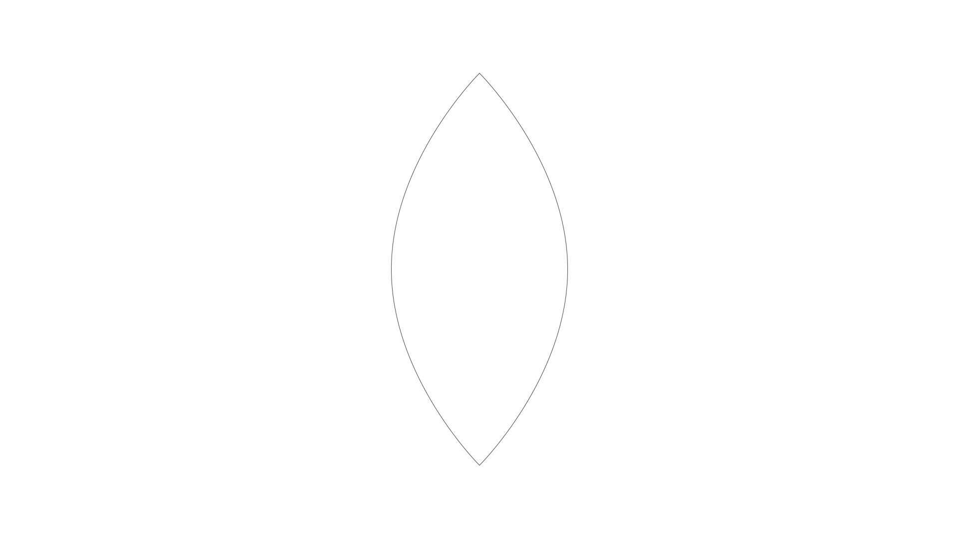
Geometric logo for Senskin.
Nature-Inspired GeometryThe logo for Senskin stands as a tribute to nature, where geometrically perfect leaves converge to form a delicate flower. This innovative design element injects a fresh breath of vitality into the brand, infusing it with a contemporary and minimalist aesthetic. Additionally, the geometric patterns ensure that the new logo seamlessly adapts to various digital platforms, enhancing its visibility and impact across social media channels. This harmonious marriage of nature and geometry serves as a visual beacon for Senskin’s commitment to modernity and natural beauty.
-
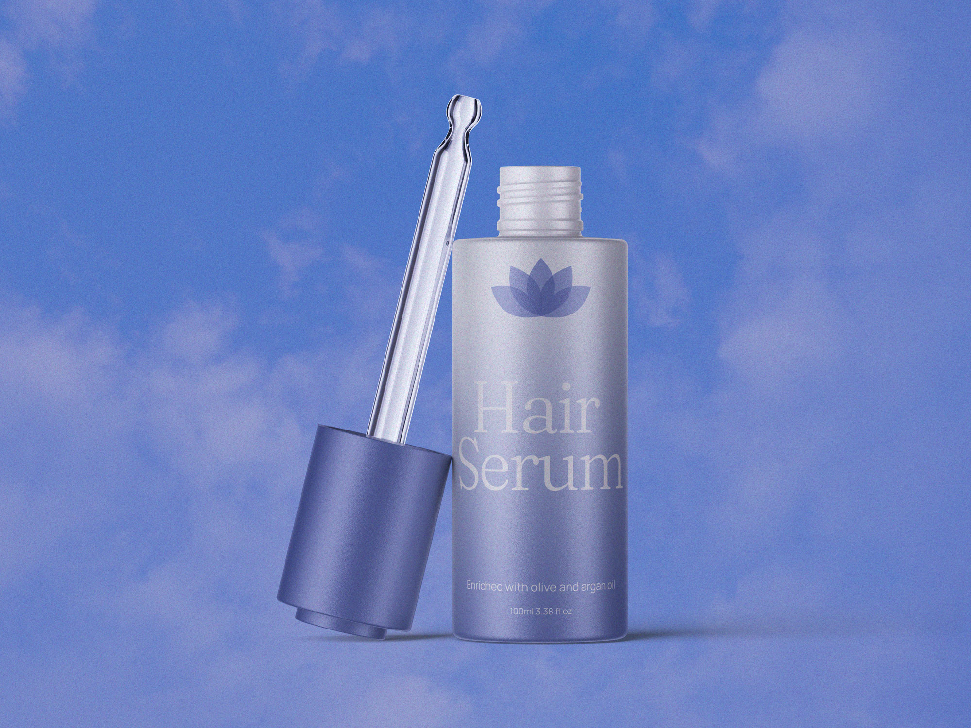
Senskin hair serum.
-
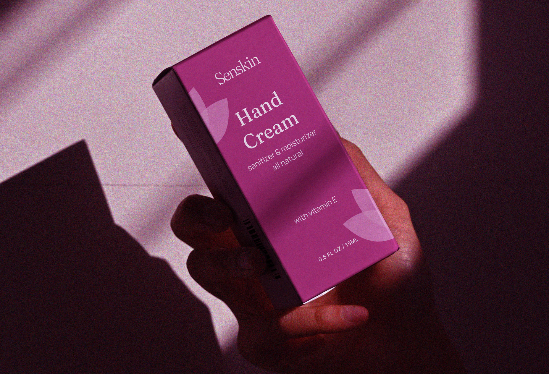
Senskin hand cream product box.
-
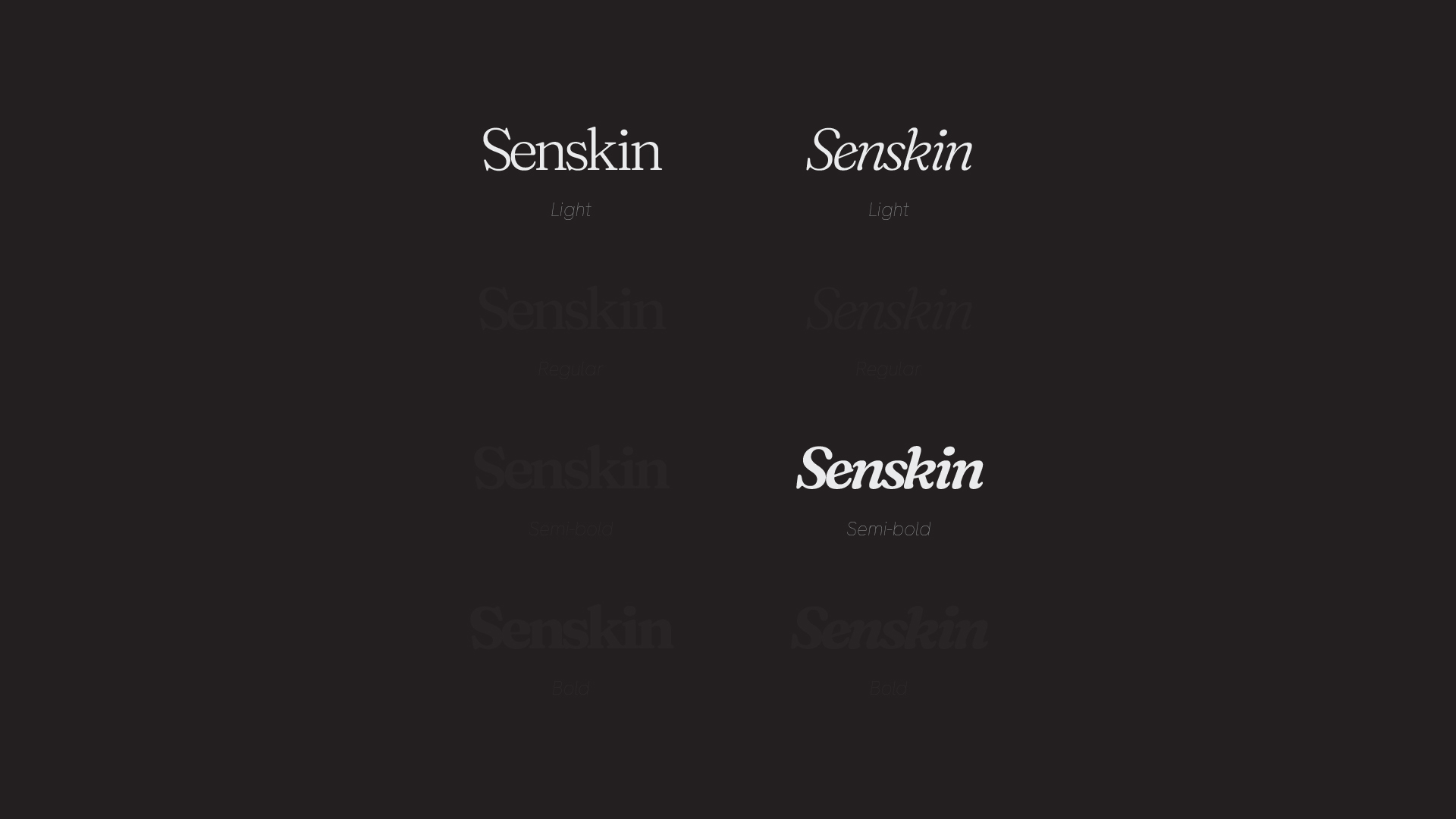
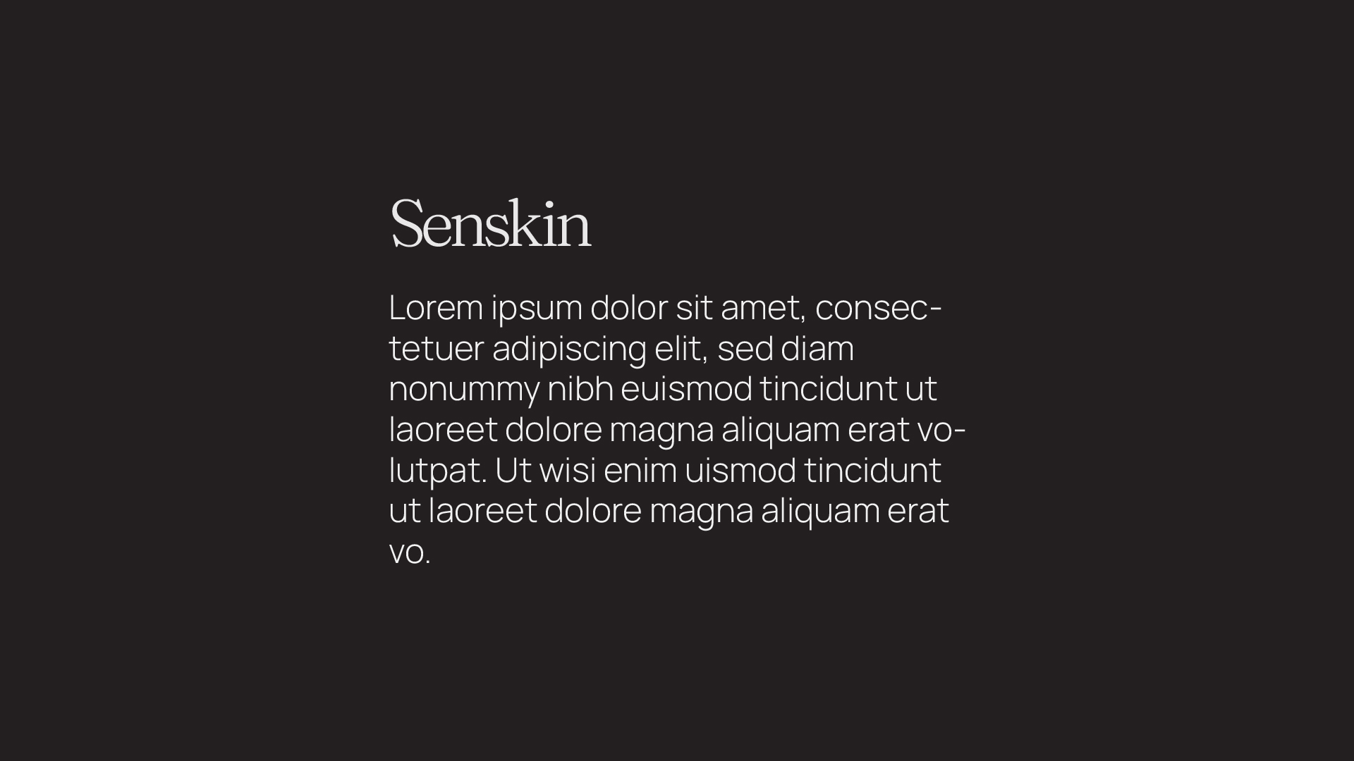
Senskin typography #1
Typography ElevationIn the journey of rebranding Senskin, an Indian skincare company, I aimed to infuse a breath of modernity into its identity. The transformation began with a strategic choice of typography - ‘Fraunces’ for the distinctive wordmark, exuding elegance and sophistication, and ‘Manrope’ for the accompanying text, offering a clean and contemporary touch. This pairing of serif and sans-serif fonts creates a harmonious visual interplay, embodying a perfect blend of tradition and modernity.
-
Senskin typography #2