Capstone People & Pinnacle Learning: Convergence
This project embarked on a transformative journey, redefining the visual identities of both Pinnacle and Capstone. Through meticulous design choices and a harmonious fusion of elements, the logos now stand as powerful symbols of their respective missions. Pinnacle’s logo ascends like a mountain, embodying growth and ambition, while Capstone’s interwoven triangles signify unity and diversity. The chosen color palette of vibrant reds and subtle greys amplifies their impact, reflecting passion, strength, and wisdom. This redesign not only revitalizes their brand images but also reinforces their commitment to empowering talent and navigating change in today’s dynamic business landscape. The Capstone People & Pinnacle Learning logo encapsulates a shared vision of growth and empowerment. Just as the Sierpinski Triangles rely on each other for their form, Capstone and Pinnacle rely on their collective strengths to shape a future-ready workforce. Through their innovative programs and contemporary practices, they leave an indelible mark on the landscape of talent development and workplace culture.
-
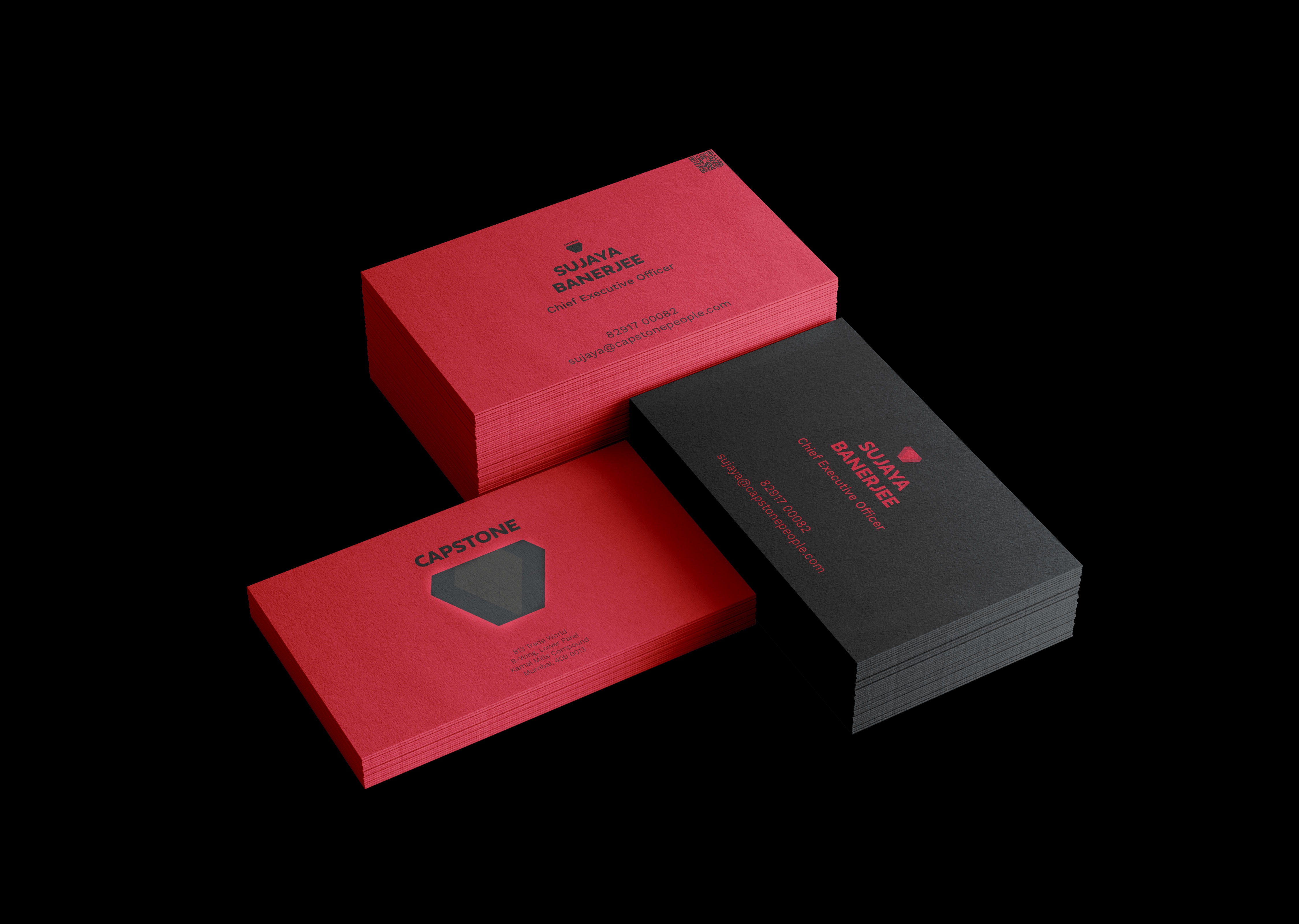
Example identity cards for Capstone People.
Typography as a Design Element:The careful selection of Display Neue for headers and Manrope for body text adds a distinctive touch to the overall design. Display Neue lends an air of modernity and boldness, perfectly encapsulating the forward-thinking approach of both Pinnacle and Capstone. On the other hand, Manrope provides a clean and legible foundation for conveying information effectively. This harmonious typographic choice not only enhances readability but also contributes to the overall visual coherence of the logos.
-
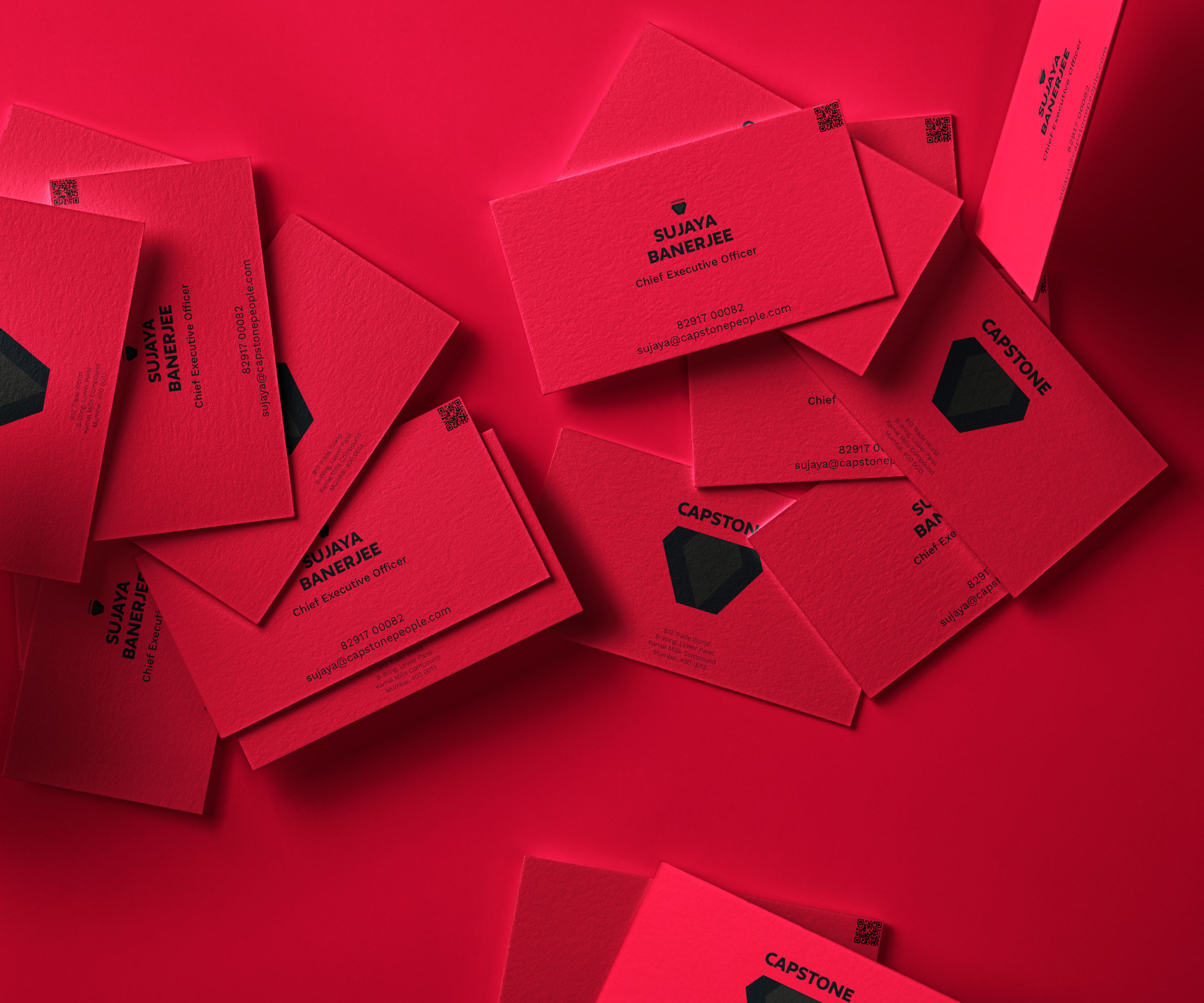
Example business cards for Capstone People.
Capstone People Consulting: Navigating Change, Embracing DiversityThe Capstone logo, with its interwoven triangles, mirrors the organization’s mission to manage change and nurture diverse and inclusive cultures. The triangles work in harmony to illuminate the center, symbolizing unity and collaboration. The red hues, particularly Deep Carmine and Cardinal, resonate with Capstone’s commitment to leading with passion and vitality, while the subtle greys and blacks embody a balanced approach to navigating change.
-
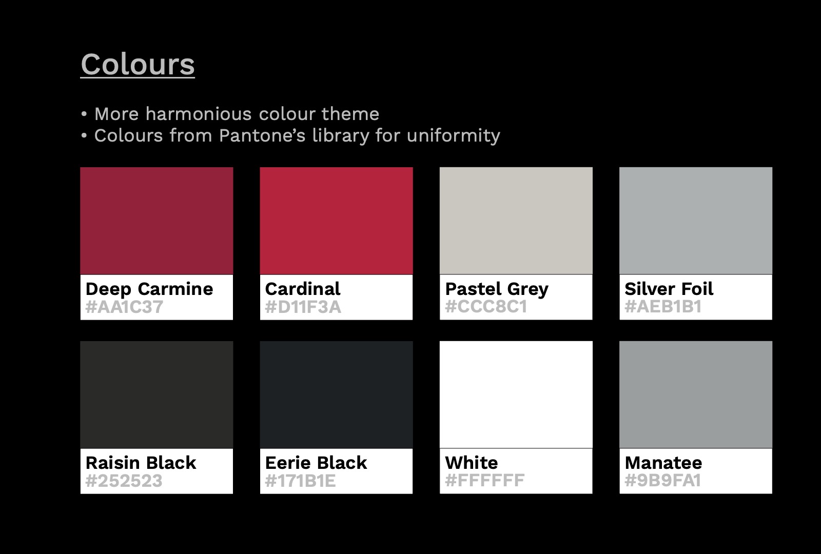
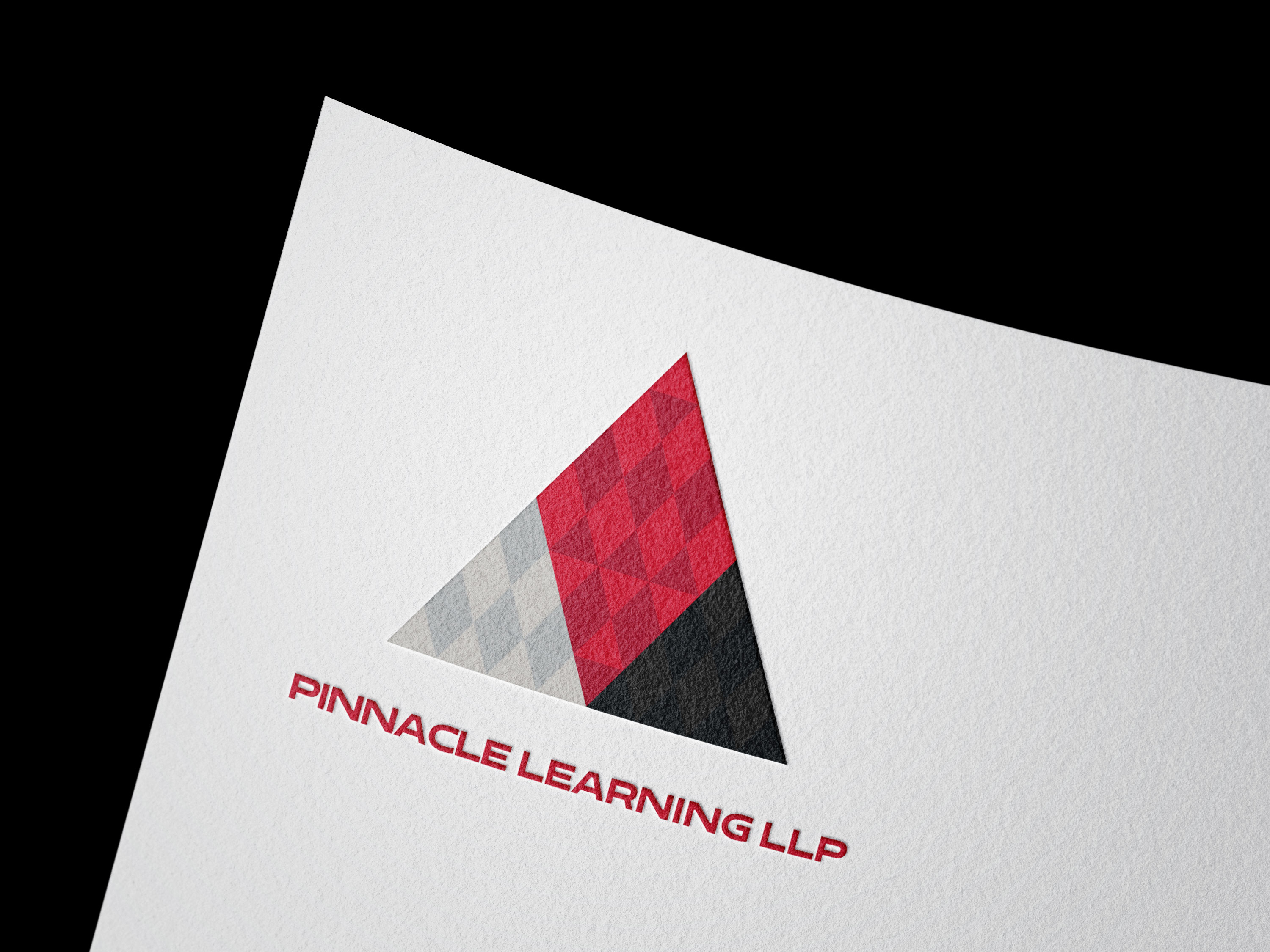
Colours used for the branding project.
Inspired Hues from Pantone’s Palette: A Colorful Narrative for Pinnacle and Capstone ProjectThe color palette chosen for the Pinnacle and Capstone project, carefully curated from Pantone’s extensive library, conveys a powerful visual narrative. Deep Carmine and Cardinal evoke a sense of passion and vitality, mirroring the organizations’ fervent commitment to their respective missions. Pastel Grey provides a balanced backdrop, offering a touch of subtlety and sophistication. The addition of Silver Foil introduces an element of elegance and refinement, while Raisin Black and Eerie Black lend depth and contrast, emphasizing the logos’ intricate details. White and Manatee act as anchors, ensuring clarity and readability. Together, these hues form a harmonious ensemble, breathing life and energy into the logos, reflecting the dynamic nature of Pinnacle and Capstone’s endeavors. This thoughtfully selected palette not only resonates with their missions but also reinforces their visual identities in the professional landscape.
-
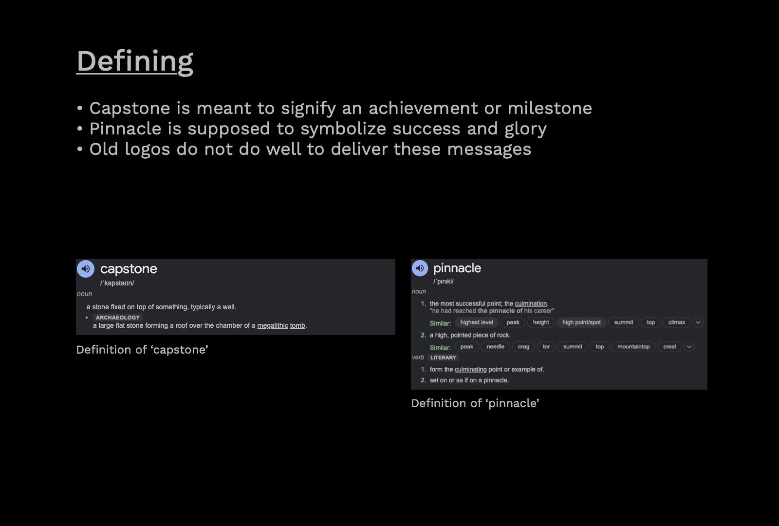
Defining the subject.
Defining Symbolism:In this redesign, Capstone and Pinnacle are more than mere visual representations; they encapsulate the essence of achievement, success, and glory. The logos ingeniously form shapes with interwoven triangles. For Capstone, this signifies unity and diversity, echoing the organization’s commitment to nurturing inclusive cultures. Pinnacle’s logo, ascending like a mountain, embodies the journey of growth and ambition that every individual aspires to. This symbolism aligns seamlessly with the organizations’ core missions, leaving an indelible mark on the landscape of talent development and workplace culture. Through intricate design choices and strategic use of colors and typography, the logos stand as powerful symbols of their shared journey towards excellence.
-
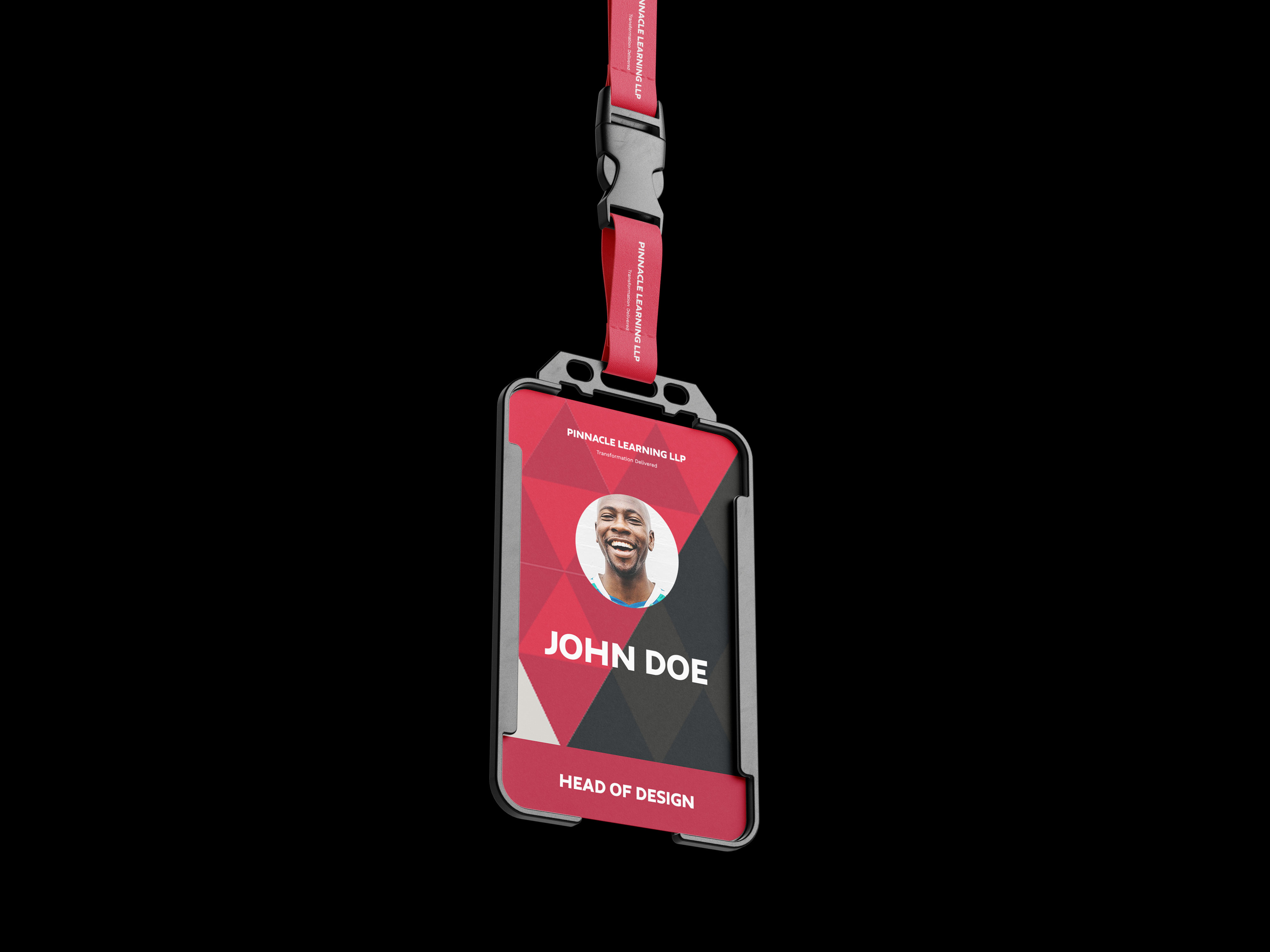
Identity card for an employee of Pinnacle Learning.
-
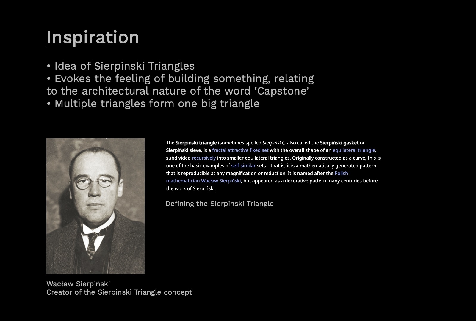
Inspiration behind the logos.
Design Concept: Sierpinski Triangles - Symbolizing Synergy and GrowthThe logos for Capstone People & Pinnacle Learning are crafted with a thoughtful integration of Sierpinski Triangles, a representation of interconnectedness and progress. Rooted in the hues of Deep Carmine, Cardinal, and Pastel Grey from Pantone’s library, these colors evoke a sense of passion, strength, and wisdom. Accentuated by Silver Foil, Raisin Black, and Eerie Black, the logos emanate a touch of sophistication and depth.
-
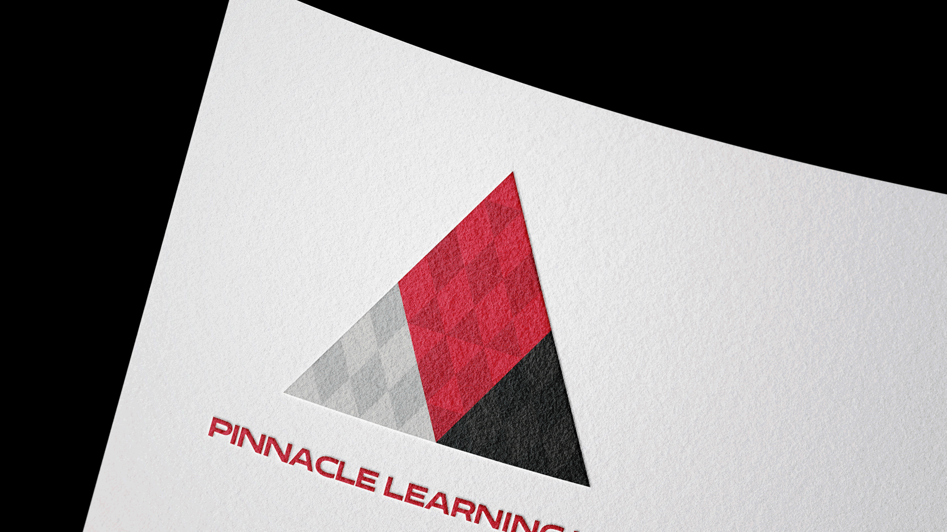
Letterhead for Pinnacle Learning.
Mutual Ascent: Bridging Change and Talent DevelopmentThe logos for Capstone People & Pinnacle Learning are more than just visual representations; they encapsulate the convergence of their missions. The Sierpinski Triangles serve as a testament to the interdependency of these organizations, working in tandem to foster growth and progress. By leveraging the power of reds, blacks, and greys, the logos not only visually resonate with their respective missions but also convey a sense of authority and purpose.
-
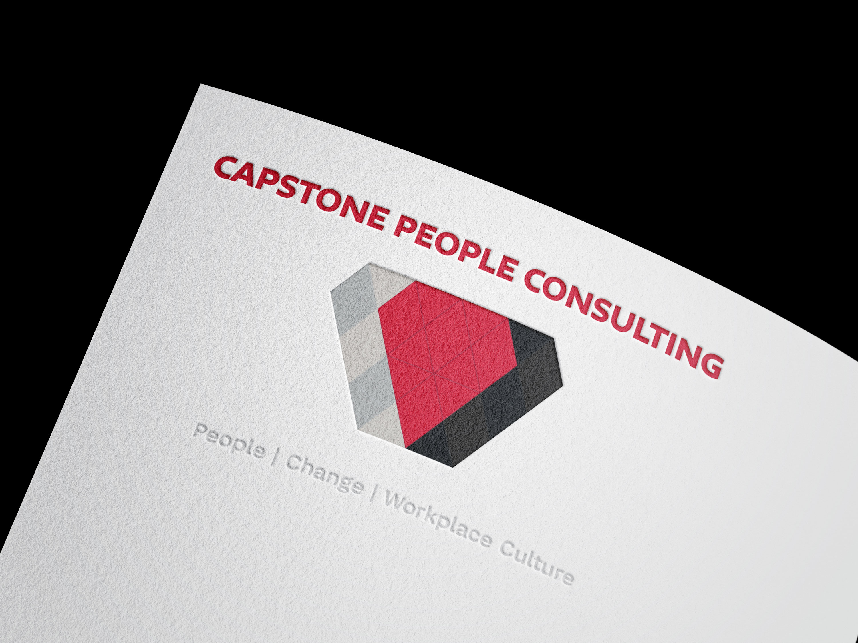
Letterhead for Capstone People.
In this dynamic visual narrative, Capstone and Pinnacle find their identities, echoing their collective dedication to transforming the landscape of talent development and workplace culture. Through intricate design choices and strategic use of colors, the logos serve as powerful symbols of their shared journey towards excellence.
-
Pin badges for Pinnacle Learning.
Pinnacle Learning: Elevating Future-Ready TalentIn the Pinnacle logo, Sierpinski Triangles dynamically ascend, culminating in a mountainous peak. This design choice ingeniously mirrors Pinnacle’s mission of empowering mid-career talent to reach new heights of success. The gradient of reds, transitioning from Deep Carmine to Cardinal, signifies the journey of growth and development. Alongside, the inclusion of Silver Foil and Eerie Black add a touch of elegance and determination, aligning seamlessly with Pinnacle’s vision.
-
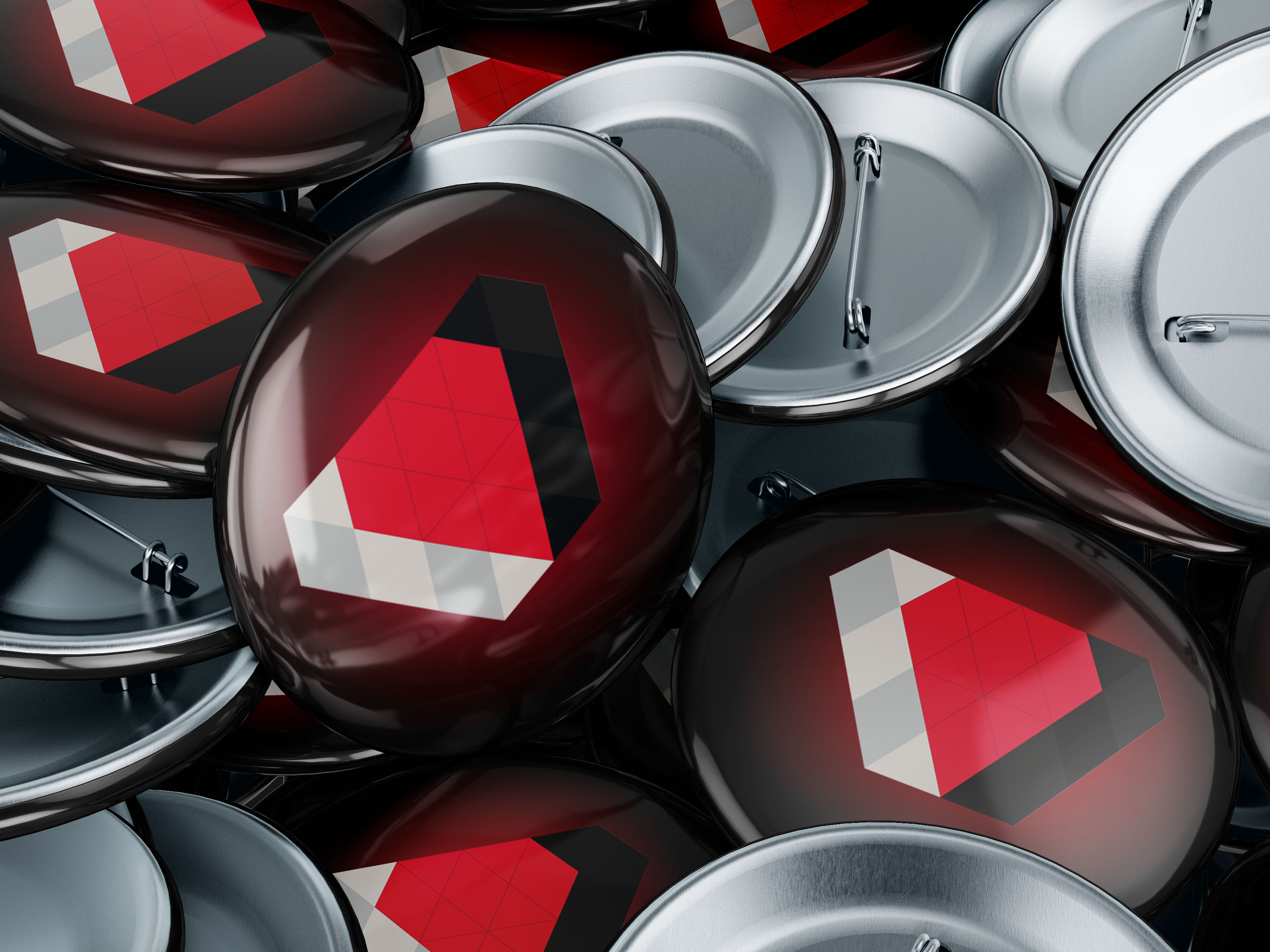
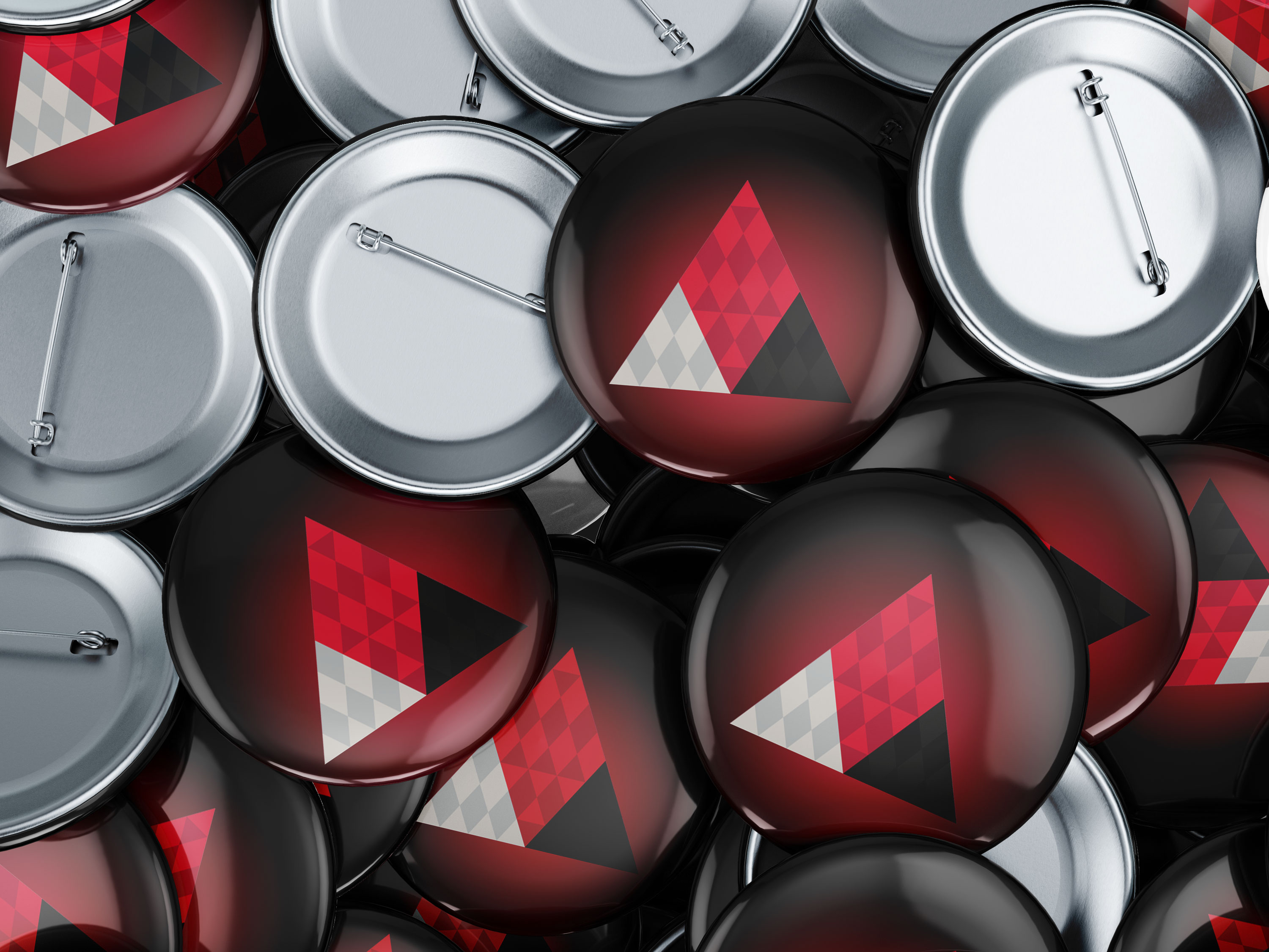
Button pins for Capstone People.
-
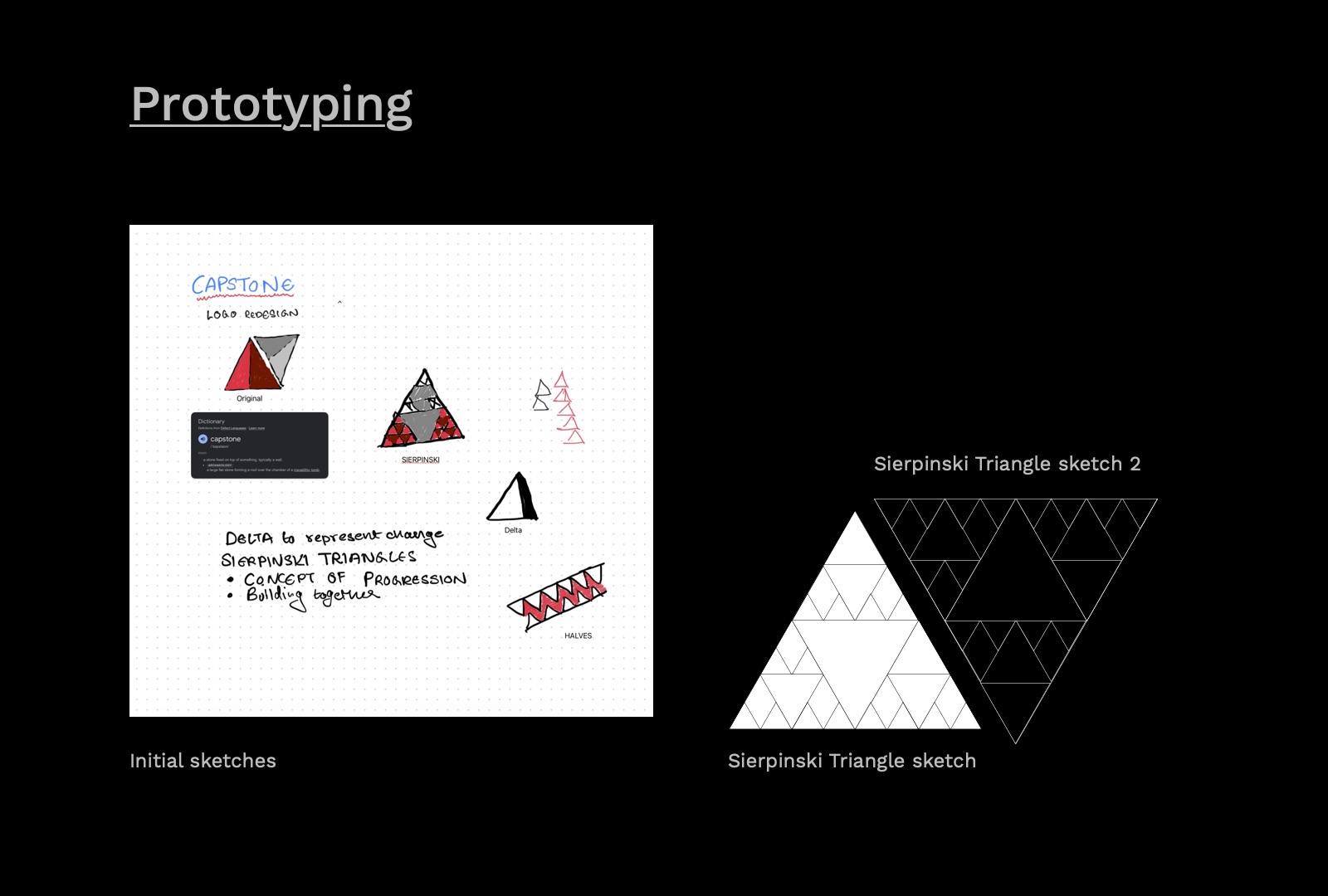
Prototyping the project.
Design Concept: Sierpinski Triangles - A Foundation of Interconnected GrowthThe logo design for Capstone People & Pinnacle Learning draws inspiration from the concept of Sierpinski Triangles. Just as these triangles rely on each other to build upon the shape, the organizations work in tandem, synergizing their strengths to create a comprehensive ecosystem for talent development. This symbiotic relationship mirrors the companies’ mission to facilitate growth and progress in the professional landscape.
-
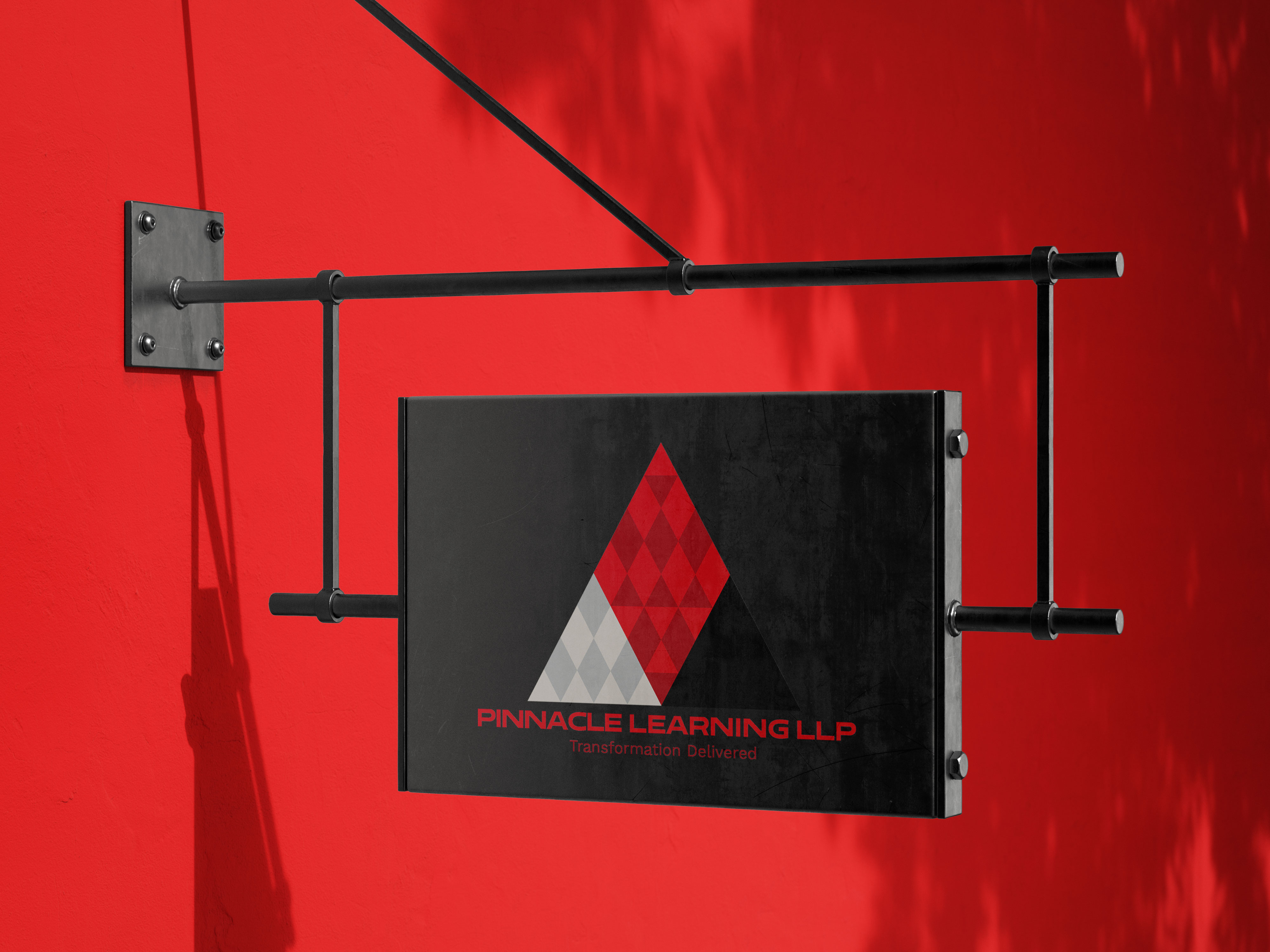
Example signage for Capstone People.
Capstone People Consulting: Nurturing Change and DiversityCapstone People Consulting excels in navigating change and transforming workplace culture. With expertise in contemporary leadership, diversity and inclusion, the organization embraces the challenges of an ever-evolving business environment. The emphasis on building diverse, inclusive cultures aligns with the mission to accelerate the future of work.
-
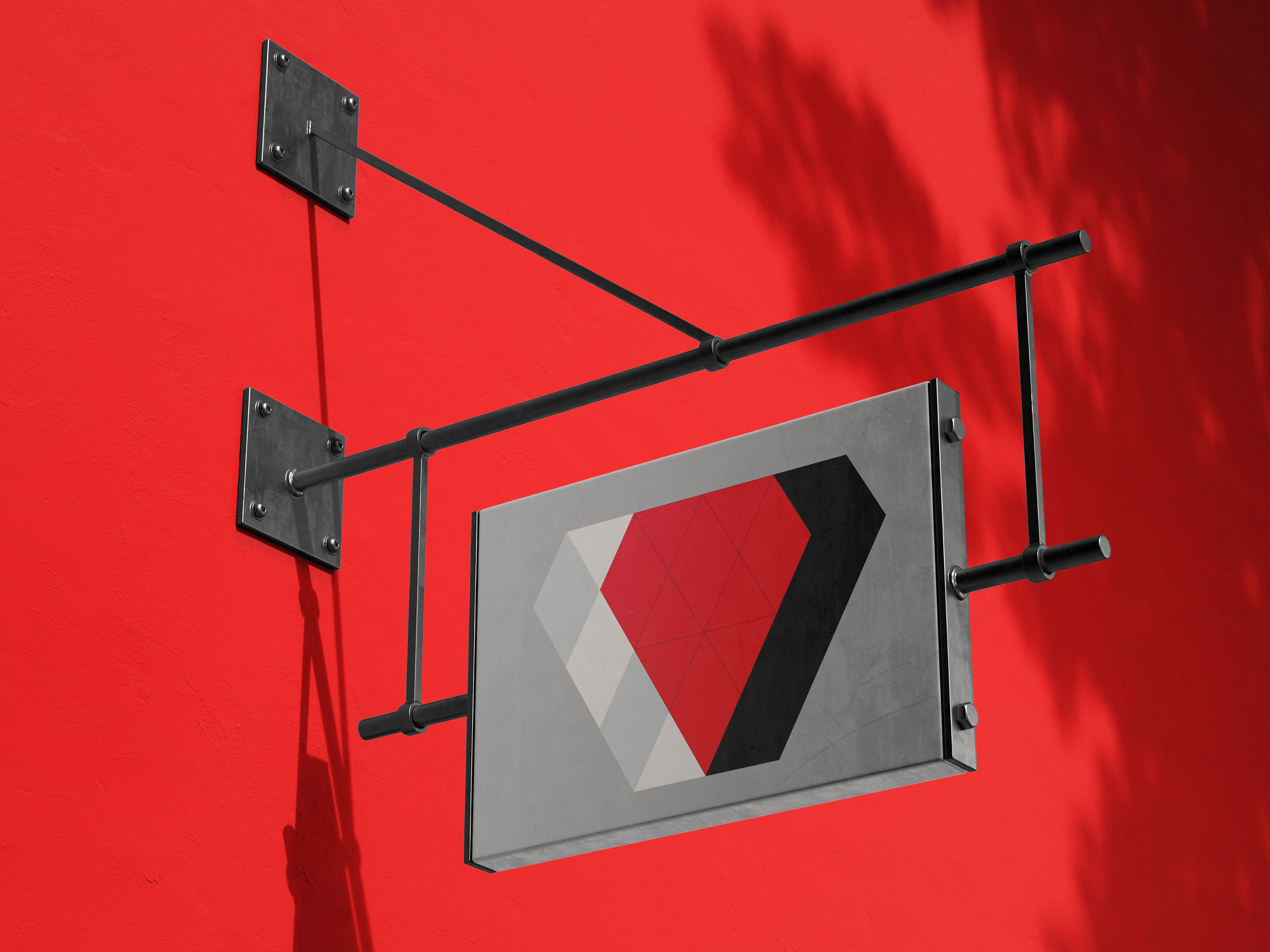
Example signage for Pinnacle Learning.
Pinnacle Learning: Empowering Mid-Career TalentPinnacle Learning stands as a beacon for mid-career professionals, offering tailored solutions for talent development. From high-potential journeys to succession planning ecosystems, the organization pioneers programs like Pinnacle Voyage and 90 Minutes to Insight, all meticulously designed to foster growth and elevate future-readiness. The Pinnacle Development Studio brings a cutting-edge approach to assessment and measurement, with tools like Future Readiness Assessment & Development Centres and 360° Pulse Feedback. These resources empower individuals to embark on a journey of self-reflection and development, aligning seamlessly with Pinnacle’s mission.