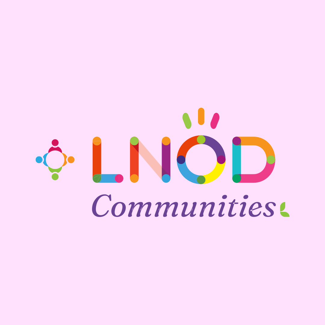
LNOD: Redefining Growth

The LNOD logo encapsulates the essence of connection and community, echoing the core values of the Learning and OD Roundtable Communities of Practice. Each meticulously crafted alphabet intertwines, forming a visual representation of the potent bonds that unite individuals in a shared mission. The Learning and OD Roundtable Communities of Practice serve as a knowledge repository, fostering best practices and continuous learning. They empower members to mine, co-create, and manifest collective intelligence, all in pursuit of building a better society.
-
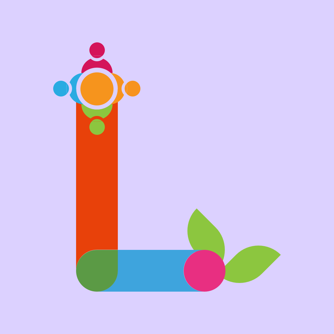
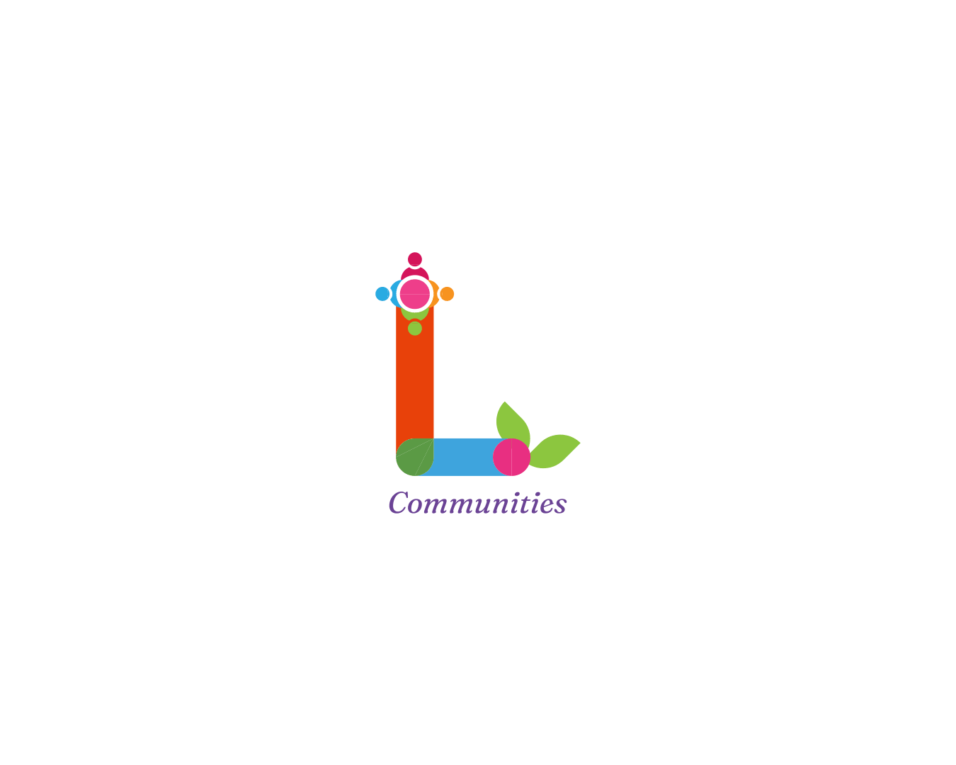
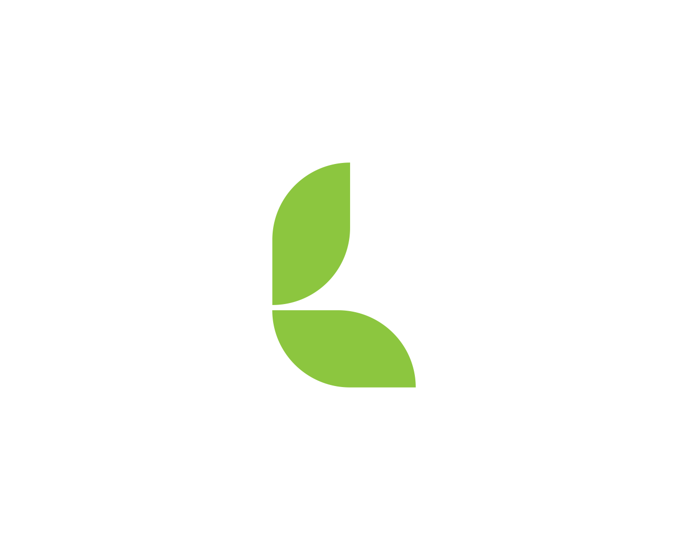
Design for the “L” icon.
The L Icon:The letter “L” stands as a beacon, adorned with symbolic elements that evoke a sense of community and growth. Deep within its structure lies a circular group of people, emblematic of unity and collaboration. Gracefully adorned with leaves, this element symbolizes the nurturing environment nurtured by LNOD.
-
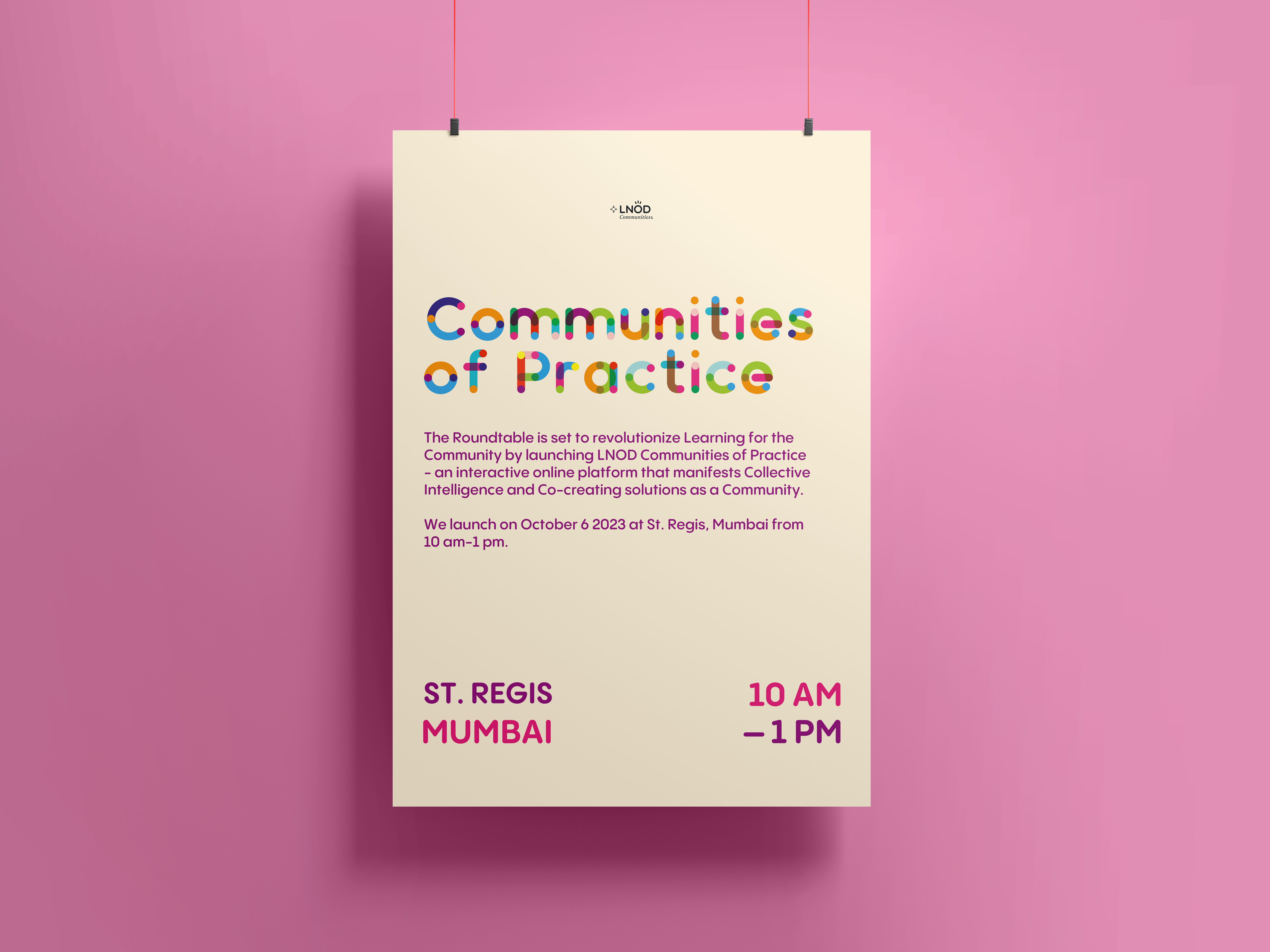
Hanging poster mockup for an LNOD event.
A Community of Empowerment:Within this dynamic online community, individuals take on multiple roles, becoming Knowledge Seekers, Knowledge Sharers, Activists, and Evangelists. The logo stands as a guiding beacon, directing individuals toward a transformative journey where knowledge is harnessed and co-created, transforming into a collective intelligence that propels society towards positive change.
-
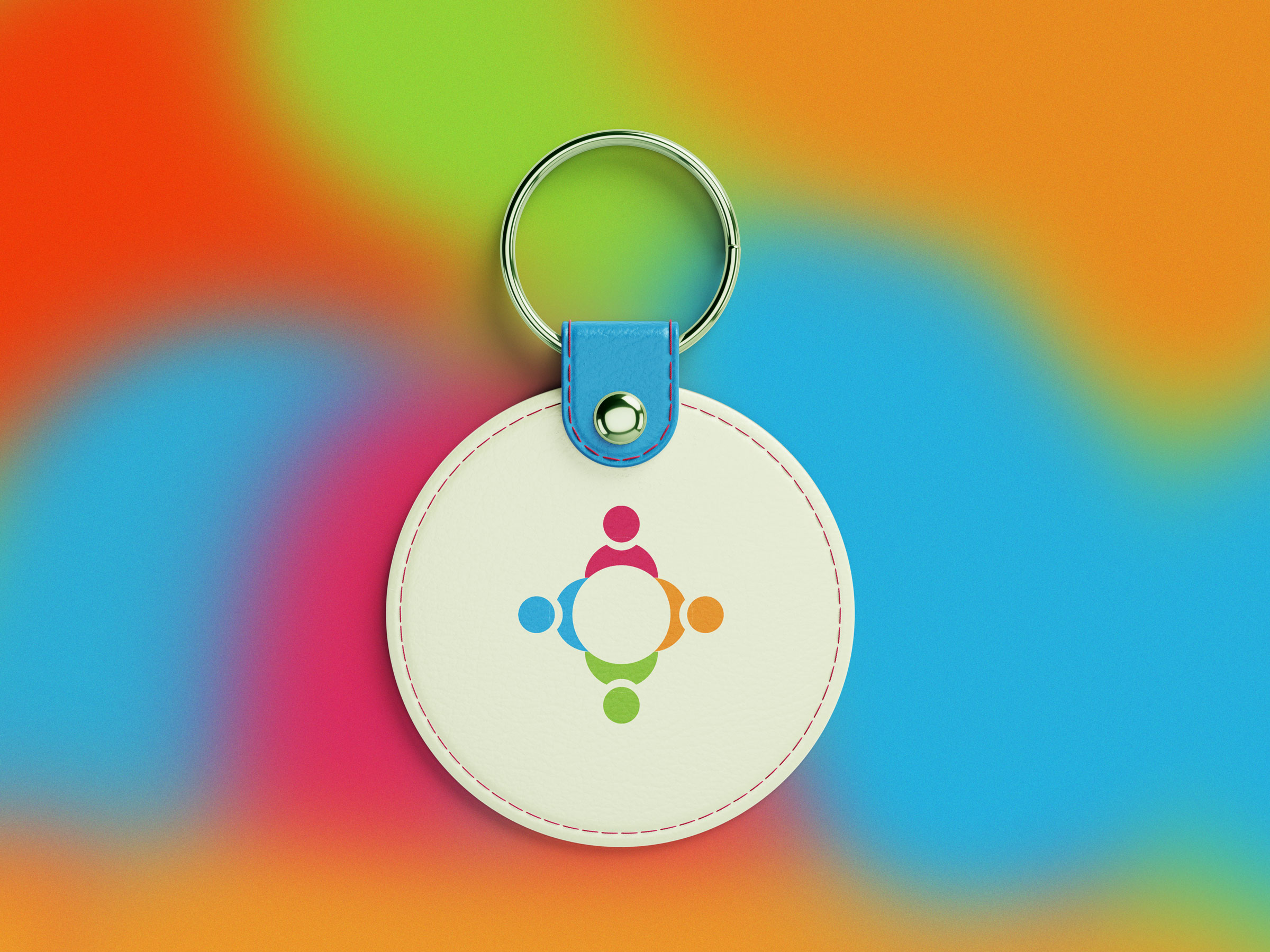
Leather keychain mockup featuring the Community icon.
Diverse, Thematic Groups:LNOD offers a diverse array of thematic groups, each focusing on areas crucial to personal and professional development. These groups, ranging from Leadership to Diversity, Equity, and Inclusion, encourage members to share ideas, opinions, and insights, fostering collaboration and problem-solving. Additionally, LNOD’s carefully curated sub-groups, such as Industry Academia Bridge and DEI Momentum, enable collective intelligence to address systemic challenges impacting all members.
-
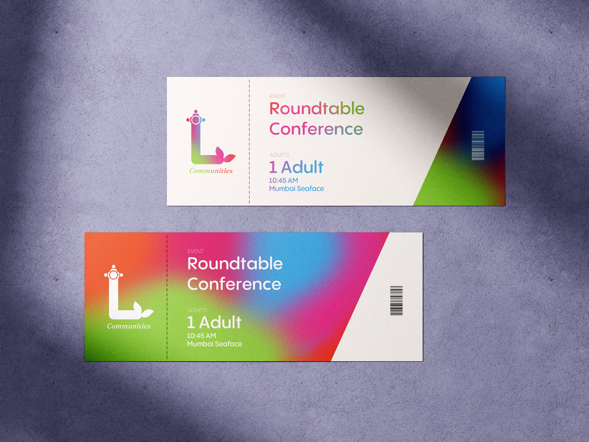
Event ticket mockup.
Expert Advisory Services:Expert Advisory services connect members with the best minds in the community, providing invaluable guidance for real-world challenges. The LNOD Roundtable Academy programs, a gallery of past masterclasses, and the opportunity to engage with global speakers and thought leaders further enrich the learning experience.
-
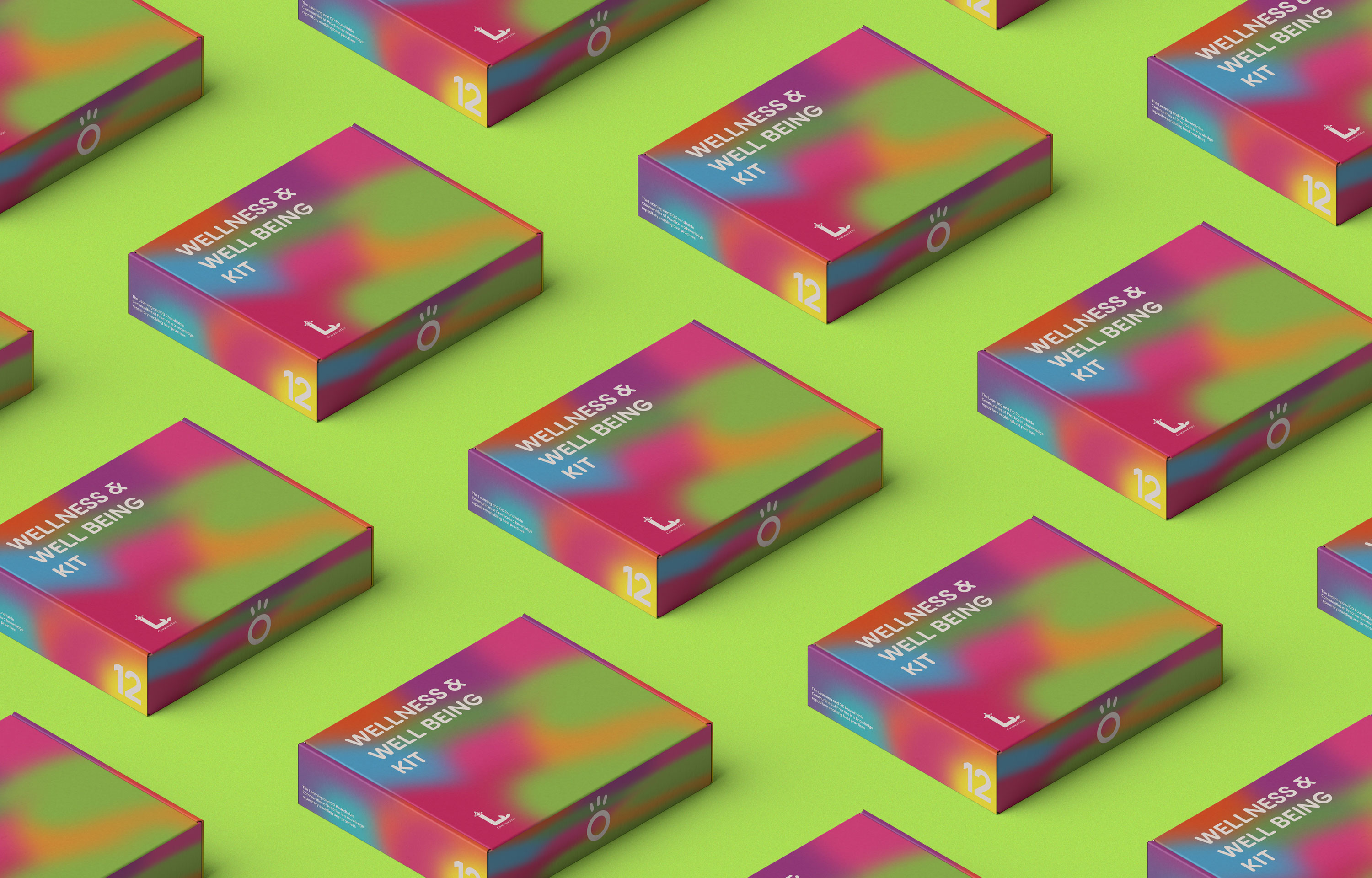
Mockups of Wellness Kit boxes.
The Learning Universe:The Learning Universe consolidates upcoming events, seminars, programs, and certifications, providing a one-stop solution for continuous learning. It empowers members to register for these events while accessing learning tools, resources, and books.
-
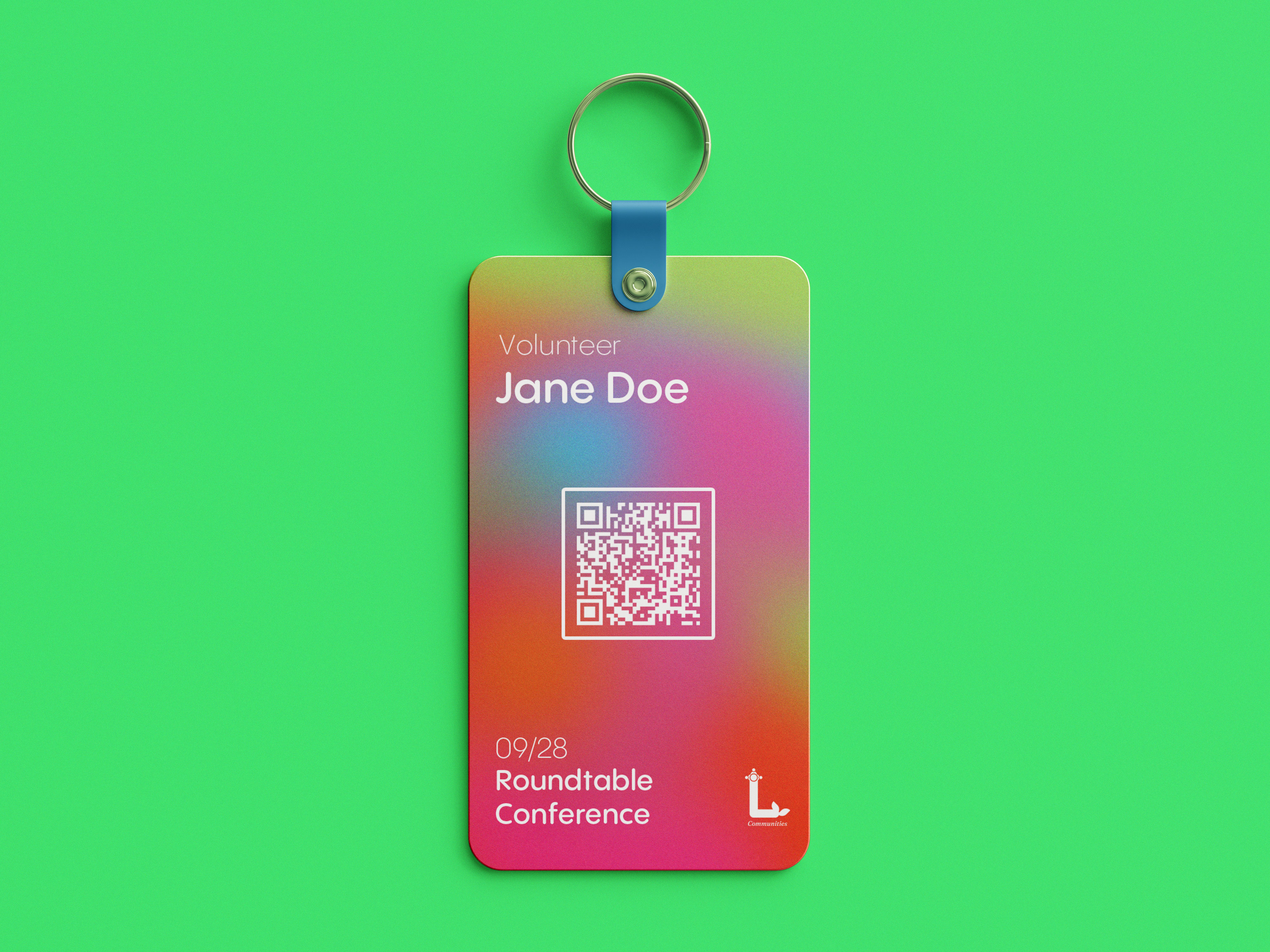
Access Keycard mockup.
A Community of Empowerment:Within this dynamic online community, individuals take on multiple roles, becoming Knowledge Seekers, Knowledge Sharers, Activists, and Evangelists. The logo stands as a guiding beacon, directing individuals toward a transformative journey where knowledge is harnessed and co-created, transforming into a collective intelligence that propels society towards positive change.
-
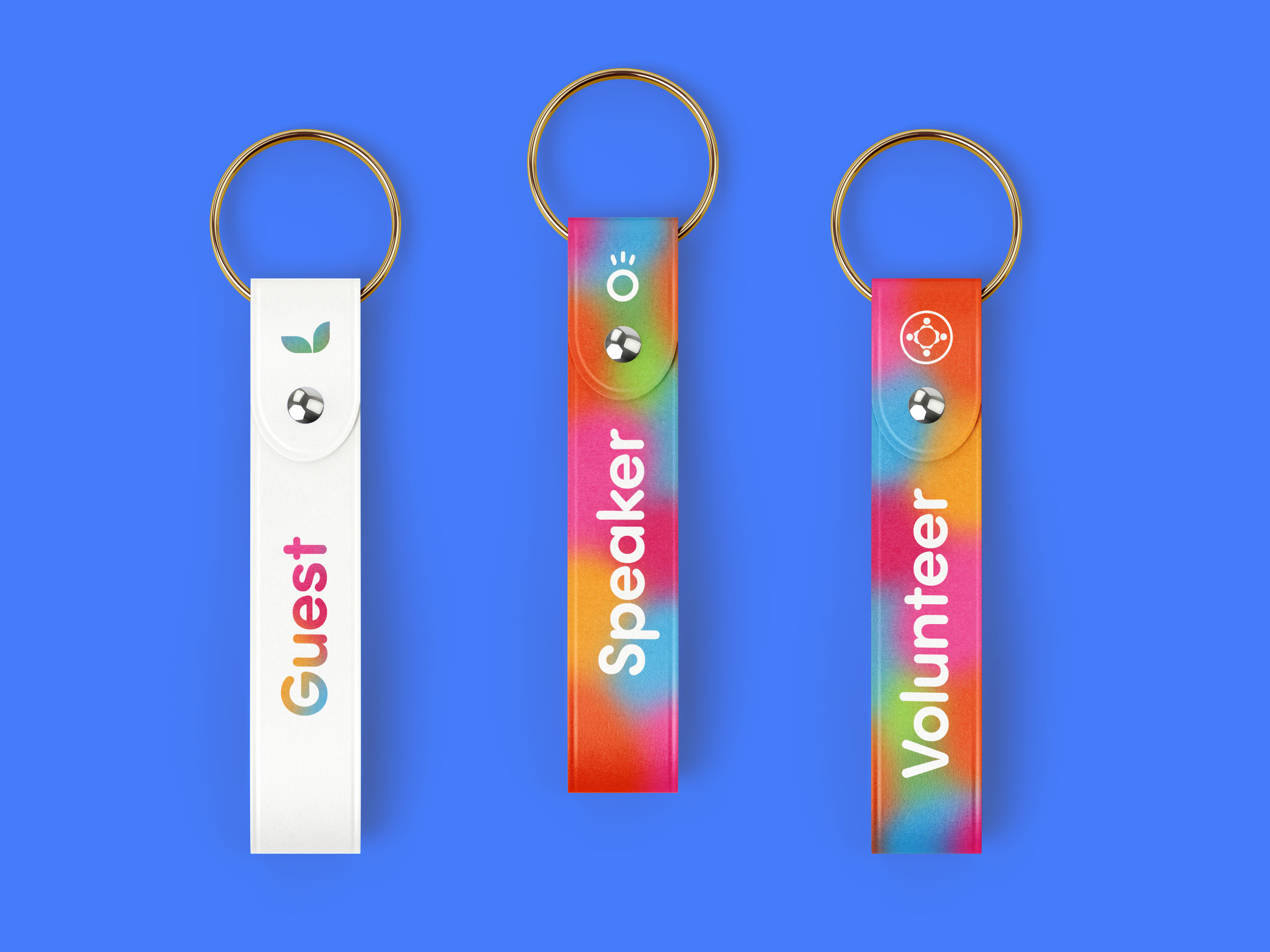
Strap tags for different types of attendants.
Tagging System for Event Attendees:In addition to the logo design, a meticulously crafted tagging system was conceptualized to enhance the attendee experience at LNOD events. Each tag is designed with precision and purpose, serving as a visual identifier for guests, volunteers, and speakers. The guest tag boasts a warm and inviting color palette, signaling a friendly welcome to newcomers. Volunteers are distinguished by a distinctive tag, embodying a sense of dedication and support for the community. Finally, speakers’ tags exude an aura of authority and expertise, setting them apart as esteemed contributors to the collective intelligence of the LNOD community. Through this thoughtful design approach, every attendee is afforded a unique visual identity, fostering a sense of belonging and ensuring seamless interactions throughout the event.
-
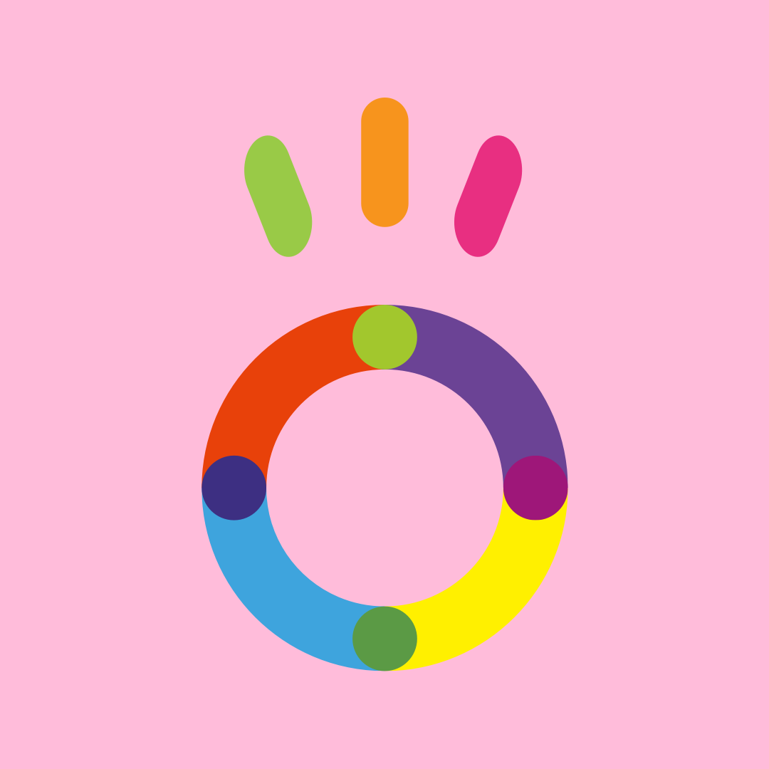
Design for the “O” letter icon from the wordmark.
The “O” Icon:In perfect tandem, the letter “O” takes on the form of a radiant sun, its rays of light symbolizing boundless growth and transformation. These elements collectively illustrate the dynamic process of continuous learning and evolution, which lies at the core of LNOD’s vision for a better society.
-
Wordmark design for LNOD.
Color as a Symbol:The use of color and gradients extends the concept of community within the logo. The vibrant palette creates a sense of inclusivity and encourages a feeling of belonging. In summary, the LNOD logo design represents the very heart and soul of a vibrant community of learning and excellence. It is a dynamic repository of knowledge designed to keep individuals at the forefront of innovation, inspiration, and achievement.
-
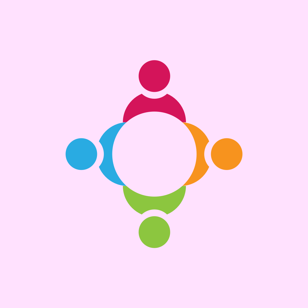
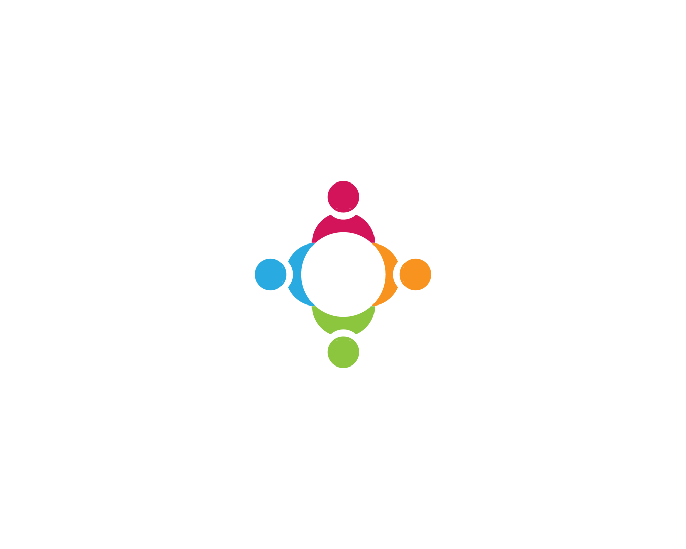
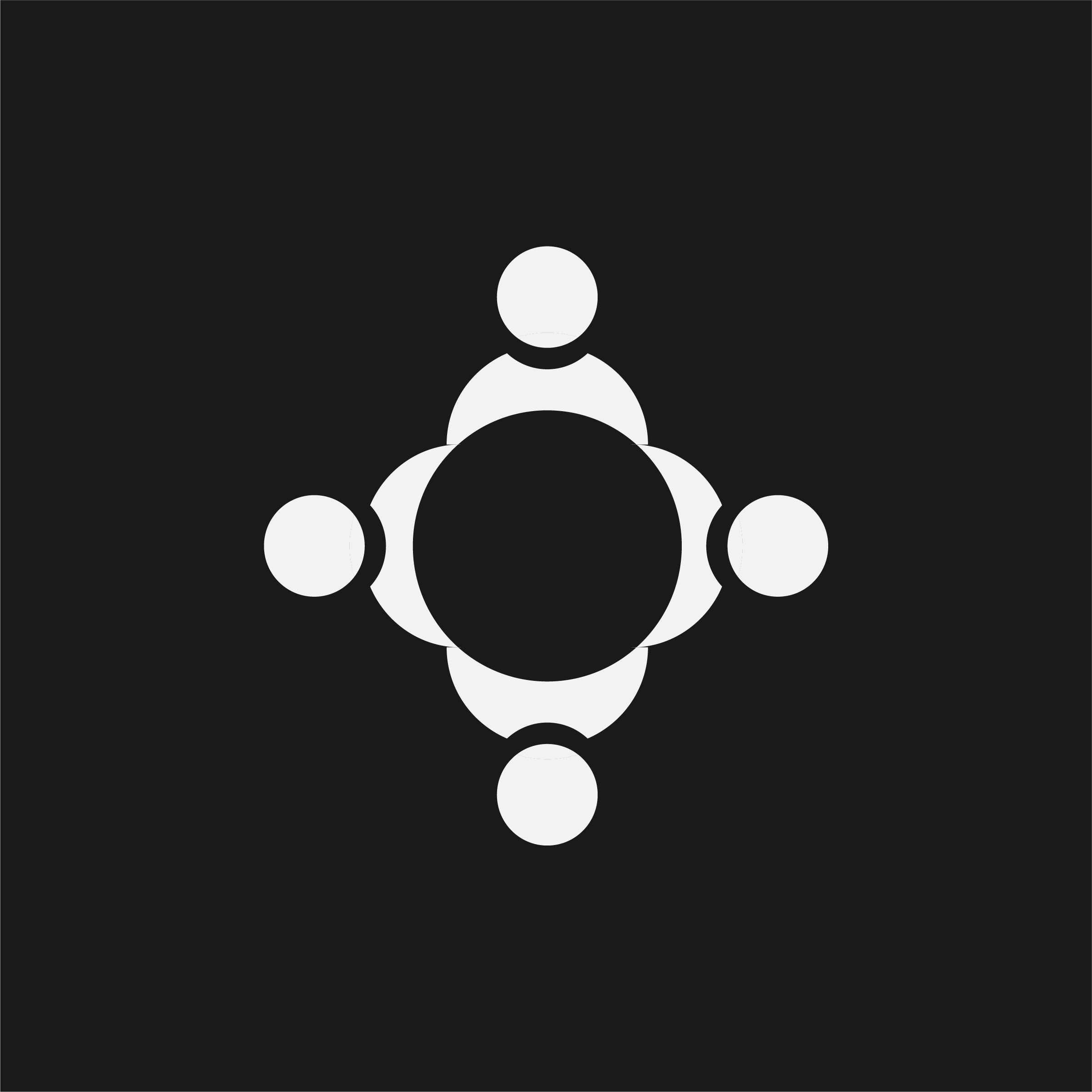
LNOD Community Icon.
The Community Icon:The community icon, formed with concentric circles, perfectly aligns with the notion of unity and togetherness. It visually represents the spirit of collaboration at the core of LNOD.
-
Process behind the Community icon.
-
Process behind the LNOD icon.
-
Process behind the leaf icon.
-
White on Black: Community Icon
-

White on Black: The “O” Icon
-
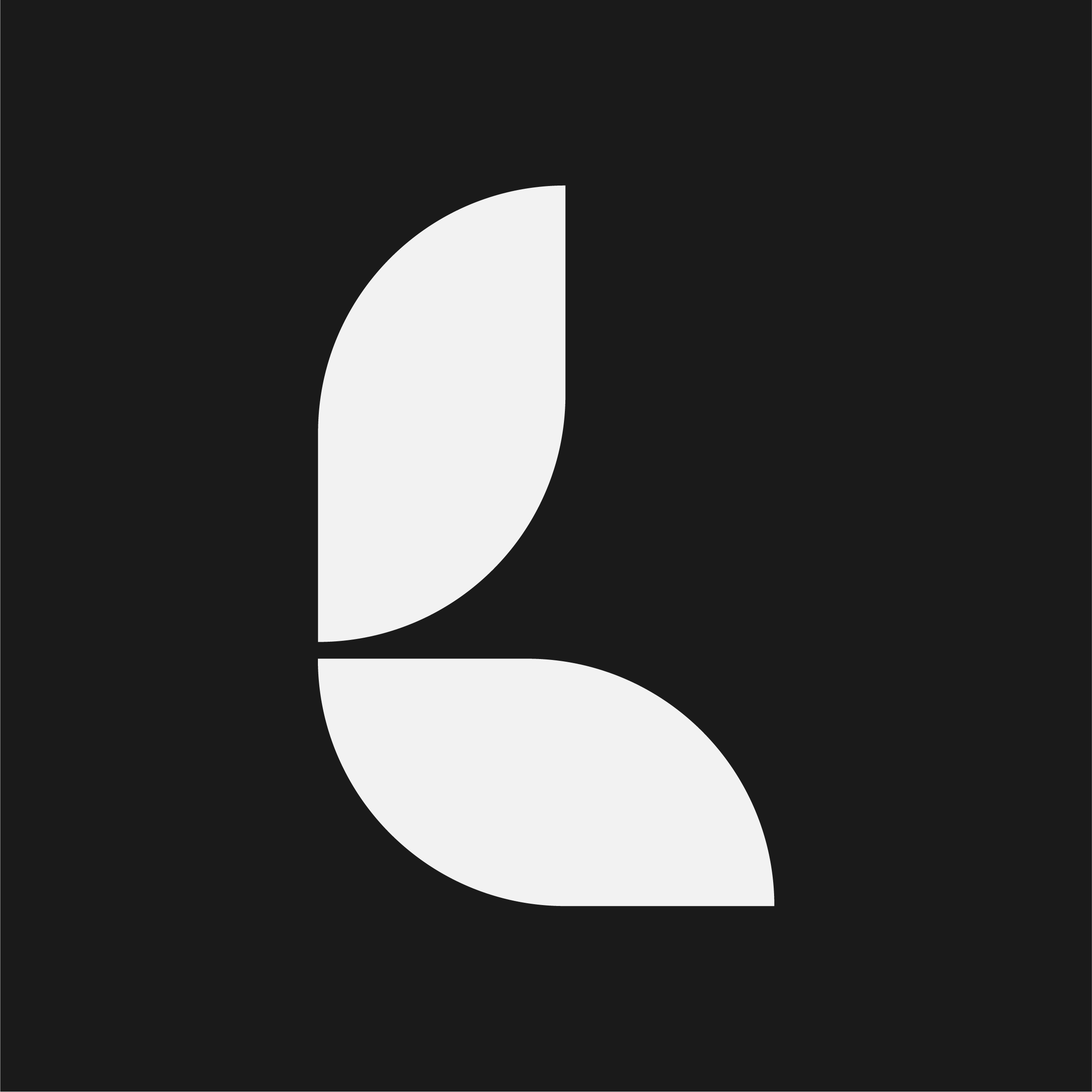
White on Black: Leaf Icon